


 本文深入探讨了量化金融中贝叶斯回归的应用,通过黄金与金矿股票ETFs的实际案例,展示了时间序列数据的回归分析。同时,文章介绍了Python中的PyMC3包如何实现贝叶斯统计的不同方法。此外,还覆盖了机器学习中的无监督和有监督学习算法,包括k-means聚类、高斯混合模型、高斯朴素贝叶斯、逻辑回归、决策树和深度神经网络等,使用scikit-learn和TensorFlow进行实践。
https://blog.youkuaiyun.com/Linli522362242/article/details/99728616
因为文件太大无法保存,所以分开
Real Data
The example we use is a “classical” pair trading strategy, namely with gold and stocks of gold miningcompanies. These are represented by ETFs with the following symbols, respectively:
• GLD ( http://finance.yahoo.com/q/pr?s=GLD+Profi1e)
• GDX ( http://finance.yahoo.com/q/pr?s=GDX+Protile )
import pandas as pd
raw=pd.read_csv('../source/tr_eikon_eod_data.csv', index_col=0, parse_dates=True)
data = raw[['GDX','GLD']].dropna()
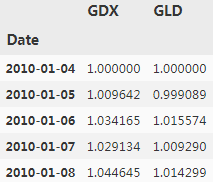
data = data/data.iloc[0] #Normalizes the data to a starting value of 1.
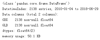
data.info()
data.head()
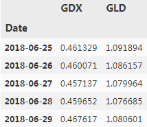
data.tail()
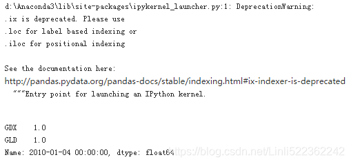
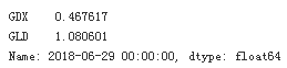
data.ix[0]
data.ix[-1]
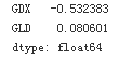
Calculates the relative performances.
data.ix[-1] / data.ix[0] -1
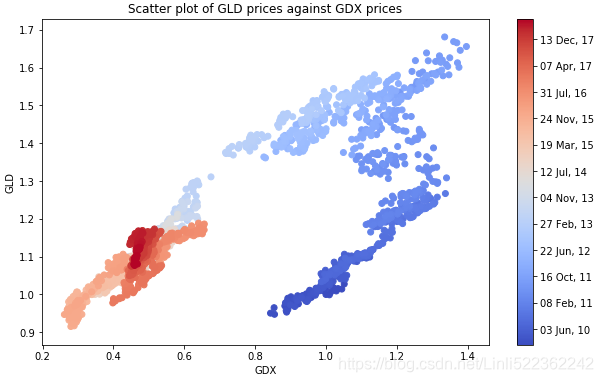
shows the historical data for both ETFs,Note gold and stocks of gold mining companies
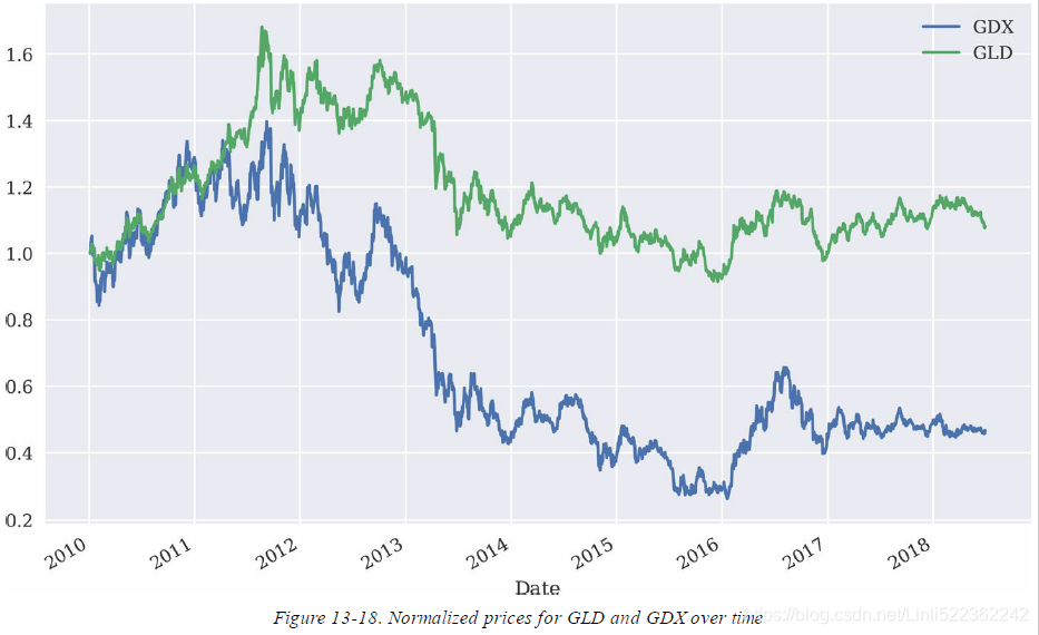
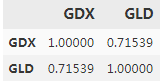
both time series seem to be quite strongly positively correlated when inspecting Figure(curves), which is also reflected in the correlation data:
data.corr() #Calculates the correlation between the two instruments.
data.index[:3] #dtype='datetime64[ns]'
![]()
import matplotlib as mpl
import matplotlib.pyplot as plt
#Converts the DatetimeIndex object to matplotlib dates.
mpl_dates = mpl.dates.date2num(data.index)
mpl_dates[:3]
![]()
plt.figure(figsize=(10,6))
plt.scatter(data['GDX'], data['GLD'], c=mpl_dates, marker='o', cmap='coolwarm')
plt.xlabel('GDX')
plt.ylabel('GLD')
plt.title('Scatter plot of GLD prices against GDX prices')
plt.colorbar(ticks=mpl.dates.DayLocator(interval=250),
format=mpl.dates.DateFormatter('%d %b, %y'))
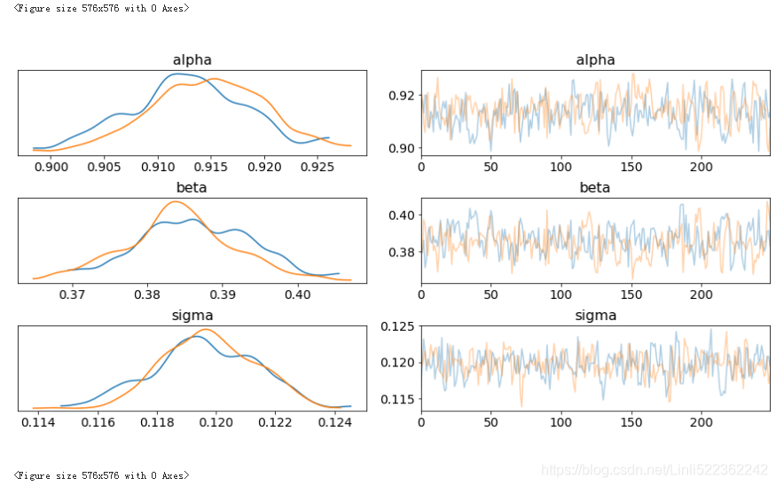
The following code implements a Bayesian regression on the basis of these two time series. The parameterizations are essentially the same as in the previous example with dummy data(虚拟数据). Figure shows the results from the MCMC sampling procedure given the assumptions about the prior probability distributions for the three parameters:
import pymc3 as pm
del() as model:
alpha = pm.Normal('alpha', mu=0, sd=20)
beta = pm.Normal('beta', mu=0, sd=20)
sigma = pm.Uniform('sigma', lower=0, upper=50)
#y_est = a + b*x
y_est = alpha+beta*data['GDX'].values
#y
likelihood = pm.Normal('GLD', mu=y_est, sd=sigma, observed=data['GLD'].values)
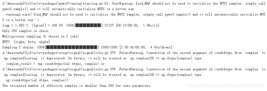
start = pm.find_MAP()
step = pm.NUTS() ## Hamiltonian MCMC with No U-Turn Sampler
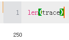
trace = pm.sample(250, step, start=start, progressbar=True)
shows the results from the MCMC sampling procedure given the assumptions about the prior probability distributions for the three parameters
#blue curve: # prior #GLD
#green curve: #postrior #GDX
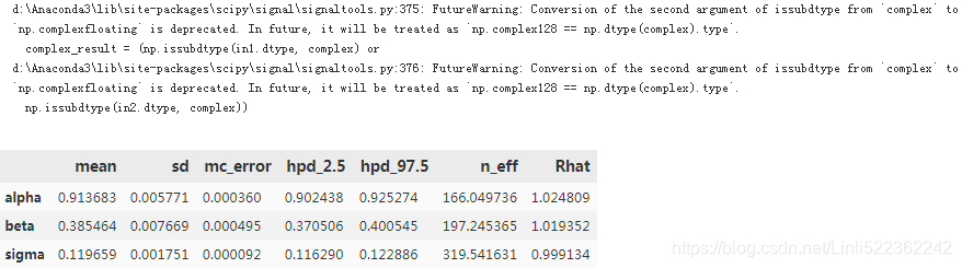
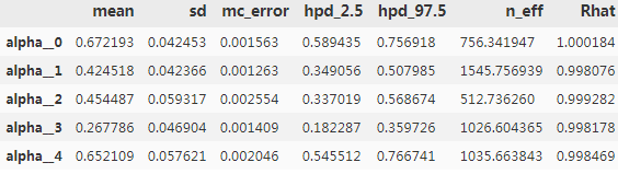
pm.summary(trace)
adds all the resulting regression lines to the scatter plot from before. However, all the regression lines are pretty close to each other:
plt.figure(figsize=(10,6))
plt.scatter(data['GDX'], data['GLD'], c=mpl_dates, marker='o')
plt.grid(True)
plt.xlabel('GDX')
plt.ylabel('GLD')
for i in range(len(trace)):
plt.plot(data['GDX'], trace['alpha'][i] +trace['beta'][i]*data['GDX'])
plt.colorbar(ticks=mpl.dates.DayLocator(interval=250),
format=mpl.dates.DateFormatter('%d %b %y'))
plt.title('Multiple Bayesian regression lines through GDX and GLD data')
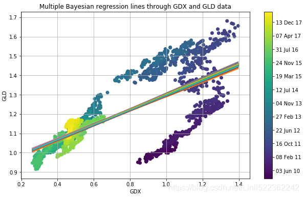
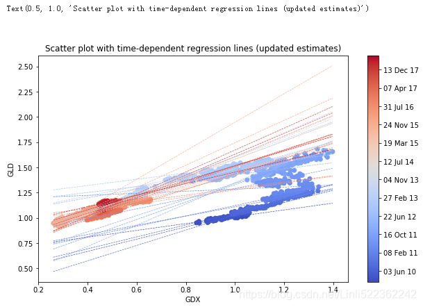
The figure reveals a major drawback of the regression approach used: the approach does not take into account evolutions over time. That is, the most recent data is treated the same way as the oldest data
k 罔揭木了所J:IJ 阳归方法的一个重大不足:该方法没有考虑随时间推移发生的变化。
也就是说.最近的数据和最老的数据受到同等对待
Updating Estimates over Time
As pointed out before, the Bayesian approach in finance is generally most useful when seen as diachronic 历史分析时— i.e., in the sense that new data revealed over time allows for better regressions and estimates through updating or learning.
To incorporate this concept in the current example, assume that the regression parameters are not only random and distributed in some fashion, but that they follow some kind of random walk over time. It is the same generalization used when making the transition in financial theory from random variables to stochastic processes (which are essentially ordered sequences of random variables).
To this end, define a new PyMC3 model, this time specifying parameter values as random walks. After having specified the distributions of the random walk parameters, one proceeds with specifying the random walks for alpha and beta. To make the whole procedure more efficient, 50 data points at a time share common coefficients:
To this end, we define a new PyMC3 model, this time specifying parameter values as random walks with the variance parameter values transformed to log space (for better sampling characteristics).
from pymc3.distributions.timeseries import GaussianRandomWalk
import numpy as np
subsample_alpha = 50
subsample_beta = 50
model_randomwalk = pm.Model()
with model_randomwalk:
# std of random wark best sampled in log space
sigma_alpha = pm.Exponential('sig_alpha', 1./.02, testval=.1) #Defines priors for the random walk parameters
sigma_beta = pm.Exponential('sig_beta', 1./.02, testval=.1)
alpha = GaussianRandomWalk('alpha', sigma_alpha ** -2, #Models for the random walks.
shape=int( len(data)/subsample_alpha )
)
beta = GaussianRandomWalk('beta', sigma_beta ** -2,
shape=int( len(data)/subsample_beta)
)
alpha_r = np.repeat(alpha, subsample_alpha) #Brings the parameter vectors to interval length.
beta_r = np.repeat(beta, subsample_beta)
#only the first 2100 data points are taken for the regression
regression = alpha_r + beta_r * data['GDX'].values[:2100] #Defines the regression model.
sd = pm.Uniform('sd', 0,20) #The prior for the standard deviation
likelihood = pm.Normal('GLD', mu=regression, sd=sd, #Defines the likelihood with mu from regression results.
observed = data['GLD'].values[:2100])
All these definitions are a bit more involved than before due to the use of random walks instead of a single random variable. However, the inference steps with the MCMC sampling remain essentially the same. Note, though, that the computational burden increases substantially since the algorithm has to estimate parameters per random walk sample — i.e., 2100 / 50 = 42 parameter combinations in this case (instead of 1, as before):
%%time
import scipy.optimize as sco
with model_randomwalk:
start = pm.find_MAP(vars=[alpha, beta],
fmin=sco.fmin_l_bfgs_b)
step = pm.NUTS(scaling=start)
trace_rw = pm.sample(250, step, start=start, progressbar=True)
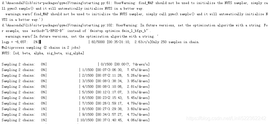
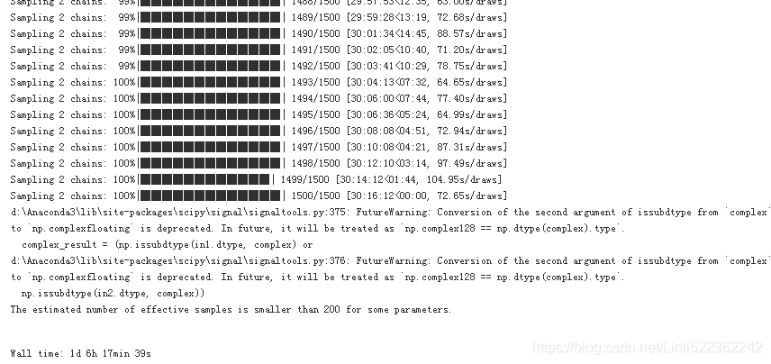
Note:电脑跑了1day 6hours 17 minutes 39 seconds
pm.summary(trace_rw).head()
In total, we have 500 estimates with 42 time intervals:
sh=np.shape(trace_rw['alpha'])
sh
![]()
part_dates = np.linspace(min(mpl_dates), max(mpl_dates),sh[1]) #sh[1]==42
import datetime as dt
index = [dt.datetime.fromordinal(int(date)) for date in part_dates]
#Creates a list of dates to match the number of intervals
alpha = {'alpha_%i' % i:v for i,v in enumerate(trace_rw['alpha']) if i<20} #get first 20 items from 500
beta = {'beta_%i' % i:v for i,v in enumerate(trace_rw['beta']) if i<20}
#Collects the relevant parameter time series in two DataFrame objects
df_alpha = pd.DataFrame(alpha, index=index)
df_beta = pd.DataFrame(beta, index=index)
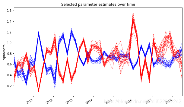
ax = df_alpha.plot(color='b', style='-.', legend=False, lw=0.7, figsize=(10,6))
df_beta.plot(color='r', style='-.', legend=False, lw=0.7, ax=ax)
plt.ylabel('alpha/beta')
plt.title('Selected parameter estimates over time')
part_dates = np.linspace(min(mpl_dates), max(mpl_dates), 42)
fig, ax1 = plt.subplots(figsize=(10, 5))
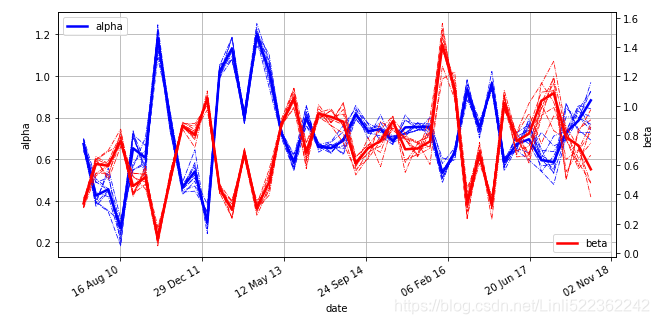
plt.plot(part_dates, np.mean(trace_rw['alpha'], axis=0), 'b', lw=2.5, label='alpha')
for i in range(45, 55): #get items at the index interval 45 and 55
plt.plot(part_dates, trace_rw['alpha'][i], 'b-.', lw=0.75)
plt.xlabel('date')
plt.ylabel('alpha')
plt.axis('tight')
plt.grid(True)
plt.legend(loc=2)
ax1.xaxis.set_major_formatter(mpl.dates.DateFormatter('%d %b %y') )
ax2 = ax1.twinx()
plt.plot(part_dates, np.mean(trace_rw['beta'], axis=0),'r', lw=2.5, label='beta')
for i in range(45, 55):
plt.plot(part_dates, trace_rw['beta'][i], 'r-.', lw=0.75)
plt.ylabel('beta')
plt.legend(loc=4)
fig.autofmt_xdate()

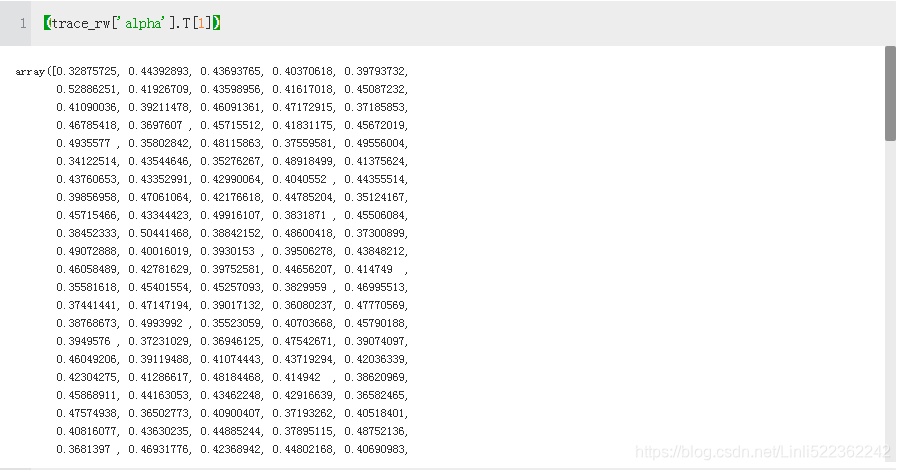
len(trace_rw['alpha'].T[1])
![]()
Using the mean alpha and beta values, the following Figure illustrates how the regression is updated over time. The 42 different regression lines resulting from the mean alpha and beta values are displayed. It is obvious that updating over time improves the regression fit (for the current/most recent data) significantly — in other words, “every time period needs its own regression"
plt.figure(figsize=(10,6))
plt.scatter( data['GDX'], data['GLD'], c=mpl_dates, marker='o', cmap='coolwarm')
plt.colorbar(ticks=mpl.dates.DayLocator(interval=250),
format=mpl.dates.DateFormatter('%d %b %y'))
plt.xlabel('GDX')
plt.ylabel('GLD')
x=np.linspace(min(data['GDX']), max(data['GDX']))
for i in range(sh[1]): #sh[1]==42
alpha_rw = np.mean(trace_rw['alpha'].T[i])
beta_rw = np.mean(trace_rw['beta'].T[i])
plt.plot(x, alpha_rw + beta_rw*x, '--', lw=0.7, color=plt.cm.coolwarm(i/sh[1]))
plt.title('Scatter plot with time-dependent regression lines (updated estimates)')
This concludes the section on Bayesian statistics. Python offers with PyMC3 a comprehensive package
to implement different approaches from Bayesian statistics and probabilistic programming. Bayesian
regression in particular is a tool that has become quite popular and important in quantitative finance.
Machine Learning
The section covers two types of algorithms: unsupervised and supervised learning algorithms.
One of the most popular packages for machine learning with Python is scikit-learn. It not only
provides implementations of a great variety of ML algorithms, but also provides a large number of
helpful tools for pre- and post-processing activities related to ML tasks. This section mainly relies on
this package. It also uses TensorFlow in the context of deep neural networks (DNNs).
VanderPlas (2016) provides a concise introduction to different ML algorithms based on Python and
scikit-learn. Albon (2018) offers a number of recipes for typical tasks in ML, also mainly using
Python and scikit-learn.
Unsupervised Learning
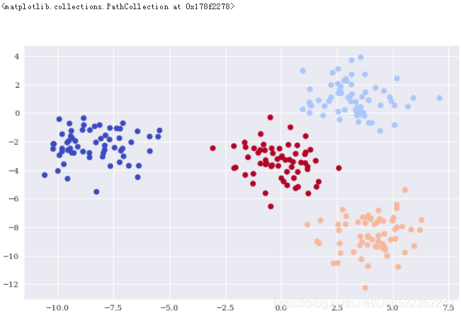
Unsupervised learning embodies the idea that a machine learning algorithm discovers insights from raw data without any further guidance. One such algorithm is the k-means clustering algorithm that clusters a raw data set into a number of subsets and assigns these subsets labels (“cluster 0,” “cluster 1,” etc.). Another one is Gaussian mixture.
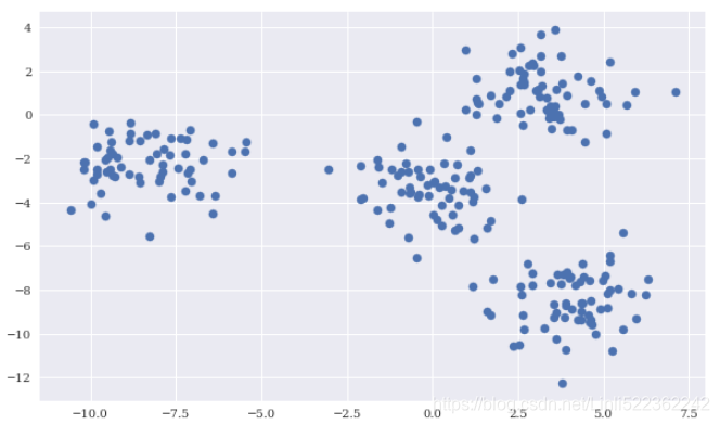
The data
Among other things, scikit-learn allows the creation of sample data sets for different types of ML problems. The following creates a sample data set suited to illustrating k-means clustering.
import numpy as np
import pandas as pd
import datetime as dt
from pylab import mpl, plt
plt.style.use('seaborn')
mpl.rcParams['font.family'] = 'serif'
np.random.seed(1000)
np.set_printoptions(suppress=True, precision=4)
%matplotlib inline
from sklearn.datasets.samples_generator import make_blobs
X, y = make_blobs(n_samples=250, centers=4, random_state=500, cluster_std=1.25)
plt.figure(figsize=(10,6))
plt.scatter(X[:,0], X[:,1], s=50)
k-means clustering
One of the convenient features of scikit-learn is that it provides a standardized API to apply different kinds of algorithms. The following code shows the basic steps for k-means clustering that are repeated for other models afterwards:
- Importing the model class
- Instantiating a model object
- Fitting the model object to some data
- Predicting the outcome given the fitted model for some data
#Data
from sklearn.datasets.samples_generator import make_blobs
X, y = make_blobs(n_samples=250, centers=4, random_state=500, cluster_std=1.25)
#Importing the model class
from sklearn.cluster import KMeans
#Instantiating a model object
#Instantiates a model object, given certain parameters; knowledge about the sample data is used
#to inform the instantiation.
model = KMeans(n_clusters=4, random_state=0)
#Fits the model object to the raw data.
model.fit(X)
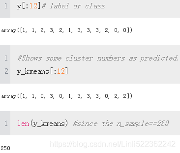
#Predicts the cluster (number) given the raw data.
y_kmeans = model.predict(X)
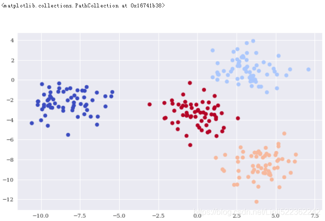
plt.figure(figsize=(10,6))
plt.scatter(X[:,0], X[:,1], c=y_kmeans, cmap='coolwarm')
Gaussian mixture
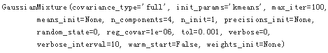
As an alternative clustering method, consider Gaussian mixture. The application is the same, and with the appropriate parameterization, the results are also the same:
#Data
from sklearn.datasets.samples_generator import make_blobs
X, y = make_blobs(n_samples=250, centers=4, random_state=500, cluster_std=1.25)
#Importing the model class
from sklearn.mixture import GaussianMixture
Instantiating a model object
#model = KMeans(n_clusters=4, random_state=0)
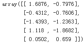
model = GaussianMixture(n_components=4, random_state=0)
#Fitting the model object to some data
model.fit(X)
#Predicting the outcome given the fitted model for some data
y_gm = model.predict(X)
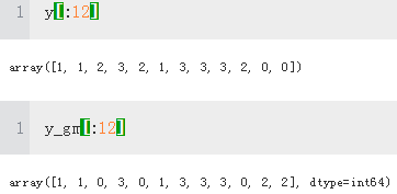
#The results from k-means clustering and Gaussian mixture are the same
(y_gm==y_kmeans).all()
Trueplt.figure(figsize=(10,6))
plt.scatter(X[:,0], X[:,1], c=y_gm, cmap='coolwarm')
Supervised Learning
the focus lies on classification problems
In supervised learning, such categorical labels are already given, so that the algorithm can learn the relationship between the features and the categories (classes). In other words, during the fitting step, the algorithm knows the right class for the given feature value combinations
This subsection illustrates the application of the following classification algorithms: Gaussian Naive Bayes, logistic regression, decision trees, deep neural networks, and support vector machines.
The data
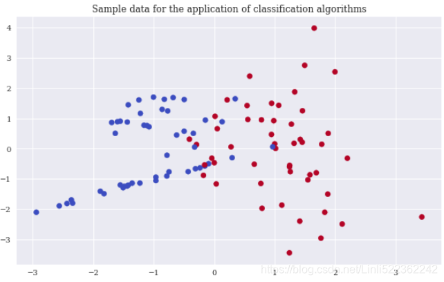
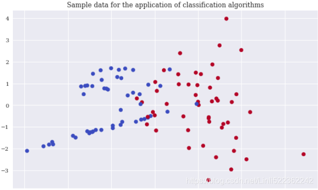
Again, scikit-learn allows the creation of an appropriate sample data set to apply classification algorithms. In order to be able to visualize the results, the sample data only contains two real-valued, informative features and a single binary label (a binary label is characterized by two different classes only, 0 and 1). The following code creates the sample data, shows some extracts of the data, and visualizes the data
from sklearn.datasets import make_classification
n_samples = 100
#https://blog.youkuaiyun.com/genghaihua/article/details/81154566
X, y = make_classification(n_samples=n_samples,
n_features=2, # 特征个数= n_informative() + n_redundant + n_repeated
n_informative=2, n_redundant=0,
n_repeated=0, random_state=250)
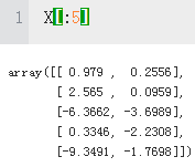
X[:5] #The two informative, real-valued features.
X.shape
![]()
y[:5]#The single binary label.
![]()
y.shape
![]()
plt.figure(figsize=(10,6))
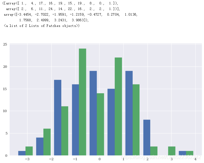
plt.hist(X)
plt.figure(figsize=(10,6))
plt.scatter(x=X[:,0], y=X[:,1], c=y, cmap='coolwarm')
plt.title('Sample data for the application of classification algorithms')
Gaussian Naive Bayes
Gaussian Naive Bayes (GNB) is generally considered to be a good baseline algorithm for a multitude of different classification problems. The application is in line with the steps outlined in “k-means clustering”:
from sklearn.datasets import make_classification
X, y = make_classification(n_samples=n_samples, n_features=2,
n_informative=2, n_redundant=0,
n_repeated=0, random_state=250)
from sklearn.naive_bayes import GaussianNB
from sklearn.metrics import accuracy_score
model = GaussianNB()
model.fit(X,y)
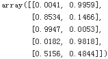
![]()
#Shows the probabilities that the algorithm assigns to each class after fitting.
model.predict_proba(X).round(4)[:5]
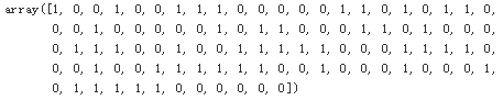
#Based on the probabilities, predicts the binary classes for the data set.
pred = model.predict(X)
pred
#Compares the predicted classes with the real ones.
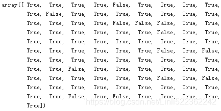
pred==y
#Calculates the accuracy score given the predicted values.
accuracy_score(y, pred)
![]()
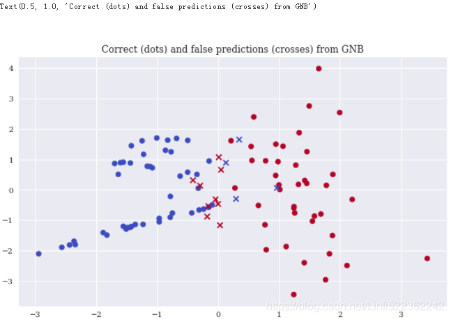
Xc = X[y==pred] #Selects the correct predictions and plots them.
Xf = X[y!=pred] #Selects the false predictions and plots them.
plt.figure(figsize=(10,6))
plt.scatter(x=Xc[:,0], y=Xc[:,1], c=y[y==pred], marker='o', cmap='coolwarm')
plt.scatter(x=Xf[:,0], y=Xf[:,1], c=y[y!=pred], marker='x', cmap='coolwarm')
plt.title('Correct (dots) and false predictions (crosses) from GNB')

Logistic regression
Logistic regression (LR) is a fast and scalable classification algorithm. The accuracy in this particular case is slightly better than with GNB:
from sklearn.datasets import make_classification
X, y = make_classification(n_samples=n_samples, n_features=2,
n_informative=2, n_redundant=0,
n_repeated=0, random_state=250)
from sklearn.linear_model import LogisticRegression
#C: Inverse of regularization strength; must be a positive float.
#Like in support vector machines, smaller values specify stronger regularization.
model = LogisticRegression(C=1, solver='lbfgs')
model.fit(X,y)
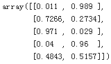
model.predict_proba(X).round(4)[:5]
pred = model.predict(X)
accuracy_score(y,pred)
![]()
Xc = X[y==pred]
Xf = X[y!=pred]
plt.figure(figsize=(10,6))
plt.scatter(x=Xc[:,0], y=Xc[:,1], c=y[y==pred], marker='o', cmap='coolwarm')
plt.scatter(x=Xf[:,0], y=Xf[:,1], c=y[y!=pred], marker='x', cmap='coolwarm')
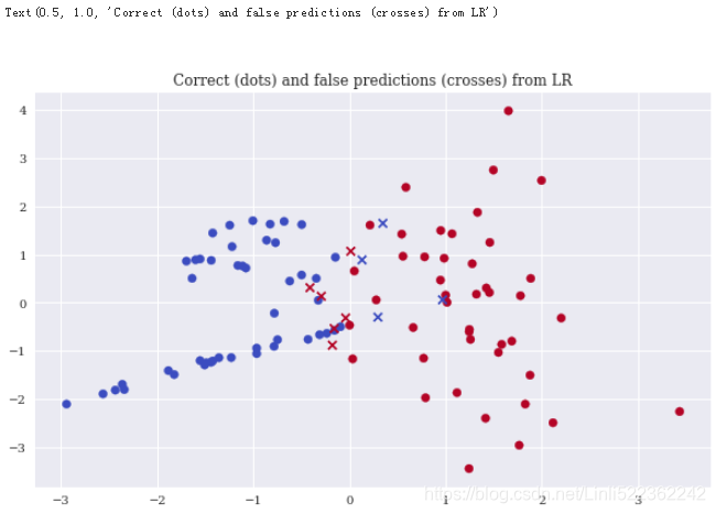
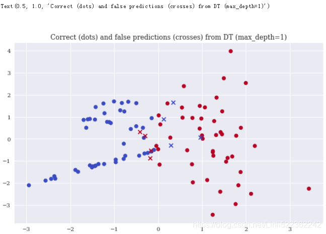
Decision trees
Decision trees(DTs) are yet another type of classification algorithm that scales quite well. With a maximum depth of 1, the algorithm already performs slightly better than both GNB and LR
from sklearn.datasets import make_classification
X, y = make_classification(n_samples=n_samples, n_features=2,
n_informative=2, n_redundant=0,
n_repeated=0, random_state=250)
from sklearn.tree import DecisionTreeClassifier
model = DecisionTreeClassifier(max_depth=1)
model.fit(X,y)
#Shows the probabilities that the algorithm assigns to each class after fitting.
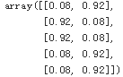
model.predict_proba(X).round(4)[:5]
pred = model.predict(X)
accuracy_score(y,pred)
![]()
Xc = X[y==pred]
Xf = X[y!=pred]
plt.figure(figsize=(10,6))
plt.scatter(x=Xc[:,0], y=Xc[:,1], c=y[y==pred], marker='o', cmap='coolwarm')
plt.scatter(x=Xf[:,0], y=Xf[:,1], c=y[y!=pred], marker='x', cmap='coolwarm')
plt.title('Correct (dots) and false predictions (crosses) from DT (max_depth=1)')


 1599
1599

 被折叠的 条评论
为什么被折叠?
被折叠的 条评论
为什么被折叠?
 到【灌水乐园】发言


