


目录
1.现状图形shape
形状图形又称shape图形, 是 Android 中用于定义几何形状、边框、渐变等效果的 XML 资源,它比图片更节省资源,且能自动适应不同屏幕尺寸。它的根节点为shape标签,存放在res/drawable目录下。根节点下定义了6个子节点,由于定义图形的各项属性。下面是各个节点的简要说明。
1.shape:根节点,它有一个属性shape用于表示图形的形状。有4中取值,rectangle(矩形,默认值)、oval(椭圆)、line(直线)、ring(圆环)。
2.size:子节点,它用于定义形状图形的宽高。若无该节点则与宿主视图一样大小。width与height为其属性,定义宽高值。
3.stroke:子节点,它用于描述形状图形的描边规格。若无该节点则无描边。它有color属性用于定义描边颜色;dashGap属性用于定义每段虚线的距离;dashWidth属性用于定义每段虚线的宽度,若dashGap与dashWidth有一个值为0则为实线;width属性用于定义描边的厚度。
4.corners:子节点,它用于描述形状图形的圆角大小。若无该节点则表示无圆角。它有radius属性定义四个圆角的半径大小;topLeftRadius属性定义左上角的圆角半径;topRightRadius属性定义右上角的圆角半径;bottomLeftRadius属性定义左下角的圆角半径;bottomRightRadius属性定义右下角的圆角半径。
5.solid:子节点,它用于描述形状图形的填充颜色。若无该节点则无填充颜色。它的color属性定义内部填充颜色。
6.padding:子节点,它用于描述形状图形的边距。若无该节点则无边距。它的top属性定义与上方的间隔;bottom属性定义与下方的间隔;left属性定义与左方的间隔;right属性定义与右方的间隔。
7.gradient:子节点,它用于描述形状图形的颜色渐变。无该节点则无颜色渐变。它的angle属性定义渐变的起始角度;type属性定义渐变类型。它的类型有linear(线性渐变,默认值)、radial(放射渐变)、sweep(滚动渐变,即一个线段一某个端点为圆心做360度旋转)。
下面是代码示例。
//第一个图形文件代码
<?xml version="1.0" encoding="utf-8"?>
<shape xmlns:android="http://schemas.android.com/apk/res/android">
    <corners android:radius="100dp"/>
    <solid android:color="#ffbfbfbf"/>
    <size android:height="50dp" android:width="100dp"/>
    <stroke android:width="5dp" android:dashWidth="20dp" android:color="@color/teal_200" android:dashGap="5dp"/>
</shape>
//第二个图形文件代码
<?xml version="1.0" encoding="utf-8"?>
<shape xmlns:android="http://schemas.android.com/apk/res/android"
    android:shape="oval">
    <size android:width="100dp" android:height="60dp"/>
    <solid android:color="@color/teal_200"/>
    <stroke android:width="5dp" android:dashWidth="20dp" android:color="@color/teal_700" android:dashGap="5dp"/>
</shape>
//页面布局文件代码
<?xml version="1.0" encoding="utf-8"?>
<LinearLayout xmlns:android="http://schemas.android.com/apk/res/android"
xmlns:app="http://schemas.android.com/apk/res-auto"
xmlns:tools="http://schemas.android.com/tools"
android:layout_width="match_parent"
android:layout_height="match_parent"
tools:context=".DrawableActivity"
android:orientation="vertical">
<EditText
android:id="@+id/editText_1"
android:layout_width="match_parent"
android:layout_height="50dp"
android:background="@drawable/edittext_normal"
android:text="Button" />
<EditText
android:id="@+id/editText_2"
android:layout_width="match_parent"
android:layout_height="50dp"
android:background="@drawable/edittext_pressed"
android:text="Button" />
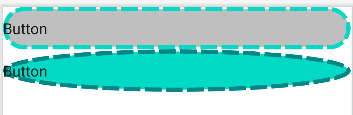
</LinearLayout>效果图如下。将两个图形文件应用于视图背景。
2.状态列表图形
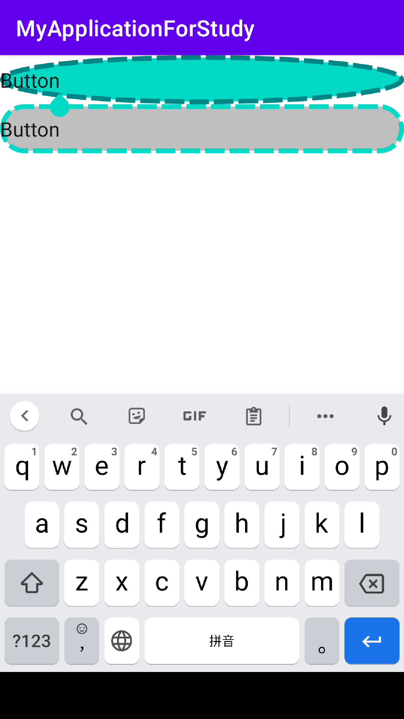
之前学过编辑框有焦点变化的知识,如果想要编辑框的背景随焦点变化而改变就需要用到状态列表图形。示例代码如下。先新建两张形状图形(上面的代码),在新建一个新的xml存放在drawable目录下。可以看到状态列表图形的根节点为selector,子节点为item。item有几种状态类型,state_focus(是否获取焦点,编辑框可用)、state_pressed(是否按下,按钮可用)、state_checked(是否勾选,复选框、单选按钮可用)、state_selected(是否选中,通用的属性),下方代码用到第一个状态类型。
<?xml version="1.0" encoding="utf-8"?>
<selector xmlns:android="http://schemas.android.com/apk/res/android">
    <item android:state_focused="true" android:drawable="@drawable/edittext_pressed"/>
    <item android:drawable="@drawable/edittext_normal"/>
</selector>
页面的布局文件代码。
<?xml version="1.0" encoding="utf-8"?>
<LinearLayout xmlns:android="http://schemas.android.com/apk/res/android"
    xmlns:app="http://schemas.android.com/apk/res-auto"
    xmlns:tools="http://schemas.android.com/tools"
    android:layout_width="match_parent"
    android:layout_height="match_parent"
    tools:context=".DrawableActivity"
    android:orientation="vertical">

    <EditText
        android:id="@+id/editText_1"
        android:layout_width="match_parent"
        android:layout_height="50dp"
        android:background="@drawable/edittext_selector"
        android:text="Button" />

    <EditText
        android:id="@+id/editText_2"
        android:layout_width="match_parent"
        android:layout_height="50dp"
        android:background="@drawable/edittext_selector"
        android:text="Button" />
</LinearLayout>
效果图如下。可以看到有无焦点背景不同。这种方式也可以应用于其他视图如按钮,文本视图等。


 扫一扫
扫一扫


 1648
1648

 被折叠的 条评论
为什么被折叠?
被折叠的 条评论
为什么被折叠?
 到【灌水乐园】发言


