


效果演示: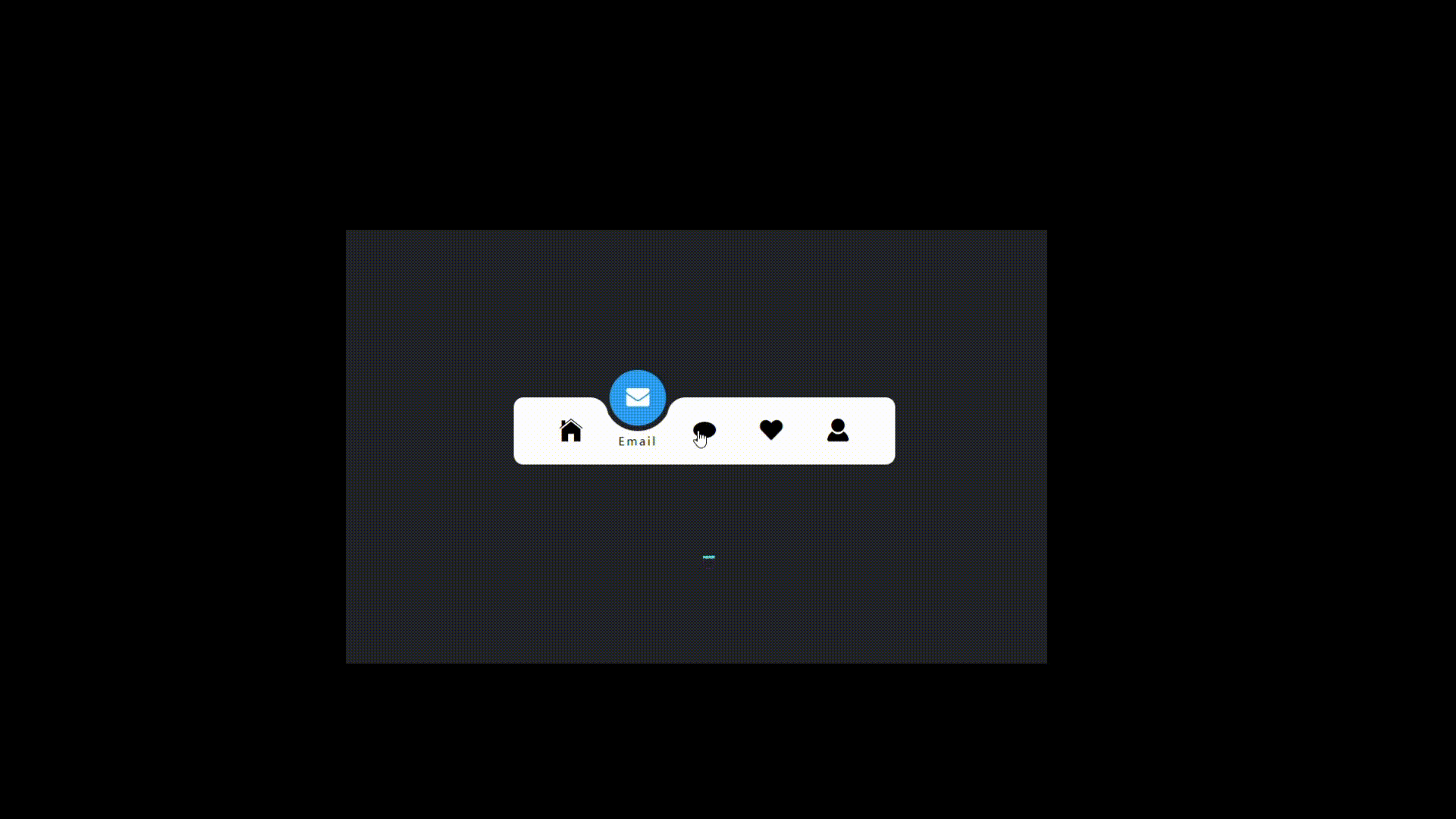
分析:实现了一个带指示器的导航栏效果,当用户点击导航栏中的某个选项时,该选项会变为激活状态,指示器会移动到该选项下方,并且该选项的图标和文字会变为白色。同时,其他选项的图标和文字会变为灰色。
Code如下
HTML
<!DOCTYPE html>
<html lang="en">

<head>
    <meta charset="UTF-8">
    <meta name="viewport" content="width=device-width, initial-scale=1.0">
    <title>内凹导航栏</title>
    <link rel="stylesheet" href="./navigation.css">
    <link rel="stylesheet" href="http://at.alicdn.com/t/c/font_4144272_3vtq4renm6e.css">
</head>

<body>
<ul class="nav">
    <li class="active">
        <i class="iconfont icon-home"></i>
        <span>Home</span>
    </li>
    <li>
        <i class="iconfont icon-envelope"></i>
        <span>Email</span>
    </li>
    <li>
        <i class="iconfont icon-comment"></i>
        <span>Message</span>
    </li>
    <li>
        <i class="iconfont icon-heart"></i>
        <span>Like</span>
    </li>
    <li>
        <i class="iconfont icon-user"></i>
        <span>Profile</span>
    </li>

    <div class="indicator"></div>
</ul>
<script src="./navigation.js"></script>
</body>
</html>
CSS
* {
    margin: 0;
    padding: 0;
    box-sizing: border-box;
    font-family: 'Poppins', sans-serif;
}
/*重置默认样式,设置默认字体。*/
body {
    display: flex;
    justify-content: center;
    align-items: center;
    min-height: 100vh;
    background: #222327;
}
/*设置页面的布局和背景颜色。*/
.nav {
    width: 400px;
    height: 70px;
    padding: 0 25px;
    border-radius: 10px;
    background-color: #fff;
    position: relative;
    display: flex;
}
/*为导航栏设置样式,包括尺寸、内边距、圆角和背景颜色。*/
.nav li {
    width: 70px;
    height: 70px;
    z-index: 1;
    position: relative;
    list-style: none;
    cursor: pointer;
    display: flex;
    flex-direction: column;
    justify-content: center;
    align-items: center;
}

.nav li i {
    position: relative;
    display: block;
    height: 70px;
    line-height: 70px;
    font-size: 24px;
    text-align: center;
    transition: all 0.5s;
}

.nav li span {
    position: absolute;
    font-size: 12px;
    letter-spacing: 2px;
    transition: all .5s;
    opacity: 0;
    transform: translateY(20px);
}
/*为导航项设置样式,包括尺寸、图标和文本的布局和动画。*/
.nav li.active i {
    transform: translateY(-35px);
    color: #fff;
}

.nav li.active span {
    opacity: 1;
    transform: translateY(10px);
}
/*设置激活状态的导航项的图标和文本变换。*/
.indicator {
    position: absolute;
    top: -50%;
    width: 70px;
    height: 70px;
    background: #2196f3;
    border-radius: 50%;
    border: 6px solid #222327;
    transition: all .5s;
}

.indicator::before {
    content: '';
    position: absolute;
    top: 50%;
    left: -22px;
    width: 20px;
    height: 20px;
    background-color: #fff;
    border-top-right-radius: 20px;
    box-shadow: 1px -10px 0 0 #222327;
}
/*为指示器设置样式,包括尺寸、位置、背景颜色和动画。*/
.indicator::after {
    content: '';
    position: absolute;
    top: 50%;
    right: -22px;
    width: 20px;
    height: 20px;
    background-color: #fff;
    border-top-left-radius: 20px;
    box-shadow: -1px -10px 0 0 #222327;
}
/*为指示器的伪元素设置样式,用于创建装饰效果。*/
li:nth-child(1).active~.indicator {
    transform: translateX(calc(70px * 0));
}

li:nth-child(2).active~.indicator {
    transform: translateX(calc(70px * 1));
}

li:nth-child(3).active~.indicator {
    transform: translateX(calc(70px * 2));
}

li:nth-child(4).active~.indicator {
    transform: translateX(calc(70px * 3));
}

li:nth-child(5).active~.indicator {
    transform: translateX(calc(70px * 4));
}
JS
// 使用CSS选择器和伪类,根据导航项的序号和激活状态改变指示器的位置。
const lis = document.querySelectorAll('.nav li');
lis.forEach(li => {
    li.addEventListener('click', function () {
        lis.forEach(item => {
            item.classList.remove('active');
            this.classList.add('active')
        })
    })
})
💞💖💓💗每个时代,
✨🌟⭐️💫都悄悄犒赏会学习的人。


 扫一扫
扫一扫


 被折叠的 条评论
为什么被折叠?
被折叠的 条评论
为什么被折叠?
 到【灌水乐园】发言


