


 博客介绍了使用CSS3实现三栏布局,两边固定、中间自适应,还结合媒体查询展示不同效果。针对不同设备宽度,如600以上、400 - 600、200 - 399,分别呈现不同布局样式,涉及HTML和CSS代码。
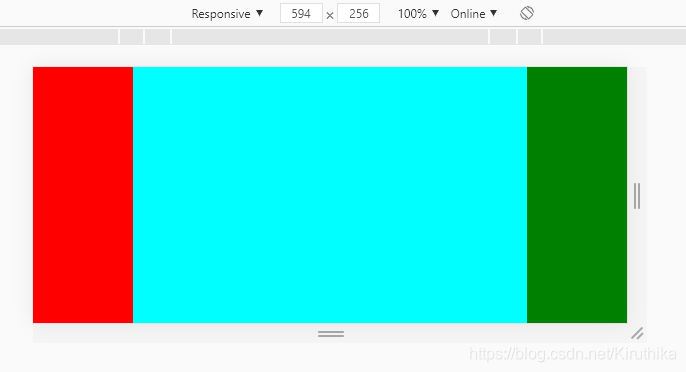
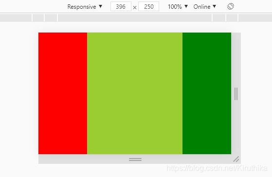
下面展示的就是三栏布局,两边固定,中间自适应,结合媒体查询展示不同的效果
- 设备宽度:600以上

- 设备宽度:400~600
- 设备宽度:200~399
HTML:
<div id="wrapper">
	<div></div>
	<div></div>
	<div></div>
</div>
CSS:
*{
	margin: 0;
	padding: 0;
}
html,body{
	height: 100%;
}
#wrapper{
	height: 100%;
	display: flex;
}

#wrapper div:nth-child(1){
	flex: 0 0 100px;
	height: 100%;
	background-color:red;
}
#wrapper div:nth-child(2){
	flex: 1 1 auto;
	height: 100%;
	background-color:blue;
}
#wrapper div:nth-child(3){
	flex: 0 0 100px;
	height: 100%;
	background-color:green;
}

@media (min-device-width:400px) and (max-device-width:600px) {
	#wrapper div:nth-child(2){
		background-color:cyan;
	}
}
@media (min-device-width:200px) and (max-device-width:399px) {
	#wrapper div:nth-child(2){
		background-color:yellowgreen;
	}
}


 扫一扫
扫一扫


 1483
1483

 被折叠的 条评论
为什么被折叠?
被折叠的 条评论
为什么被折叠?
 到【灌水乐园】发言


