


有时候我们会碰到这样的需求,让你把前端某个功能封装成一个组件或者让你直接调用某个组件实现某个功能。
这都需要我们有组件相关的知识。下面我们就来说说关于vue组件的一些知识,关于组件如何创建,组件功能写好后如何传参进行使用的问题。
一、组件如何编写
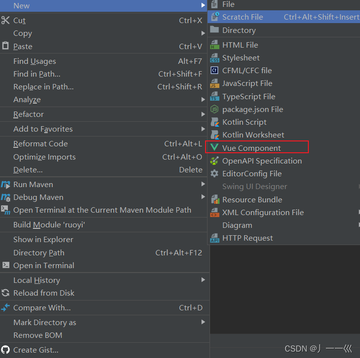
我们在前端项目中新建文件的时候会发现,直接就有创建Vue Component这个选项,就是创建一个vue组件。这里我们直接创建。
通过这个创建,创建出来的组件部分并不完整,其他的props、data、methods、mounted是我加上去的。
我们其实会发现,这个组件跟一个正常的vue页面没什么区别,唯一就是多了一部分props。
重点说一下props,这一部分是组件的参数,当使用组件的时候,我们可以对组件进行传参,灵活性就会更强。
简单了解后,我们直接用案例来说组件如何使用
组件demo:
<template>

</template>

<script>
    export default {
      name: "test",
      props: {
        title: {
          type: String,
          required: true,
          default:"默认值"
        }
      },
      data() {
        return {
        };
      },
      methods: {

      },
      mounted() {

      },
    }
</script>

<style scoped>

</style>
这里有一个小细节
style样式上加了一个scoped关键字,那么这个关键字的作用是什么?
<style scoped>标签用于给当前组件的样式设置作用域,它的作用是限制样式仅应用于当前组件的元素,而不会泄露到其他组件。这种作用域样式的方式可以避免样式冲突和干扰。
在 Vue 组件中,<style scoped>其实是通过 Vue 的编译器将 CSS 转化为带有唯一标识符的类名或属性选择器来实现的。这样,每个组件都会生成一个独特的选择器,只有当前组件内的元素才会受到该样式的影响,不会影响到其他组件的样式。
使用<style scoped>可以提供更好的样式封装和组件化能力,
确保样式只应用于当前组件,增加代码的可维护性和可重用性。
我们现在写好了一个MyList组件。
MyList 组件的作用是显示一个带标题的列表,并且可以限制显示列表项的数量。
它接受以下参数:
title:列表的标题,必填。
items:要显示的列表项数组,必填。
limit:可选参数,用于限制显示的列表项数量,默认为无限制。
组件会根据传入的参数渲染出一个具有标题的列表,列表的每一项都会在界面上显示出来。如果列表项的数量超过了 limit,则只会显示前 limit 个列表项,并附加一个“显示全部”的按钮。如果列表项的数量没有超过 limit,则会显示所有列表项,且不会显示“显示全部”的按钮。
这个组件的使用场景可以是展示产品列表、文章列表等需要显示标题和部分内容,并且可以选择性地显示更多内容的情况。通过设置 limit 参数,可以控制列表的显示数量,以便更好地适应页面布局和用户需求。
MyList子组件:
<template>
  <div class="my-list">
    <h2>{{ title }}</h2>
    <ul>
      <li v-for="(item, index) in limitedItems" :key="index">{{ item }}</li>
    </ul>
    <div v-if="showMoreButton">
      <button @click="showAllItems">显示全部</button>
    </div>
  </div>
</template>

<script>
  export default {
    name: "MyList",
    props: {
      title: {
        type: String,
        required: true,
      },
      items: {
        type: Array,
        required: true,
      },
      limit: {
        type: Number,
        //默认值没有限制
        default: Infinity,
      },
    },
    data() {
      return {
        showMoreButton: false,
        limitedItems: [],
      };
    },
    methods: {
      showAllItems() {
        this.limitedItems = this.items;
        this.showMoreButton = false;
      },
    },
    mounted() {
      if (this.items.length > this.limit) {
        this.showMoreButton = true;
        this.limitedItems = this.items.slice(0, this.limit);
      } else {
        this.limitedItems = this.items;
      }
    },
  };
</script>

<style scoped>
  .my-list {
    background-color: #f5f5f5;
    padding: 10px;
    border-radius: 5px;
  }

  h2 {
    font-size: 20px;
    margin-bottom: 10px;
  }

  ul {
    margin: 0;
    padding: 0;
  }

  li {
    list-style: none;
    padding: 5px 0;
    border-bottom: 1px solid #ccc;
  }

  button {
    background-color: #007bff;
    color: #fff;
    border: none;
    padding: 8px 16px;
    border-radius: 3px;
    cursor: pointer;
  }

  button:hover {
    background-color: #0069d9;
  }
</style>
二、组件的调用
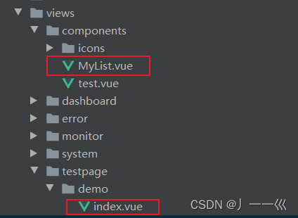
现在我想在testpage下的demo下的index.vue页面中调用components下的MyList.vue组件。
index.vue是父组件,在父组件中调用子组件MyList.vue
步骤
1、在父组件中引入子组件
直接import文件名即可,form后的内容会自动进行补全。
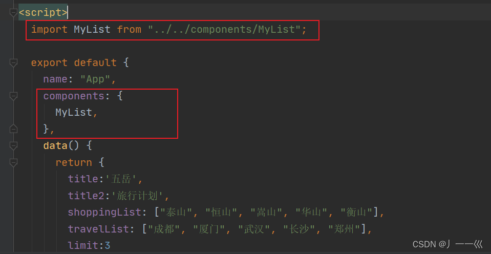
2、在components对象注册和声明组件
声明之后可以在当前Vue实例或父组件的模板中使用<my-list></my-list>标签来引用MyList组件。通过这样的方式,Vue将会查找并渲染MyList组件的模板,执行相应的逻辑代码。
这里有一个小细节:
为什么我的组件名是MyList,而要用<my-list>标签来引用?
这是因为Vue建议将组件名转换为"kebab-case"格式,并在模板中使用相应的标签。因此,在模板中使用<my-list></my-list>标签来引用组件"MyList",能够保证组件能够正常渲染。
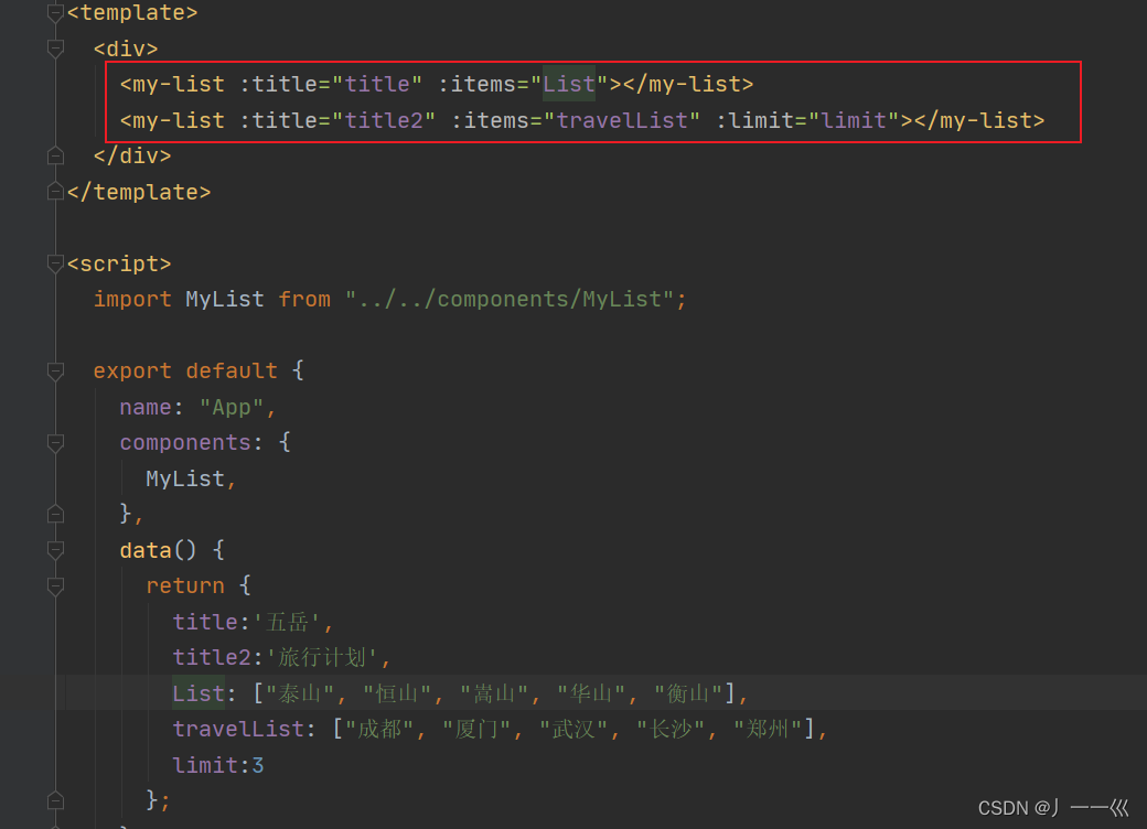
3、引用MyList组件,传递参数
这里我们在data中创建了两个title跟两个数组,内容是自定义的,然后在<my-list>标签中将title跟list传递过去。
还有一个limit参数,用控制数组显示的个数。
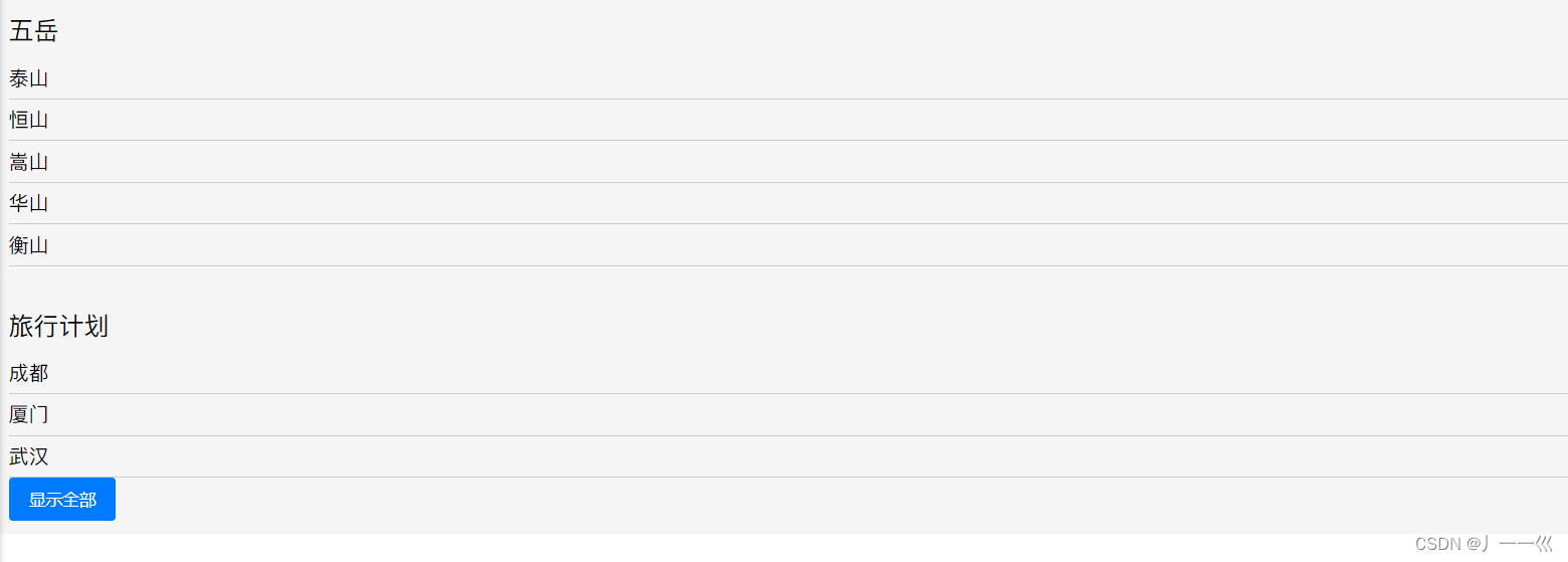
4、页面效果
三、组件的传值
组件传值分两种情况:父组件向子组件传值,子组件向父组件传值
这里是通过案例二来进行说明的。
3.1 父组件向子组件传递数据
父组件向子组件传递数据:使用props
父组件通过在子组件上使用props属性来传递数据。子组件中声明props属性接受父组件传递的数据。在这个更新后的代码中,我们可以看到父组件通过将 items 数组、title 文本和 limit 数量分别绑定到MyList组件上的 props 属性,来将这些值传递给 MyList 组件。
这里就是父组件向子组件传值
3.2 子组件向父组件传递数据
如何传递?
使用$emit方法
子组件向父组件传递数据:使用emit子组件可以通过emit方法来触发一个事件,并将值传递给父组件。
在这个代码更新中,Modal 组件中的保存按钮被点击时,会使用 $emit 方法触发一个 save-item 事件,并将输入框中的值作为参数传递给父组件。
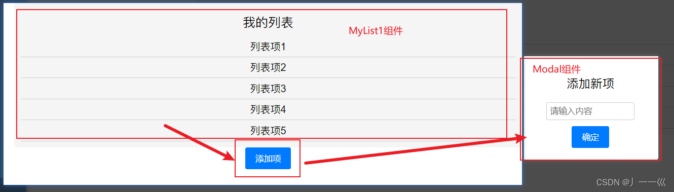
1、页面效果
页面效果是这样,点击添加项之后,输入内容,然后将输入的内容添加到列表中。
2、代码实现
再说一下代码实现,这个输入的内容是在Modal组件中,然后需要将值传递到父组件中进行处理显示。
通过 this.$emit 方法,我们可以在子组件中触发自定义事件,并将数据传递给父组件。在这个例子中,“submit” 是自定义事件的名称,它可以是任何你想定义的合法事件名称。
当 Modal 组件中的保存按钮被点击时,执行 this.$emit(“submit”, this.inputValue) 将会触发父组件中对应的事件处理函数。父组件通过监听这个 “submit” 事件,并在事件处理函数中接收传递过来的参数,从而实现父组件获取到子组件的值或进行相应的操作。
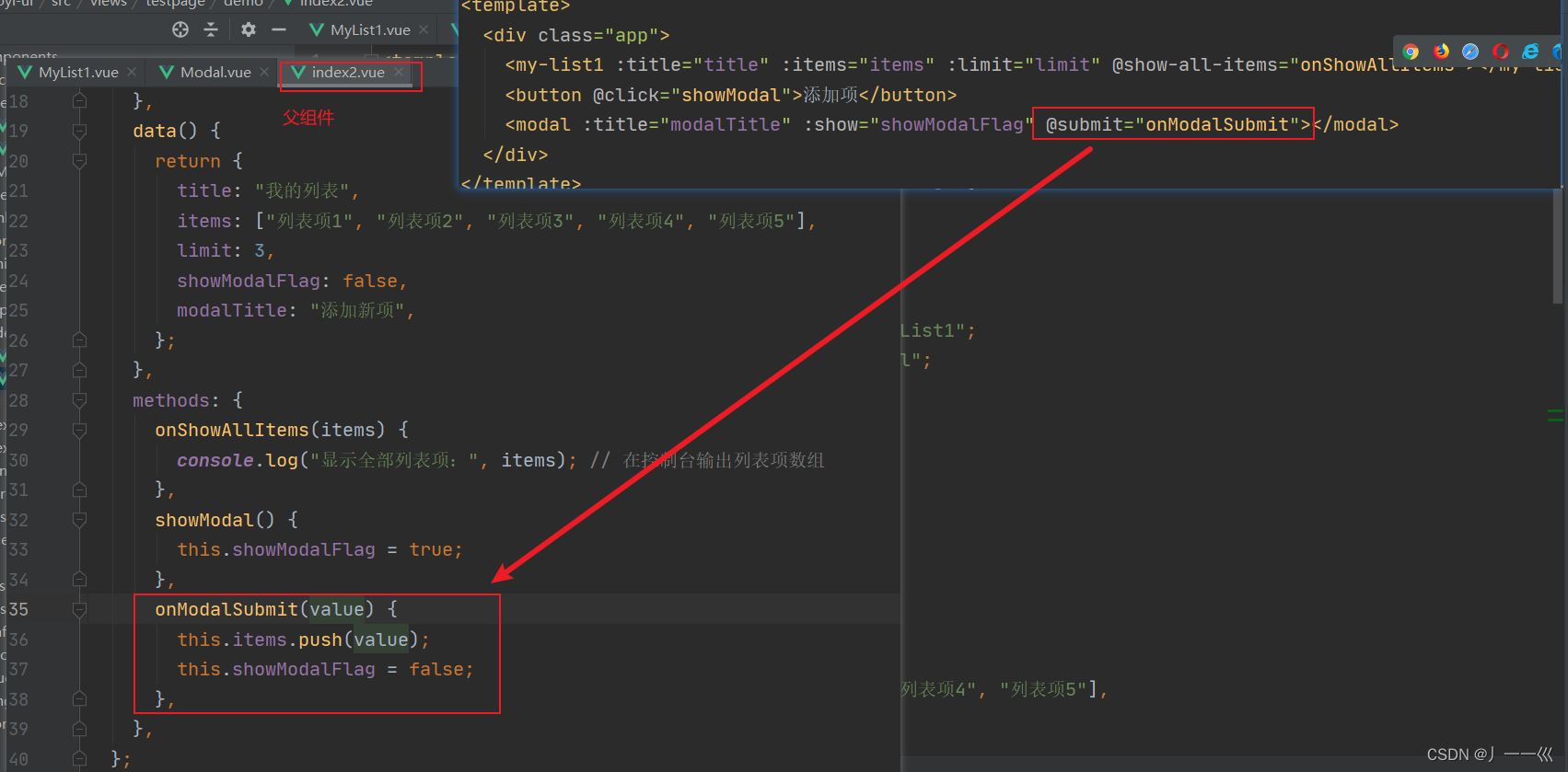
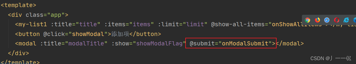
这里重点说一下父组件中使用modal时@submit这个方法。
@submit=“onModalSubmit” 的意思是,在父组件中调用 onModalSubmit 方法来处理 Modal 组件触发的 submit 事件。
四、附录(包含完整案例代码)
4.1 案例一
MyList子组件
<template>
  <div class="my-list">
    <h2>{{ title }}</h2>
    <ul>
      <li v-for="(item, index) in limitedItems" :key="index">{{ item }}</li>
    </ul>
    <div v-if="showMoreButton">
      <button @click="showAllItems">显示全部</button>
    </div>
  </div>
</template>

<script>
  export default {
    name: "MyList",
    props: {
      title: {
        type: String,
        required: true,
      },
      items: {
        type: Array,
        required: true,
      },
      limit: {
        type: Number,
        //默认值没有限制
        default: Infinity,
      },
    },
    data() {
      return {
        showMoreButton: false,
        limitedItems: [],
      };
    },
    methods: {
      showAllItems() {
        this.limitedItems = this.items;
        this.showMoreButton = false;
      },
    },
    mounted() {
      if (this.items.length > this.limit) {
        this.showMoreButton = true;
        this.limitedItems = this.items.slice(0, this.limit);
      } else {
        this.limitedItems = this.items;
      }
    },
  };
</script>

<style scoped>
  .my-list {
    background-color: #f5f5f5;
    padding: 10px;
    border-radius: 5px;
  }

  h2 {
    font-size: 20px;
    margin-bottom: 10px;
  }

  ul {
    margin: 0;
    padding: 0;
  }

  li {
    list-style: none;
    padding: 5px 0;
    border-bottom: 1px solid #ccc;
  }

  button {
    background-color: #007bff;
    color: #fff;
    border: none;
    padding: 8px 16px;
    border-radius: 3px;
    cursor: pointer;
  }

  button:hover {
    background-color: #0069d9;
  }
</style>
index父组件
<template>
  <div>
    <my-list :title="title" :items="List"></my-list>
    <my-list :title="title2" :items="travelList" :limit="limit"></my-list>
  </div>
</template>

<script>
  import MyList from "../../components/MyList";

  export default {
    name: "App",
    components: {
      MyList,
    },
    data() {
      return {
        title:'五岳',
        title2:'旅行计划',
        List: ["泰山", "恒山", "嵩山", "华山", "衡山"],
        travelList: ["成都", "厦门", "武汉", "长沙", "郑州"],
        limit:3
      };
    },
  };
</script>
4.2 案例二
MyList1子组件
<template>
  <div class="my-list">
    <h2>{{ title }}</h2>
    <ul>
      <li v-for="(item, index) in limitedItems" :key="index">{{ item }}</li>
    </ul>
    <div v-if="showMoreButton">
      <button @click="showAllItems">显示全部</button>
    </div>
  </div>
</template>

<script>
  export default {
    name: "MyList1",
    props: {
      title: {
        type: String,
        required: true,
      },
      items: {
        type: Array,
        required: true,
      },
      limit: {
        type: Number,
        default: Infinity,
      },
    },
    data() {
      return {
        showMoreButton: false,
        limitedItems: [],
      };
    },
    methods: {
      showAllItems() {
        this.limitedItems = this.items;
        this.showMoreButton = false;
        this.$emit('show-all-items', this.items); // 触发自定义事件并传递数据
      },
    },
    mounted() {
      if (this.items.length > this.limit) {
        this.showMoreButton = true;
        this.limitedItems = this.items.slice(0, this.limit);
      } else {
        this.limitedItems = this.items;
      }
    },
  };
</script>

<style scoped>
  .my-list {
    background-color: #f5f5f5;
    padding: 10px;
    border-radius: 5px;
  }

  h2 {
    font-size: 20px;
    margin-bottom: 10px;
  }

  ul {
    margin: 0;
    padding: 0;
  }

  li {
    list-style: none;
    padding: 5px 0;
    border-bottom: 1px solid #ccc;
  }

  button {
    background-color: #007bff;
    color: #fff;
    border: none;
    padding: 8px 16px;
    border-radius: 3px;
    cursor: pointer;
  }

  button:hover {
    background-color: #0069d9;
  }
</style>
Modal子组件
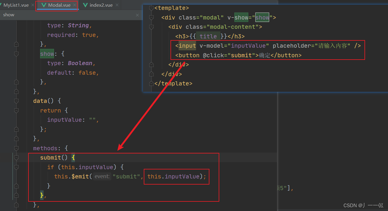
<template>
  <div class="modal" v-show="show">
    <div class="modal-content">
      <h3>{{ title }}</h3>
      <input v-model="inputValue" placeholder="请输入内容" />
      <button @click="submit">确定</button>
    </div>
  </div>
</template>

<script>
  export default {
    name: "Modal",
    props: {
      title: {
        type: String,
        required: true,
      },
      show: {
        type: Boolean,
        default: false,
      },
    },
    data() {
      return {
        inputValue: "",
      };
    },
    methods: {
      submit() {
        if (this.inputValue) {
          this.$emit("submit", this.inputValue);
        }
      },
    },
  };
</script>

<style scoped>
  .modal {
    position: fixed;
    top: 0;
    left: 0;
    width: 100%;
    height: 100%;
    background-color: rgba(0, 0, 0, 0.7);
    display: flex;
    justify-content: center;
    align-items: center;
  }

  .modal-content {
    background-color: #fff;
    padding: 20px;
    border-radius: 5px;
    text-align: center;
  }

  input {
    display: block;
    margin: 10px auto;
    padding: 5px;
    width: 80%;
    border: 1px solid #ccc;
    border-radius: 3px;
  }

  button {
    background-color: #007bff;
    color: #fff;
    border: none;
    padding: 8px 16px;
    border-radius: 3px;
    cursor: pointer;
  }

  button:hover {
    background-color: #0069d9;
  }
</style>
index2父组件
<template>
<div class="app">
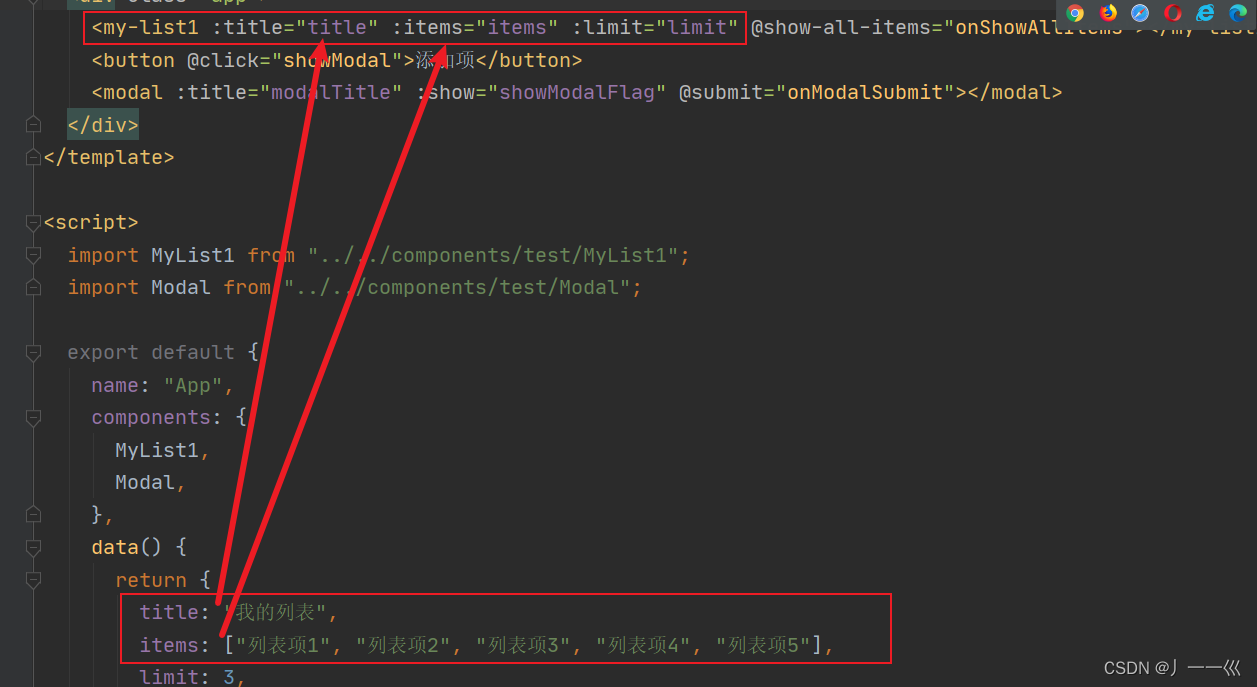
<my-list1 :title="title" :items="items" :limit="limit" @show-all-items="onShowAllItems"></my-list1>
<button @click="showModal">添加项</button>
<modal :title="modalTitle" :show="showModalFlag" @submit="onModalSubmit"></modal>
</div>
</template>
<script>
import MyList1 from "../../components/test/MyList1";
import Modal from "../../components/test/Modal";
export default {
name: "App",
components: {
MyList1,
Modal,
},
data() {
return {
title: "我的列表",
items: ["列表项1", "列表项2", "列表项3", "列表项4", "列表项5"],
limit: 3,
showModalFlag: false,
modalTitle: "添加新项",
};
},
methods: {
onShowAllItems(items) {
console.log("显示全部列表项:", items); // 在控制台输出列表项数组
},
showModal() {
this.showModalFlag = true;
},
onModalSubmit(value) {
this.items.push(value);
this.showModalFlag = false;
},
},
};
</script>
<style>
.app {
width: 60%;
margin: 0 auto;
text-align: center;
}
button {
background-color: #007bff;
color: #fff;
border: none;
padding: 8px 16px;
border-radius: 3px;
cursor: pointer;
}
button:hover {
background-color: #0069d9;
}
</style>


 扫一扫
扫一扫


 9845
9845

 被折叠的 条评论
为什么被折叠?
被折叠的 条评论
为什么被折叠?
 到【灌水乐园】发言


