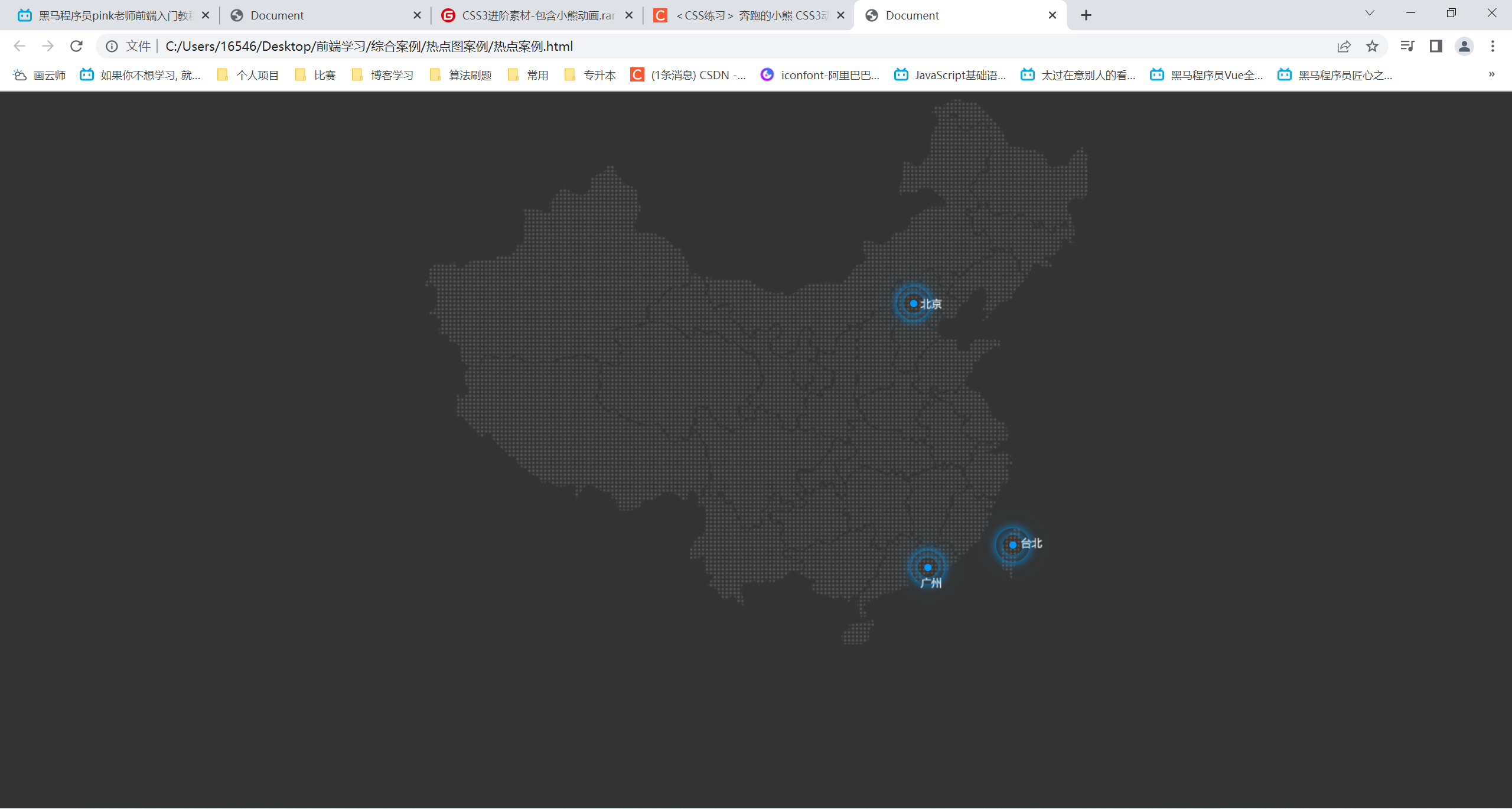
热点图案例
<!DOCTYPE html>
<html lang="en">
<head>
    <meta charset="UTF-8">
    <meta http-equiv="X-UA-Compatible" content="IE=edge">
    <meta name="viewport" content="width=device-width, initial-scale=1.0">
    <title>Document</title>
    <style>
        body {
            background: #333;
        }
        .map {
            position: relative;
            margin: 0 auto;
            width: 747px;
            height: 616px;
            background: url(map.png) no-repeat;
        }
        .city {
            position: absolute;
            top: 227px;
            right: 192px;
        }
        .dotted {
            width: 8px;
            height: 8px;
            background-color: #09f;
            border-radius: 50%;
        }
        /* 属性选择器 选择class属性中以pulse开头的div */
        .city div[class^="pulse"] {
            position: absolute;
            /* 在div中垂直水平居中 */
            top: 50%;
            left: 50%;
            transform: translate(-50%,-50%);
            width: 8px;
            height: 8px;
            box-shadow: 0 0 12px #009dfd;
            border-radius: 50%;
            animation: pulse 1.2s linear infinite;
        }
        .city div.pulse2 {
            animation-delay: 0.4s;
        }
        .city div.pulse3 {
            animation-delay: 0.8s;
        }
        @keyframes pulse {
            0% {

            }
            70% {
                width: 40px;
                height: 40px;
                opacity: 1;
            }
            100% {
                width: 70px;
                height: 70px;
                opacity: 0;
            }
        }
        .tb {
            top: 500px;
            right: 80px;
        }
        .gz {
            top: 525px;
            right: 176px;
        }
    </style>
</head>
<body>
    <div class="map">
        <div class="city">
            <div class="dotted"></div>
            <div class="pulse1"></div>
            <div class="pulse2"></div>
            <div class="pulse3"></div>
        </div>
        <div class="city tb">
            <div class="dotted"></div>
            <div class="pulse1"></div>
            <div class="pulse2"></div>
            <div class="pulse3"></div>
        </div>
        <div class="city gz">
            <div class="dotted"></div>
            <div class="pulse1"></div>
            <div class="pulse2"></div>
            <div class="pulse3"></div>
        </div>
    </div>
</body>
</html>
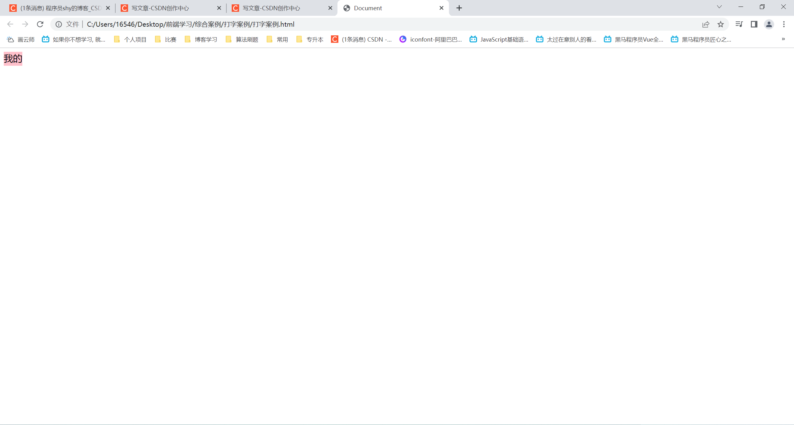
打字案例
<!DOCTYPE html>
<html lang="en">
<head>
    <meta charset="UTF-8">
    <meta http-equiv="X-UA-Compatible" content="IE=edge">
    <meta name="viewport" content="width=device-width, initial-scale=1.0">
    <title>Document</title>
    <style>
        div {
            overflow: hidden;
            width: 0;
            height: 30px;
            background-color: pink;
            font-size: 20px;
            /* 强制在一行显示文字 */
            white-space: nowrap;
            animation: w 4s steps(10) forwards;
        }
        @keyframes w {
            0% {
                width: 0;
            }
            100% {
                width: 200px;
            }
        }
    </style>
</head>
<body>
    <div>我的家在东北松花江上</div>
</body>
</html>
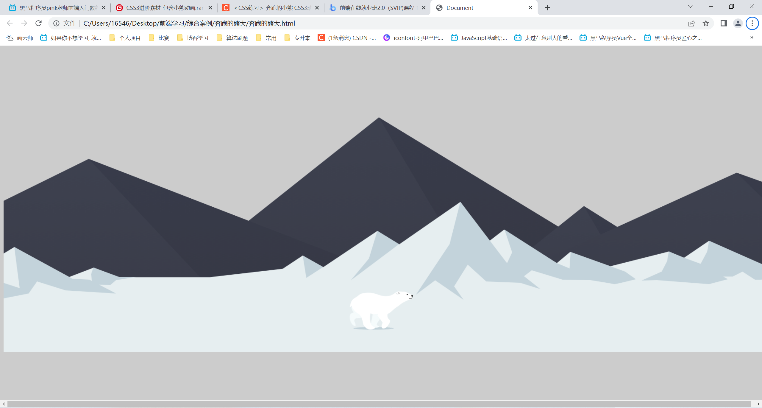
奔跑的熊大
<!DOCTYPE html>
<html lang="en">
<head>
    <meta charset="UTF-8">
    <meta http-equiv="X-UA-Compatible" content="IE=edge">
    <meta name="viewport" content="width=device-width, initial-scale=1.0">
    <title>Document</title>
    <style>
        body {
            background-color: #ccc;
        }
        .mou {
            position: absolute;
            top: 20%;
            width: 100%;
            height: 569px;
            background: url(bg2.png) no-repeat;
            animation: moua 20s infinite linear;
        }
        @keyframes moua {
            0% {
                background-position: 0 0;
            }
            100% {
                background-position: -1920px 0;
            }
        }
        .wh {
            position: absolute;
            top: 44%;
            width: 100%;
            height: 336px;
            background: url(bg1.png) no-repeat;
            animation: wh 10s infinite linear;
        }
        @keyframes wh {
            0% {
                background-position: 0 0;
            }
            100% {
                background-position: -1920px 0;
            }
        }
        .bear {
            position: absolute;
            top: 68%;
            width: 200px;
            height: 100px;
            background: url(bear.png) repeat-x;
            animation: beara 0.3s steps(8) infinite, move 10s forwards;
        }

        @keyframes beara {
            0% {
                background-position: 0 0;
            }
            100% {
                background-position: -1600px 0;
            }
        }
        @keyframes move {
            0% {
                left: 0;
            }
            100% {
                left: 50%;
                transform: translate(-50%);
            }
        }
    </style>
</head>
<body>
    <div class="mou"></div>
    <div class="wh"></div>
    <div class="bear"></div>
</body>
</html>
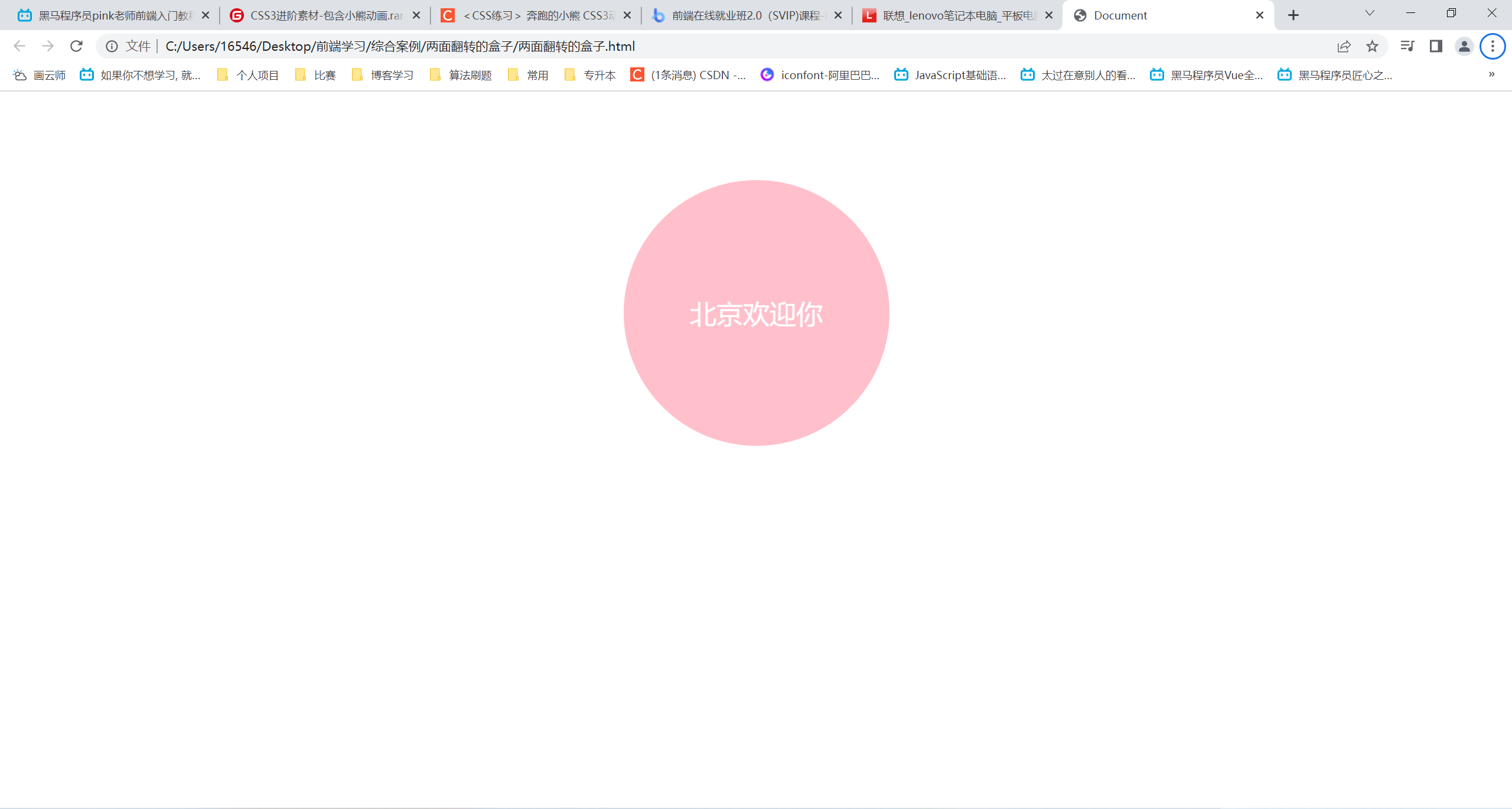
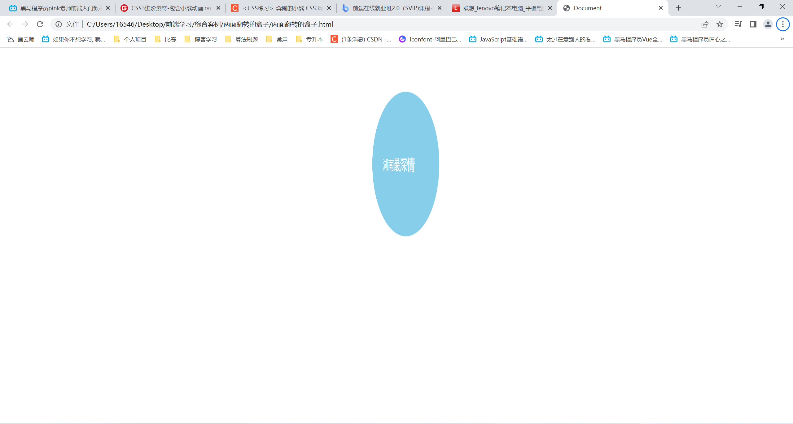
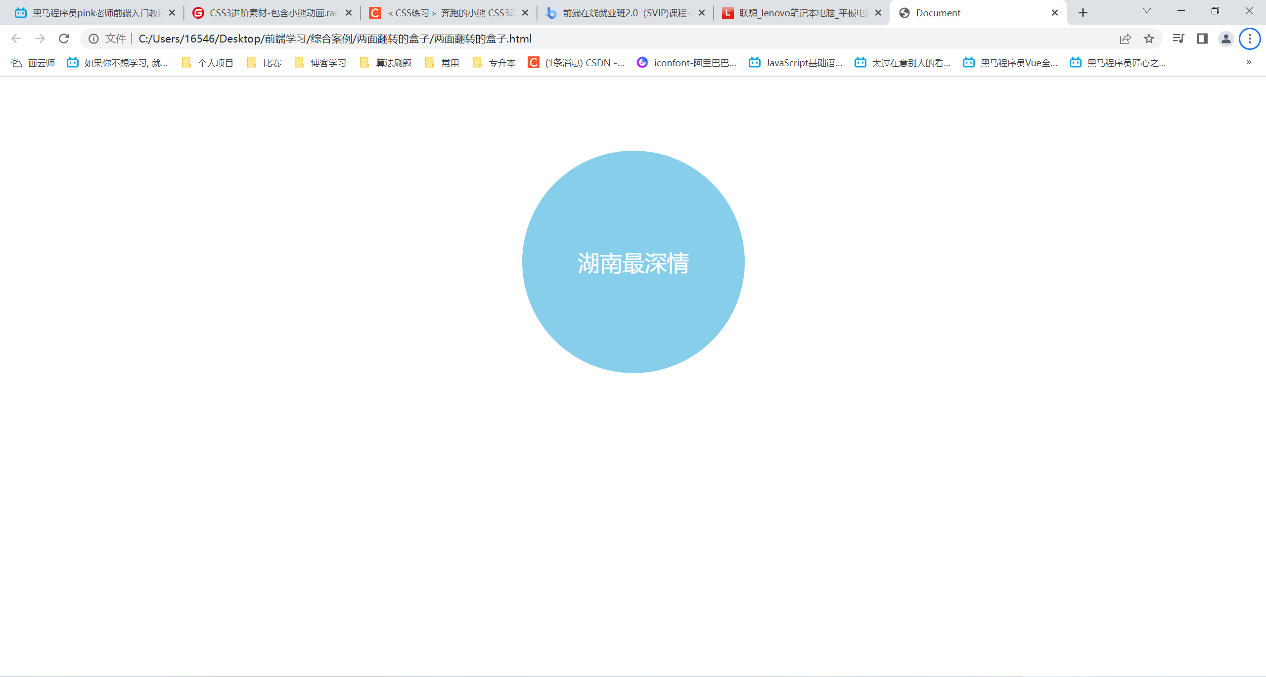
两面翻转的盒子
<!DOCTYPE html>
<html lang="en">
<head>
    <meta charset="UTF-8">
    <meta http-equiv="X-UA-Compatible" content="IE=edge">
    <meta name="viewport" content="width=device-width, initial-scale=1.0">
    <title>Document</title>
    <style>
        body {
            /* 透视z轴平面 */
            perspective: 500px;
        }
        .box {
            position: relative;
            width: 300px;
            height: 300px;
            margin: 100px auto;
            transition: all 1s;
            /* 让子盒子在3d呈现 */
            transform-style: preserve-3d;
        }
        .box:hover {
            transform: rotateY(180deg);
        }
        .front,
        .back {
            position: absolute;
            top: 0;
            left: 0;
            width: 100%;
            height: 100%;
            color: #fff;
            font-size: 30px;
            text-align: center;
            line-height: 300px;
            border-radius: 50%;
            /* 我也不知道这个是干啥的,但是不加只显示.front的那一面 */
            backface-visibility: hidden;
        }
        .front {
            background-color: pink;
            transform: rotateZ(1px);
            /* 防止被.back覆盖 */
            z-index: 1;
        }
        .back {
            background-color: skyblue;
            /* 提前旋转,当hover的时候刚好再旋转回来 */
            transform: rotateY(180deg);
        }
    </style>
</head>
<body>
    <div class="box">
        <div class="front">北京欢迎你</div>
        <div class="back">湖南最深情</div>
    </div>
</body>
</html>
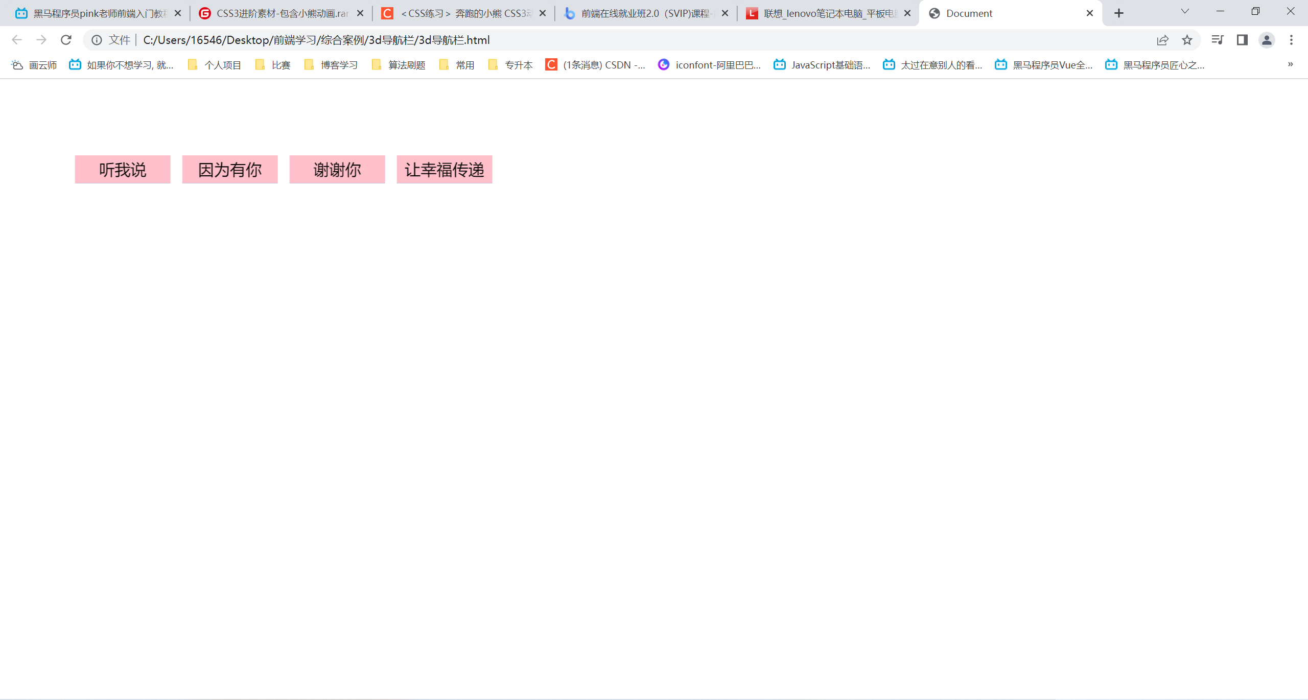
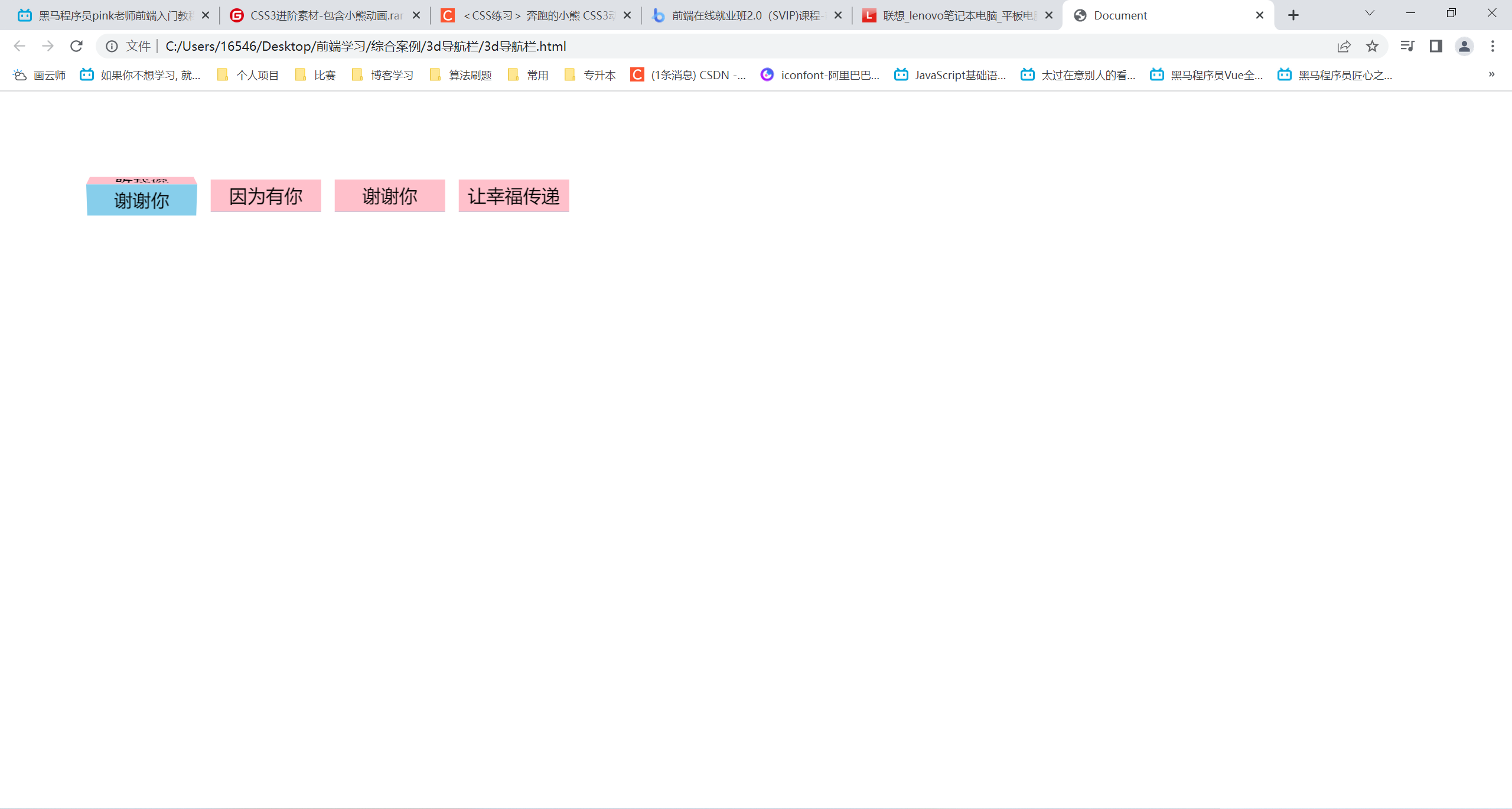
3D导航栏
<!DOCTYPE html>
<html lang="en">
<head>
    <meta charset="UTF-8">
    <meta http-equiv="X-UA-Compatible" content="IE=edge">
    <meta name="viewport" content="width=device-width, initial-scale=1.0">
    <title>Document</title>
    <style>
        * {
            margin: 0;
            padding: 0;
        }
        ul {
            margin: 100px;
        }
        ul li {
            position: relative;
            float: left;
            width: 120px;
            height: 35px;
            margin-right: 20px;
            list-style: none;
            /* 此处加或不加取决于是否需要进大远小的3d效果 */
            perspective: 500px;
        }
        .box {
            width: 100%;
            height: 100%;
            transform-style: preserve-3d;
            transition: all .5s;
        }
        .box:hover {
            transform: rotateX(90deg);
        }
        .front,
        .bottem {
            position: absolute;
            left: 0;
            top: 0;
            width: 100%;
            height: 100%;
            font-size: 20px;
            line-height: 35px;
            text-align: center;
        }
        .front {
            background-color: pink;
            /* 向前移动一半的距离,类似于保留出模仿的中心结构 */
            transform: translateZ(17.5px);
            z-index: 1;
        }
        .bottem {
            background-color: skyblue;
            transform: translateY(17.5px) rotateX(-90deg);
        }
    </style>
</head>
<body>
    <ul>
        <li>
            <div class="box">
                <div class="front">听我说</div>
                <div class="bottem">谢谢你</div>
            </div>
        </li>
        <li>
            <div class="box">
                <div class="front">因为有你</div>
                <div class="bottem">温暖了四季</div>
            </div>
        </li>
        <li>
            <div class="box">
                <div class="front">谢谢你</div>
                <div class="bottem">感谢有你</div>
            </div>
        </li>
        <li>
            <div class="box">
                <div class="front">让幸福传递</div>
                <div class="bottem">!!!</div>
            </div>
        </li>
    </ul>
</body>
</html>

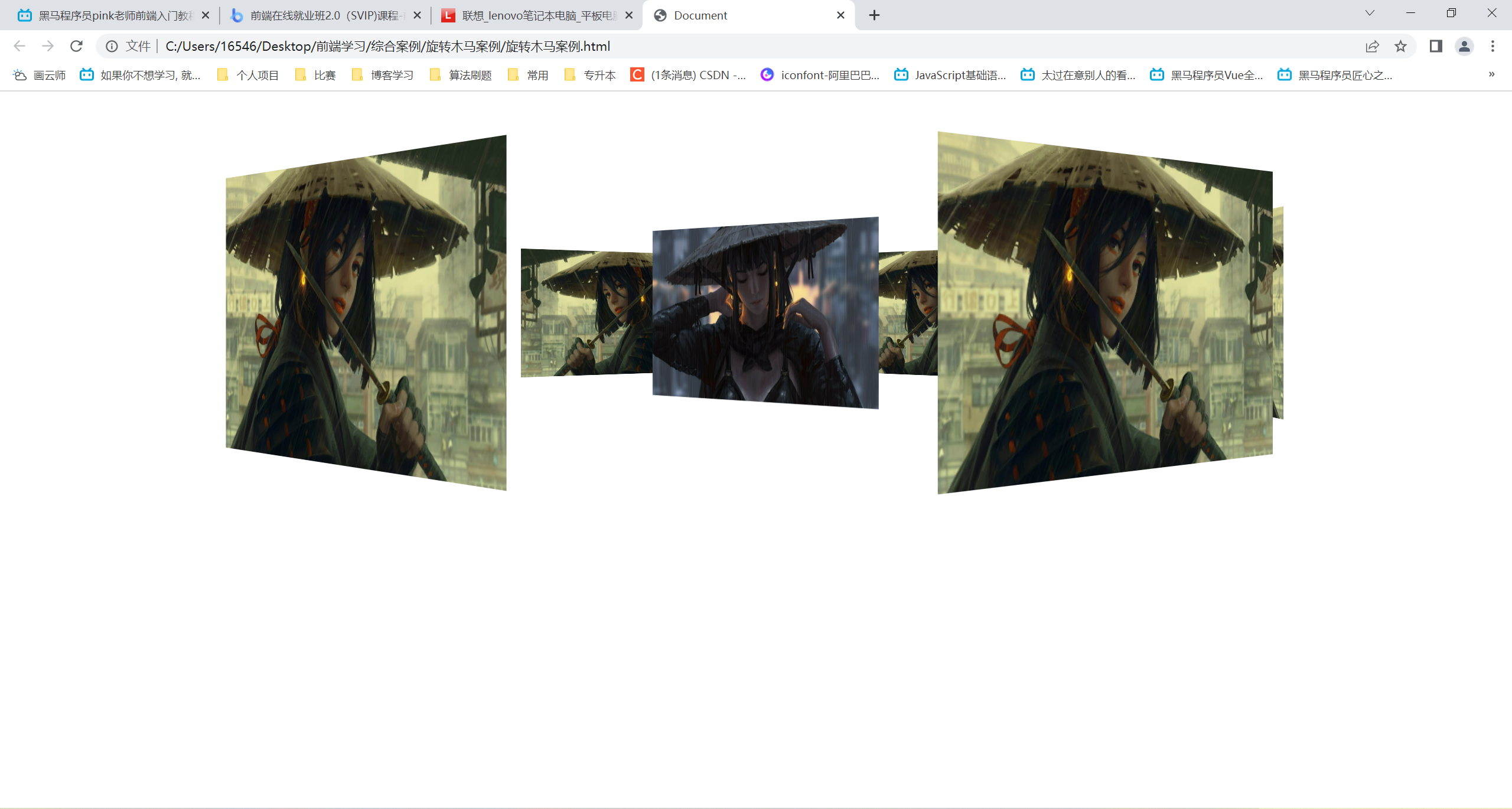
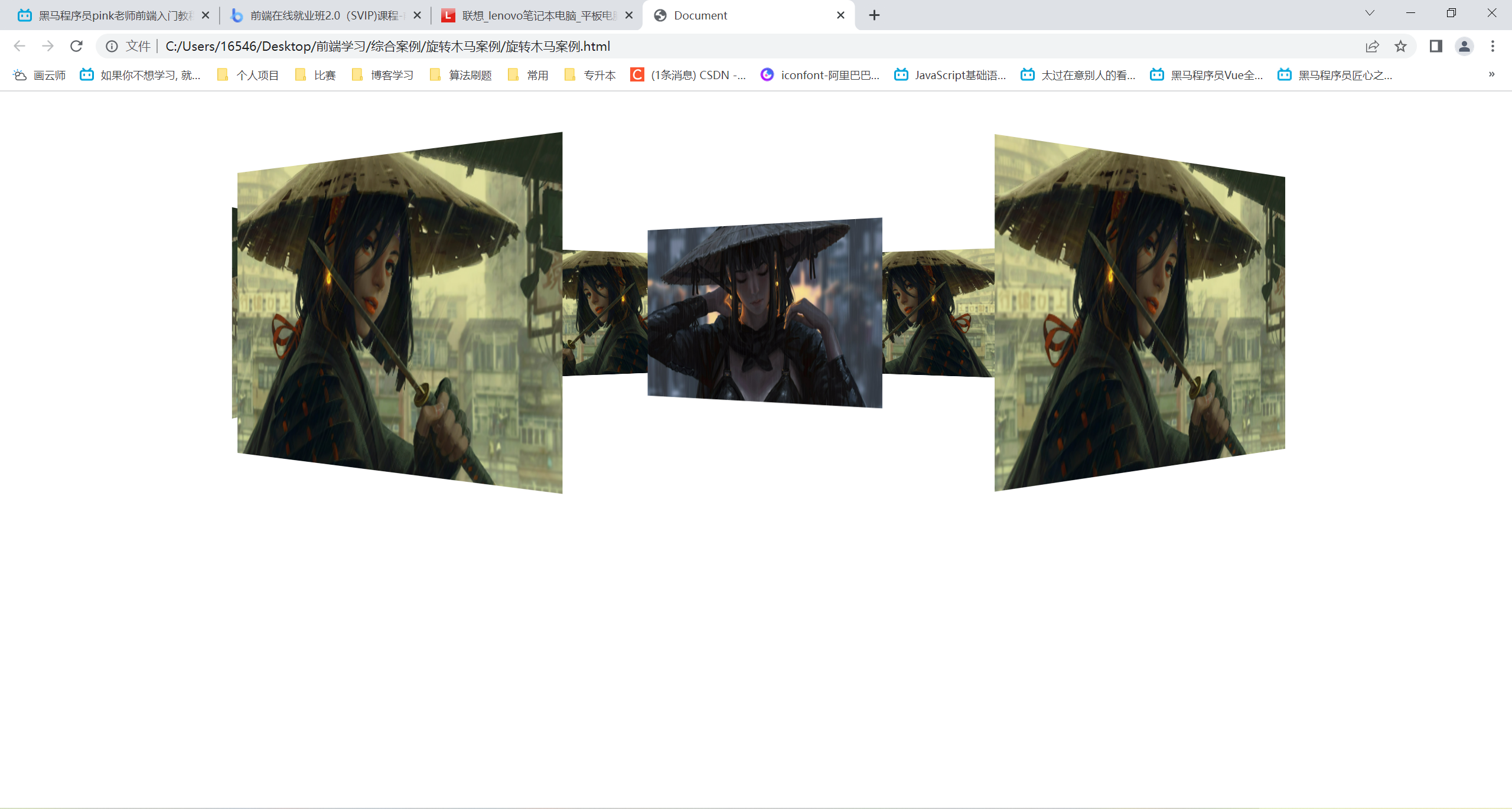
旋转木马案例
<!DOCTYPE html>
<html lang="en">
<head>
    <meta charset="UTF-8">
    <meta http-equiv="X-UA-Compatible" content="IE=edge">
    <meta name="viewport" content="width=device-width, initial-scale=1.0">
    <title>Document</title>
    <style>
        body {
            /* 在body平面展示section旋转div */
            perspective: 1000px;
        }
        section {
            position: relative;
            width: 300px;
            height: 200px;
            margin: 150px auto;
            /* 子元素呈现3d */
            transform-style: preserve-3d;
            animation: rotate 10s linear infinite;
            background: url("雨天武士女孩.jpg") no-repeat;
            background-size: 100% 100%;
        }
        @keyframes rotate {
            0% {
                transform: rotateY(0);
            }
            100% {
                transform: rotateY(360deg);
            }
        }
        section:hover {
            animation-play-state: paused;
        }
        section div {
            position: absolute;
            top: 0;
            left: 0;
            width: 100%;
            height: 100%;
            background: url("武士女孩.jpg") no-repeat;
            background-size: 100% 100%;
        }
        img {
            width: 300px;
            height: 200px;
        }
        section div:nth-child(1) {
            transform: translateZ(500px);
        }
        /* 先旋转在移动!!! */
        section div:nth-child(2) {
            transform: rotateY(60deg) translateZ(500px);
        }
        section div:nth-child(3) {
            transform: rotateY(120deg) translateZ(500px);
        }
        section div:nth-child(4) {
            transform: rotateY(180deg) translateZ(500px);
        }
        section div:nth-child(5) {
            transform: rotateY(240deg) translateZ(500px);
        }
        section div:nth-child(6) {
            transform: rotateY(300deg) translateZ(500px);
        }
    </style>
</head>
<body>
    <section>
        <div></div>
        <div></div>
        <div></div>
        <div></div>
        <div></div>
        <div></div>
    </section>
</body>
</html>


 此博客展示了几个使用HTML和CSS创建的动态效果案例,包括热点图、文字打字效果、奔跑的熊大、两面翻转的盒子以及3D导航栏。通过CSS的动画属性,实现了元素的动态变化,如元素大小、位置、透明度等的平滑过渡,展示了HTML和CSS在视觉交互设计上的应用。


 扫一扫
扫一扫


 731
731

 被折叠的 条评论
为什么被折叠?
被折叠的 条评论
为什么被折叠?
 到【灌水乐园】发言


