


目录
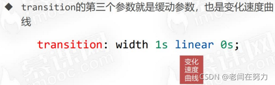
1.2.1 缓动参数 transition-timing-fuction
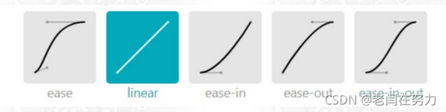
1.2.2 常用的缓动参数 ease linear ease-in ease-out ease-in-out
1.5 过渡效果实例3:3D旋转、transform-origin
2.3 动画的执行次数 alternate和forwards
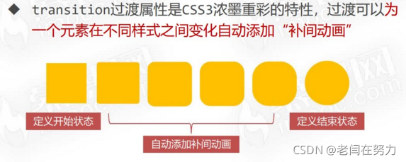
1.过渡的基本使用
1.1 transition过渡
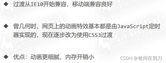
兼容性:
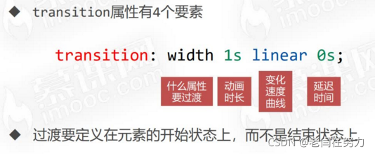
1.1.2 transition属性的基本使用
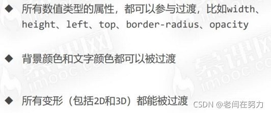
1.1.3 哪些属性可以参与过渡?
1.1.4 all

<!DOCTYPE html>
<html lang="en">
<head>
    <meta charset="UTF-8">
    <meta http-equiv="X-UA-Compatible" content="IE=edge">
    <meta name="viewport" content="width=device-width, initial-scale=1.0">
    <title>Document</title>
    <style>
        *{
            margin: 0;
            padding: 0;
        }
        .box1{
            width: 200px;
            height: 200px;
            background-color: orange;
            /* s不能省 */
            transition: width 5s linear 0s;
            margin-bottom: 10px;
        }
        .box1:hover{
            width: 800px;
        }
        .box2{
            margin-bottom: 10px;
        }
        .box2 p{
            width: 200px;
            height: 200px;
            background-color: orange;
            position: relative;
            transition: left 1s linear 0s;
            /* 开始状态 */
            left: 0;
        }
        .box2:hover p{
            left: 1000px;
        }
        .box3{
            width: 200px;
            height: 200px;
            background-color: red;
            transition: background-color 1s linear 0s;
            margin-bottom: 10px;
            border-radius: 0;
        }
        .box3:hover{
            background-color: green;
        }
        .box4{
            width: 200px;
            height: 200px;
            background-color: red;
            transition: border-radius 1s linear 0s;
            border-radius: 0;
        }
        .box4:hover{
            border-radius: 50%;
        }
        .box5{
            width: 200px;
            height: 200px;
            background-color: orange;
            margin-bottom: 10px;
            transition: transform 1s linear 0s;
        }
        .box5:hover{
            transform: scale(1.2) rotate(360deg);
        }
        .box6{
            perspective: 300px;
            width: 200px;
            height: 200px;
            border: 1px solid #000;
        }
        .box6 p{
            width: 200px;
            height: 200px;
            background-color: orange;
            transition: transform 1s linear 0s;
        }
        .box6:hover p{
            transform: rotateX(360deg);
        }
        .box7{
            width: 200px;
            height: 200px;
            background-color: orange;
            border-radius: 0;
            /* 涉及属性较多可以用all,但是要注意效率 */
            transition: all 1s linear 0s;
        }
        .box7:hover:hover{
            width: 400px;
            height: 160px;
            background-color: green;
            border-radius: 50%;
            transform: rotateX(360deg);
        }

    </style>
</head>
<body>
    <div class="box1"></div>
    <div class="box2">
        <p></p>
    </div>
    <div class="box3"></div>
    <div class="box4"></div>
    <div class="box5"></div>
    <div class="box6">
        <p></p>
    </div>
    <div class="box7">

    </div>
</body>
</html>
效果都是动态的,这里不截效果静图了。
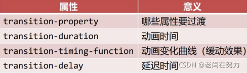
1.1.5 过渡的四个小属性
1.2 过渡的缓动效果
1.2.1 缓动参数 transition-timing-fuction
1.2.2 常用的缓动参数 ease linear ease-in ease-out ease-in-out
1.2.3 贝塞尔曲线
网站https://cubic-bezier.com/可以生成贝塞尔曲线,可以自定义动画缓动参数。
<!DOCTYPE html>
<html lang="en">
<head>
    <meta charset="UTF-8">
    <meta http-equiv="X-UA-Compatible" content="IE=edge">
    <meta name="viewport" content="width=device-width, initial-scale=1.0">
    <title>Document</title>
    <style>
        *{
            margin: 0;
            padding: 0;
        }
        .box{
            border: 1px solid #000;
        }
        .box p{
            width: 60px;
            height: 60px;
            background-color: orange;
            margin-bottom: 10px;
            position: relative;
            left: 0;
            transition: left 5s linear 0s;
        }
        .box p:nth-child(2){
            transition-timing-function: ease;
        }
        .box p:nth-child(3){
            transition-timing-function: ease-in;
        }
        .box p:nth-child(4){
            transition-timing-function: ease-out;
        }
        .box p:nth-child(5){
            transition-timing-function: ease-in-out;
        }
        .box p:nth-child(6){
            transition-timing-function: cubic-bezier(.29,-0.98,.5,1.76);
        }
        .box:hover p{
            left: 1000px;
        }
    </style>
</head>
<body>
    <div class="box">
        <p></p>
        <p></p>
        <p></p>
        <p></p>
        <p></p>
        <p></p>
    </div>
</body>
</html>
1.3 过渡实例1:图片下文字信息过渡
<!DOCTYPE html>
<html lang="en">
<head>
    <meta charset="UTF-8">
    <meta http-equiv="X-UA-Compatible" content="IE=edge">
    <meta name="viewport" content="width=device-width, initial-scale=1.0">
    <title>Document</title>
    <style>
        *{
            margin: 0;
            padding: 0;
        }
        .box{
            width: 1200px;
            overflow: hidden;
            margin: 40px auto;
        }
        .box ul{
            list-style: none;
        }
        .box ul li{
            float: left;
            width: 380px;
            height: 210px;
            margin-right: 20px;
            position: relative;
        }
        .box ul li img{
            width: 380px;
            height: 210px;
        }
        .box ul li .info{
            position: absolute;
            width: 370px;
            height: 30px;
            line-height: 30px;
            color: white;
            bottom: 0;
            padding-left: 10px;
            background-color: rgba(0,0,0,.5);
            /* 透明度设置为0,不是背景的透明度,而是整体的透明度 */
            opacity: 0;
            /* 过渡 */
            transition: opacity 1s ease 0s;
        }
        .box ul li:hover .info{
            opacity: 1;
        }
    </style>
</head>
<body>
    <div class="box">
        <ul>
            <li>
                <img src="images/0.jpg" alt="">
                <div class="info">故宫</div>
            </li>
            <li>
                <img src="images/archer.png" alt="">
                <div class="info">精灵</div>
            </li>
            <li>
                <img src="images/Bloodborne™ The Old Hunters Edition_20210515213015.jpg " alt="">
                <div class="info">老猎人</div>
            </li>
        </ul>
    </div>
</body>
</html>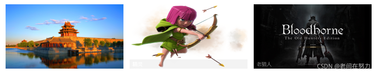
实际上是渐变的动画效果,这里贴gif比较麻烦所以就大概意思一下
1.4 过渡效果实例2:圆盘图片旋转
通过伪元素背景图片设置li的背景图,需要注意伪元素before天生就是行内元素,需要转块,通过绝对定位技术设置圆盘背景之上的图片
li中的圆盘可以进行旋转,达到一个过渡效果
<!DOCTYPE html>
<html lang="en">
<head>
    <meta charset="UTF-8">
    <meta http-equiv="X-UA-Compatible" content="IE=edge">
    <meta name="viewport" content="width=device-width, initial-scale=1.0">
    <title>Document</title>
    <style>
        *{
            margin: 0;
            padding:0 ;
        }
        .box{
            width: 508px;
            height: 107px;
            margin: 40px auto;
        }
        .box ul{
            list-style: none;
        }
        .box ul li{
            width: 107px;
            height: 107px;
            float: left;
            margin-right: 20px;
            position: relative;
        }
        .box ul li::before{
            /* 伪元素一定要写content:'',天生是行内元素 */
            content:'';
            display: block;
            width: 107px;
            height: 107px;
            transform: rotate(0);
            transition: transform 1s ease 0s;
        }
        .box ul li:nth-child(1)::before{
            background-image: url(images/a_1.png);
        }
        .box ul li:nth-child(2)::before{
            background-image: url(images/a_2.png);
        }
        .box ul li:nth-child(3)::before{
            background-image: url(images/a_3.png);
        }
        .box ul li:nth-child(4)::before{
            background-image: url(images/a_4.png);
        }
        .box ul li img{
            position: absolute;
            width: 60px;
            height: 60px;
            top: 50%;
            left: 50%;
            margin-left: -30px;
            margin-top: -30px;
            transition: transform 0.5s ease 0s;
        }
        .box ul li:hover::before{
            transform: rotate(360deg);
        }
        .box ul li:hover img{
            transform: scale(1.2);
        }
    </style>
</head>
<body>
    <div class="box">
        <ul>
            <li>
                <img src="images/icon1.svg" alt="">
            </li>
            <li>
                <img src="images/icon2.svg" alt="">
            </li>
            <li>
                <img src="images/icon3.svg" alt="">
            </li>
            <li>
                <img src="images/icon4.svg" alt="">
            </li>
        </ul>
    </div>
</body>
</html>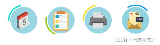
1.5 过渡效果实例3:3D旋转、transform-origin
注意点在于,transforme-origin的设置,以及旋转的方向、绕轴,还有另一种类的写法
<!DOCTYPE html>
<html lang="en">
<head>
    <meta charset="UTF-8">
    <meta http-equiv="X-UA-Compatible" content="IE=edge">
    <meta name="viewport" content="width=device-width, initial-scale=1.0">
    <title>Document</title>
    <style>
        *{
            margin: 0;
            padding: 0;
        }
        .box{
            width: 200px;
            height: 200px;
            /* border: 1px solid #000; */
            margin: 40px auto;
            /* 3D */
            perspective: 500px;
            position: relative;
        }
        .box img{
            width: 200px;
            height: 200px;
            border: 1px solid #000;
            border-radius: 50%;
        }
        .box img.dog{
            position: absolute;
            top: 0;
            left: 0;
            transform-origin: 0 0;
            transition: transform 1s ease 0s;
        }
        .box:hover img.dog{
            transform:rotateY(-180deg);
        }
        .n2 img.dog{
            transform-origin: 100% 100%;
            transition: transform 1s ease 0s;
        }
        .n2:hover img.dog{
            transform:rotateY(180deg);
        }
        .n3 img.dog{
            transform-origin: 0 0;
            transition: transform 1s ease 0s;
        }
        .n3:hover img.dog{
            transform:rotateX(180deg);
        }
    </style>
</head>
<body>
    <div class="box">
        <img src="images/cat.jpg" alt="" class="cat">
        <img src="images/dog.jpg" alt="" class="dog">
    </div>
    <!-- 还能这么写。。 -->
    <div class="box n2">
        <img src="images/cat.jpg" alt="" class="cat">
        <img src="images/dog.jpg" alt="" class="dog">
    </div>
    <!--  -->
    <div class="box n3">
        <img src="images/cat.jpg" alt="" class="cat">
        <img src="images/dog.jpg" alt="" class="dog">
    </div>
</body>
</html>
1.6 过渡效果实例4:旋转正方体
关键点:
1.box带有6个<p>,每个p是正方体的一个面,要让正方体整体旋转,则需要设置一个新的“舞台”<section>,这时box即使“舞台”(相对于<p>),又是“演员”(相对于<section>)。所以要对box设置transform-style: preserve-3d;
.box{
            width: 200px;
            height: 200px;
            perspective: 10000px;
            position: relative;
            /* 设置变形类型,保留它内部的3D效果 */
            /* 这个盒子又是舞台,又是演员,这个box带着里面的p旋转 */
            transform-style: preserve-3d;
            transition: all 10s ease 0s;
}2.对透视程度perspective设置的大一些,section和box都要设置
<!DOCTYPE html>
<html lang="en">
<head>
    <meta charset="UTF-8">
    <meta http-equiv="X-UA-Compatible" content="IE=edge">
    <meta name="viewport" content="width=device-width, initial-scale=1.0">
    <title>Document</title>
    <style>
        *{
            margin: 0;
            padding: 0;
        }
        section{
            width: 200px;
            height: 200px;
            margin: 100px auto;
            perspective: 10000px;
        }
        .box{
            width: 200px;
            height: 200px;
            perspective: 10000px;
            position: relative;
            /* 设置变形类型,保留它内部的3D效果 */
            /* 这个盒子又是舞台,又是演员,这个box带着里面的p旋转 */
            transform-style: preserve-3d;
            transition: all 10s ease 0s;
        }

        section:hover .box{
            transform: rotateX(360deg) rotateY(360deg);
        }

        .box p{
            position: absolute;
            top: 0;
            left: 0;
            width: 200px;
            height: 200px;
        }
        .box p:nth-child(1){
            background-color: rgba(219,56,211,0.486);
            /* 前面 */
            transform: translateZ(100px);
        }
        .box p:nth-child(2){
            background-color: rgba(52, 12, 197, 0.486);
            /* 顶面 */
            transform: rotateX(90deg) translateZ(100px);
        }
        .box p:nth-child(3){
            background-color: rgba(230, 67, 102, 0.486);
            /* 背面 */
            transform: rotateX(180deg) translateZ(100px);
        }
        .box p:nth-child(4){
            background-color: rgba(230, 156, 21, 0.486);
            /* 底面 */
            transform: rotateX(-90deg) translateZ(100px);
        }
        .box p:nth-child(5){
            background-color: rgba(239, 243, 13, 0.486);
            /* 侧面 */
            transform: rotateY(90deg) translateZ(100px);
        }
        .box p:nth-child(6){
            background-color: rgba(17, 235, 53, 0.486);
            /* 侧面 */
            transform: rotateY(-90deg) translateZ(100px);
        }
    </style>
</head>
<body>
    <!-- 安排一个新的舞台 -->
    <section>
        <div class="box">
            <p></p>
            <p></p>
            <p></p>
            <p></p>
            <p></p>
            <p></p>
        </div>
    </section>

</body>
</html>
若是不对box设置 transform-style: preserve-3d;的话:
感觉其中涉及很多原理,目前只能学个大概,希望以后能深入研究一下其中的原理
2.动画
2.1 动画的定义
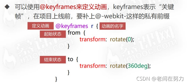
2.2 动画的调用

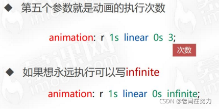
2.3 动画的执行次数 alternate和forwards
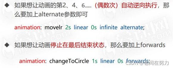
alternate也可以说是交替执行
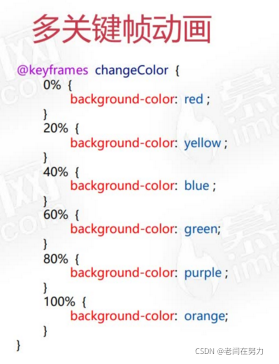
2.4 多关键帧动画
以上所有例子的代码:
<!DOCTYPE html>
<html lang="en">
<head>
    <meta charset="UTF-8">
    <meta http-equiv="X-UA-Compatible" content="IE=edge">
    <meta name="viewport" content="width=device-width, initial-scale=1.0">
    <title>Document</title>
    <style>
        .box1{
            width: 200px;
            height: 200px;
            background-color: orange;
            margin: 40px auto;
            margin-bottom: 10px;
            animation: r 1s linear 0s infinite ;
        }
        @keyframes r {
            from{
                transform: rotate(0);
            }
            to{
                transform: rotate(360deg);
            }
        }

        .box2{
            width: 200px;
            height: 200px;
            background-color: blue;
            margin: 40px auto;
            margin-bottom: 10px;
            animation: movelr 1s linear 0s infinite alternate;
        }
        @keyframes movelr {
            from{
                transform: translateX(0);
            }
            to{
                transform: translateX(500px);
            }
        }

        .box3{
            width: 200px;
            height: 200px;
            background-color: green;
            margin: 40px auto;
            margin-bottom: 10px;
            animation: changeToCircle 3s linear 0s forwards;
        }
        @keyframes changeToCircle {
            from{
                border-radius: 0;
            }
            to{
                border-radius: 50%;
            }
        }

        .box4{
            width: 200px;
            height: 200px;
            background: red;
            margin: 40px auto;
            margin-bottom: 10px;
            animation: changeColor 2s linear 0s alternate infinite;
        }
        @keyframes changeColor{
            0%{
                background-color: red;
            }
            20%{
                background-color: yellow;
            }
            40%{
                background-color: blue;
            }
            60%{
                background-color: green;
            }
            80%{
                background-color: purple;
            }
            100%{
                background-color: orange;
            }
        }
    </style>
</head>
<body>
    <div class="box1"></div>
    <div class="box2"></div>
    <div class="box3"></div>
    <div class="box4"></div>
</body>
</html>
2.5 动画效果实例:灯泡,火箭
关键点:
1.依旧是利用绝对定位实现图片的位置观赏性,然后对其实现动画效果
2.火箭的“震动”效果可由translateX与translateY的反复动画alternate实现
3.穿梭线条可以通过不同的top与left定位实现不同的位置,同时需要注意,translateX与translateY是对rotate之后的状态进行平移的。
<!DOCTYPE html>
<html lang="en">
<head>
    <meta charset="UTF-8">
    <meta http-equiv="X-UA-Compatible" content="IE=edge">
    <meta name="viewport" content="width=device-width, initial-scale=1.0">
    <title>Document</title>
    <style>
        *{
            margin: 0;
            padding: 0;
        }
        .dengpao{
            position: absolute;
            top: 300px;
            left: 300px;
        }
        .guang{
            position: absolute;
            top: 235px;
            left: 222px;
            animation: ss 1s ease 0s infinite alternate;
        }
        @keyframes ss{
            from{
                opacity: 1;
            }
            to{
                opacity: 0;
            }
        }

        .huojian{
            position: absolute;
            top: 300px;
            left: 800px;
            animation: zhendong .5s ease 0s infinite alternate;
        }
        @keyframes zhendong{
            from{
                transform: translateX(-20px) translateY(-20px);
            }
            to{
                transform: translateX(20px) translateY(20px);
            }
        }

        .line1{
            width: 2px;
            height: 166px;
            position: absolute;
            background-color: blue;
            top: 300px;
            left: 800px;
            animation: yd 1s linear 0s infinite;
        }
        @keyframes yd{
            0%{
                transform:rotate(45deg) translateY(-300px);
                opacity: 0;
            }
            50%{
                opacity: 1;
            }
            100%{
                transform:rotate(45deg) translateY(300px);
                opacity: 0;
            }
        }

        .line2{
            width: 2px;
            height: 166px;
            position: absolute;
            background-color: blue;
            top: 340px;
            left: 850px;
            animation: yd 1s linear 0.4s infinite;
            opacity: 0;
        }
        @keyframes yd{
            0%{
                transform:rotate(45deg) translateY(-300px);
                opacity: 0;
            }
            50%{
                opacity: 1;
            }
            100%{
                transform:rotate(45deg) translateY(300px);
                opacity: 0;
            }
        }

        .line3{
            width: 2px;
            height: 166px;
            position: absolute;
            background-color: blue;
            top: 380px;
            left: 880px;
            animation: yd 1s linear 0.6s infinite;
            opacity: 0;
        }
        @keyframes yd{
            0%{
                transform:rotate(45deg) translateY(-300px);
                opacity: 0;
            }
            50%{
                opacity: 1;
            }
            100%{
                transform:rotate(45deg) translateY(300px);
                opacity: 0;
            }
        }

        .line4{
            width: 2px;
            height: 166px;
            position: absolute;
            background-color: blue;
            top: 400px;
            left: 920px;
            animation: yd 1s linear 0.2s infinite;
        }
        @keyframes yd{
            0%{
                transform:rotate(45deg) translateY(-300px);
                opacity: 0;
            }
            50%{
                opacity: 1;
            }
            100%{
                transform:rotate(45deg) translateY(300px);
                opacity: 0;
            }
        }

    </style>
</head>
<body>
    <img src="images/dengpao.png" alt="" class="dengpao">
    <img src="images/guang.png" alt="" class="guang">

    <img src="images/huojian.png" alt="" class="huojian">
    <div class="line1"></div>
    <div class="line2"></div>
    <div class="line3"></div>
    <div class="line4"></div>
</body>
</html>
over~


 扫一扫
扫一扫


 152
152

 被折叠的 条评论
为什么被折叠?
被折叠的 条评论
为什么被折叠?
 到【灌水乐园】发言


