


通过链式调用串接API,因此顺序会影响最终结果(例如边距padding)。
一、尺寸
1.1 指定具体值
设置首选值(如果指定的大小不满足父布局的约束,则尺寸将会无效。如果强制设置而不考虑父控件约束使用 requiredSize)。
| width | .width(width: Dp) .width(intrinsicSize: IntrinsicSize) //参数为 IntrinsicSize.Min 或 IntrinsicSize.Max |
| height | .height(height: Dp) .height(intrinsicSize: IntrinsicSize) |
| size | .size(size: Dp) //同时设置宽高 .size(width: Dp, height: Dp) //分开设置宽高 |
Modifier.width(5.dp).height(5.dp)
Modifier.size(5.dp)    //同时设置宽高
1.2 强制使用指定值
| .requiredWidth(width: Dp) .requiredHeight(height: Dp) .requiredSize(size: Dp) |

@Preview(showBackground = true)
@Composable
fun Demo1() {
    Column(modifier = Modifier.size(100.dp)) {
        Image(
            painter = painterResource(id = R.drawable.logo_wechat_rectangle),
            contentDescription = null,
            modifier = Modifier.size(150.dp)    //大于父控件尺寸,无效
        )
    }
}

@Preview(showBackground = true)
@Composable
fun Demo2() {
    Column(modifier = Modifier.size(100.dp)) {
        Image(
            painter = painterResource(id = R.drawable.logo_wechat_rectangle),
            contentDescription = null,
            modifier = Modifier.requiredSize(150.dp)    //强制使用指定值
        )
    }
}
1.3 占可用空间百分比
取值范围0.0~1.0。
| .fillMaxWidth(fraction: Float = 1f) .fillMaxHeight(fraction: Float = 1f) .fillMaxSize(fraction: Float = 1f) |
Modifier.fillMaxWidth(0.5f).fillMaxHeight(0.5f)
Modifier.fillMaxSize(0.5f)    //同时设置宽高
1.4 设置范围
限定在最大值和最小值之间。
| .widthIn(min: Dp = Dp.Unspecified, max: Dp = Dp.Unspecified) .heightIn(min: Dp = Dp.Unspecified, max: Dp = Dp.Unspecified) .sizetIn(min: Dp = Dp.Unspecified, max: Dp = Dp.Unspecified) |
| 父容器和子元素width一致,只看height | |
| 父heightIn(min=10、max=40) | 子 < 父:子显示3,父显示10 |
| 子 = 父:高度显示一致 | |
| 子 > 度:都为父最大值40 | |
| 父heightIn(min=50) | 子 < 父:子显示30,父显示50 |
| 子 = 父:高度显示一致 | |
| 子 > 度:都为子高度100 | |
| 父height(max=50) | 子 < 父:都为子高度30 |
| 子 = 父:高度显示一致 | |
| 子 > 度:都为父最大值50 | |
@Composable
fun Demo() {
    Box(Modifier
        .background(Color.Blue)
        .width(50.dp)
        .heightIn(min = 10.dp,max = 40.dp)
    ){
        Box(Modifier
            .background(Color.Red)
            .width(25.dp)
//            .height(30.dp)  //子元素在范围内,蓝色和红色一样高
//            .height(900.dp)  //子元素高于最大值,红色蓝色都显示40dp
            .height(3.dp)  //子元素低于最小值,红色显示3dp,蓝色显示10dp
        )
    }
}
1.5 权重
其它组件正常设置尺寸,设置了 weight(1F) 的组件会填充剩余布局。
| fun Modifier.weight( @FloatRange(from = 0.0, fromInclusive = false) weight: Float, fill: Boolean = true, //为 true 时元素将占据所分配的全部高度 ): Modifier |

1.6 根据自身内容决定大小
例如可以让 Image 根据自身内容来决定控件的大小。根据子元素的宽高来确定自身的大小,如果自身设置了最小宽高的话则会被忽略。当无边界 unbounded = true 的时候,自身设置了最大宽高的话也会被忽略。
| .wrapContentWidth( align: Alignment.Horizontal = Alignment.CenterHorizontally, //对齐方式 unbounded: Boolean = false ) |
| .wrapContentHeight( align: Alignment.Vertical = Alignment.CenterVertically, unbounded: Boolean = false ) |
| .wrapContentSize( align: Alignment = Alignment.Center, unbounded: Boolean = false ) |
@Composable
fun Demo() {
    Column(modifier = Modifier.width(50.dp)) {
        Image(
            painter = painterResource(id = R.drawable.logo_baidu),
            contentDescription = null,
            modifier = Modifier.wrapContentSize()
        )
    }
}
二、样式
2.1 边距 padding
由于调整链式调用的顺序就能实现内外边距,因此是没有margin的。
| 分别设置:上下左右 | .padding( start = 0.dp, top = 0.dp, end: Dp = 0.dp, bottom: Dp = 0.dp ) |
| 分别设置:水平、垂直 | .padding( horizontal: Dp = 0.dp, vertical: Dp = 0.dp ) |
| 同时设置 | .padding(all: Dp) |

val paddingValues = PaddingValues(10.dp,20.dp,30.dp,40.dp)

@Composable
fun Demo() {
    //传入一个PaddingValues对象
    Box(Modifier.padding(paddingValues)) {}
}
2.3 背景 background
| .background( color: Color, //颜色 shape: Shape = RectangleShape //形状 ) |
| .background( brush: Brush, // shape: Shape = RectangleShape, @FloatRange(from = 0.0, to = 1.0) alpha: Float = 1.0f ) |
2.4 剪裁 clip
根据传入的 Shape 可以裁剪成对应的形状。
| .clip(shape: Shape) 可传:CircleShape圆形、RectangleShape矩形、RoundedCornerShape圆角矩形、CutCornerShape切角矩形 |

@Composable
fun Demo() {
    Image(
        painter = painterResource(id = R.drawable.logo_wechat_square),
        contentDescription = null,
        modifier = Modifier.clip(CircleShape)
    )
}
2.5 边框 border
| .border(width: Dp, brush: Brush, shape: Shape) |

@Composable
fun Demo() {
    Image(
        painter = painterResource(id = R.drawable.logo_wechat_square),
        contentDescription = null,
        modifier = Modifier.border(
            width = 2.dp,
            color = Color.Blue,
            shape = CircleShape
        )
    )
}
2.6 阴影 shadow
2.7 透明度 alpha
| fun Modifier.alpha( alpha: Float //取值范围0~1F ) |

@Composable
fun Demo() {
    Column {
        Image(
            painterResource(id = R.drawable.logo_wechat_square),
            contentDescription = null,
            modifier = Modifier.alpha(0.8F)
        )
        Image(
            painterResource(id = R.drawable.logo_wechat_square),
            contentDescription = null,
            modifier = Modifier.alpha(0.3F)
        )
    }
}
2.8 模糊 blur
| fun Modifier.blur( 预设两种通过 BlurredEdgeTreatment 伴生对象调用:Rectangle和Unbounded。或者通过构造传个 Shape,Shape 不包含的区域不会显示。 |
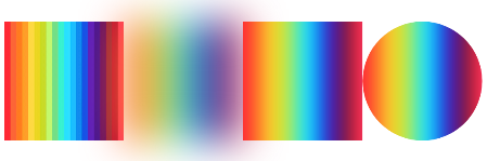
@Composable
fun BlurScreen() {
    Row {
        Image(
            modifier = Modifier.size(100.dp),
            painter = painterResource(R.drawable.rainbow),
            contentDescription = ""
        )
        Image(
            modifier = Modifier.size(100.dp)
                .blur(
                    radius = 30.dp,
                    edgeTreatment = BlurredEdgeTreatment.Unbounded
                ),
            painter = painterResource(R.drawable.rainbow),
            contentDescription = ""
        )
        Image(
            modifier = Modifier.size(100.dp)
                .blur(
                    radius = 10.dp,
                    edgeTreatment = BlurredEdgeTreatment.Rectangle
                ),
            painter = painterResource(R.drawable.rainbow),
            contentDescription = ""
        )
        Image(
            modifier = Modifier.size(100.dp)
                .blur(
                    radius = 10.dp,
                    edgeTreatment = BlurredEdgeTreatment(CircleShape)
                ),
            painter = painterResource(R.drawable.rainbow),
            contentDescription = ""
        )
    }
}
三、布局
3.1 子元素对齐 align
Compose能理解当前代码所处作用域,例如给一个纵向布局设置子元素对齐,IDE给出的选项自动变成 Alignment.Horizontal,说明只能在水平方向上指定对齐方式。
具体选项和效果详见
| .align(alignment: Alignment) |
四、行为
4.1 偏移 offset
| .offset(x: Dp = 0.dp, y: Dp = 0.dp) |

@Composable
fun Demo() {
    Image(
        painter = painterResource(id = R.drawable.logo_wechat_square),
        contentDescription = null,
        modifier = Modifier.offset(x = 10.dp, y = 30.dp)
    )
}
4.2 旋转 rotate
围绕其中心点旋转的角度。
| .rotate(degrees: Float) |

@Composable
fun Demo() {
    Image(
        painter = painterResource(id = R.drawable.logo_wechat_square),
        contentDescription = null,
        modifier = Modifier.rotate(180F)
    )
}
4.3 可见性追踪
4.3.1 可见性变化时 onVisibilityChanged
用于需要根据组件可见性变化触发副作用的场景,如自动播放/暂停视频或启动动画。
| fun Modifier.onVisibilityChanged( @IntRange(from = 0) minDurationMs: Long = 0, //达到该最小可见时间才触发(避免频繁触发带来的性能开销) @FloatRange(from = 0.0, to = 1.0) minFractionVisible: Float = 1f, //最小可见比例 viewportBounds: LayoutBoundsHolder? = null, callback: (Boolean) -> Unit, ) |
Box(modifier = Modifier
    .size(100.dp)
    .background(Color.White)
    .onVisibilityChanged(
        minDurationMs = 500,
        minFractionVisible = 1F
    ) { visible ->
        if (visible) ... else ...
    }
) {}
4.3.2 第一次出现在屏幕上 onFirstVisible
处理元素首次出现在屏幕上的场景,如记录曝光日志。
| fun Modifier.onFirstVisible( @IntRange(from = 0) minDurationMs: Long = 0, //达到该最小可见时间才触发(避免频繁触发带来的性能开销) @FloatRange(from = 0.0, to = 1.0) minFractionVisible: Float = 1f, //最小可见比例 viewportBounds: LayoutBoundsHolder? = null, callback: () -> Unit, ) |
Box(modifier = Modifier
    .size(100.dp)
    .background(Color.White)
    .onFirstVisible(
        minDurationMs = 500,
        minFractionVisible = 1F
    ) {
        //当元素可见超过500ms时...
    }
) {}
4.3.4 尺寸发生变化时 onSizeChanged
如需实现组件间的尺寸联动(即一个组件的尺寸影响另一个组件的尺寸),应当使用 Layout 或 SubcomposeLayout 布局组件。
| fun Modifier.onSizeChanged( onSizeChanged: (IntSize) -> Unit //拿到的是元素的新尺寸 ) |


 扫一扫
扫一扫


 1336
1336

 被折叠的 条评论
为什么被折叠?
被折叠的 条评论
为什么被折叠?
 到【灌水乐园】发言


