


 本文详细介绍了Element UI中的Layout布局组件,包括基础布局、分栏间隔、混合布局、分栏偏移、对齐方式以及响应式布局。同时提到了用于响应式隐藏的断点类名。
组件-Element—Layout(布局)
组件—安装:
<link rel="stylesheet" href="https://unpkg.com/element-ui/lib/theme-chalk/index.css">
<script src="https://unpkg.com/vue/dist/vue.js"></script>
<script src="https://unpkg.com/element-ui/lib/index.js"></script>

<script>
	new Vue({
		el: '#app',
		data: function() {
			return { visible: false }
		}
	})
</script>
组件—布局
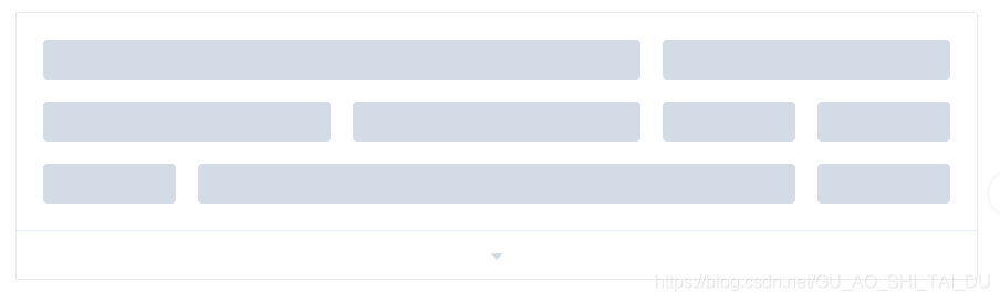
- 基础布局:

<el-row>
	<el-col :span="24"><div class="grid-content bg-purple-dark"></div></el-col>
</el-row>
<el-row>
		<el-col :span="12"><div class="grid-content bg-purple"></div></el-col>
			<el-col :span="12"><div class="grid-content bg-purple-light"></div></el-col>
</el-row>
<el-row>
	<el-col :span="8"><div class="grid-content bg-purple"></div></el-col>
	<el-col :span="8"><div class="grid-content bg-purple-light"></div></el-col>
	<el-col :span="8"><div class="grid-content bg-purple"></div></el-col>
</el-row>
<el-row>
	<el-col :span="6"><div class="grid-content bg-purple"></div></el-col>
	<el-col :span="6"><div class="grid-content bg-purple-light"></div></el-col>
	<el-col :span="6"><div class="grid-content bg-purple"></div></el-col>
	<el-col :span="6"><div class="grid-content bg-purple-light"></div></el-col>
</el-row>
<el-row>
	<el-col :span="4"><div class="grid-content bg-purple"></div></el-col>
	<el-col :span="4"><div class="grid-content bg-purple-light"></div></el-col>
	<el-col :span="4"><div class="grid-content bg-purple"></div></el-col>
	<el-col :span="4"><div class="grid-content bg-purple-light"></div></el-col>
	<el-col :span="4"><div class="grid-content bg-purple"></div></el-col>
	<el-col :span="4"><div class="grid-content bg-purple-light"></div></el-col>
</el-row>

<style>
	.el-row {
		margin-bottom: 20px;
		&:last-child {
			margin-bottom: 0;
		}
	}
	.el-col {
		border-radius: 4px;
	}
	.bg-purple-dark {
		background: #99a9bf;
	}
	.bg-purple {
		background: #d3dce6;
	}
	.bg-purple-light {
		background: #e5e9f2;
	}
	.grid-content {
		border-radius: 4px;
		min-height: 36px;
	}
	.row-bg {
		padding: 10px 0;
		background-color: #f9fafc;
	}
</style>
- 分栏间隔

<el-row :gutter="20">
   <el-col :span="6"><div class="grid-content bg-purple"></div></el-col>
   <el-col :span="6"><div class="grid-content bg-purple"></div></el-col>
   <el-col :span="6"><div class="grid-content bg-purple"></div></el-col>
   <el-col :span="6"><div class="grid-content bg-purple"></div></el-col>
</el-row>

<style>
   .el-row {
   		margin-bottom: 20px;
   		&:last-child {
   			margin-bottom: 0;
   		}
   }
   .el-col {
   		border-radius: 4px;
   }
   .bg-purple-dark {
   		background: #99a9bf;
   }
   .bg-purple {
   		background: #d3dce6;
   }
   .bg-purple-light {
   		background: #e5e9f2;
   }
   .grid-content {
   		border-radius: 4px;
   		min-height: 36px;
   }
   .row-bg {
   		padding: 10px 0;
   		background-color: #f9fafc;
   }
</style>
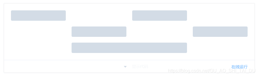
- 混合布局
<el-row :gutter="20">
  <el-col :span="16"><div class="grid-content bg-purple"></div></el-col>
  <el-col :span="8"><div class="grid-content bg-purple"></div></el-col>
</el-row>
<el-row :gutter="20">
  <el-col :span="8"><div class="grid-content bg-purple"></div></el-col>
  <el-col :span="8"><div class="grid-content bg-purple"></div></el-col>
  <el-col :span="4"><div class="grid-content bg-purple"></div></el-col>
  <el-col :span="4"><div class="grid-content bg-purple"></div></el-col>
</el-row>
<el-row :gutter="20">
  <el-col :span="4"><div class="grid-content bg-purple"></div></el-col>
  <el-col :span="16"><div class="grid-content bg-purple"></div></el-col>
  <el-col :span="4"><div class="grid-content bg-purple"></div></el-col>
</el-row>

<style>
  .el-row {
    margin-bottom: 20px;
    &:last-child {
      margin-bottom: 0;
    }
  }
  .el-col {
    border-radius: 4px;
  }
  .bg-purple-dark {
    background: #99a9bf;
  }
  .bg-purple {
    background: #d3dce6;
  }
  .bg-purple-light {
    background: #e5e9f2;
  }
  .grid-content {
    border-radius: 4px;
    min-height: 36px;
  }
  .row-bg {
    padding: 10px 0;
    background-color: #f9fafc;
  }
</style>
- 分栏偏移
<el-row :gutter="20">
  <el-col :span="6"><div class="grid-content bg-purple"></div></el-col>
  <el-col :span="6" :offset="6"><div class="grid-content bg-purple"></div></el-col>
</el-row>
<el-row :gutter="20">
  <el-col :span="6" :offset="6"><div class="grid-content bg-purple"></div></el-col>
  <el-col :span="6" :offset="6"><div class="grid-content bg-purple"></div></el-col>
</el-row>
<el-row :gutter="20">
  <el-col :span="12" :offset="6"><div class="grid-content bg-purple"></div></el-col>
</el-row>

<style>
  .el-row {
    margin-bottom: 20px;
    &:last-child {
      margin-bottom: 0;
    }
  }
  .el-col {
    border-radius: 4px;
  }
  .bg-purple-dark {
    background: #99a9bf;
  }
  .bg-purple {
    background: #d3dce6;
  }
  .bg-purple-light {
    background: #e5e9f2;
  }
  .grid-content {
    border-radius: 4px;
    min-height: 36px;
  }
  .row-bg {
    padding: 10px 0;
    background-color: #f9fafc;
  }
</style>
- 对齐方式
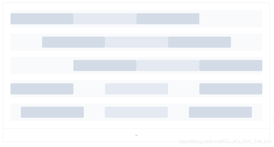
<el-row type="flex" class="row-bg">
  <el-col :span="6"><div class="grid-content bg-purple"></div></el-col>
  <el-col :span="6"><div class="grid-content bg-purple-light"></div></el-col>
  <el-col :span="6"><div class="grid-content bg-purple"></div></el-col>
</el-row>
<el-row type="flex" class="row-bg" justify="center">
  <el-col :span="6"><div class="grid-content bg-purple"></div></el-col>
  <el-col :span="6"><div class="grid-content bg-purple-light"></div></el-col>
  <el-col :span="6"><div class="grid-content bg-purple"></div></el-col>
</el-row>
<el-row type="flex" class="row-bg" justify="end">
  <el-col :span="6"><div class="grid-content bg-purple"></div></el-col>
  <el-col :span="6"><div class="grid-content bg-purple-light"></div></el-col>
  <el-col :span="6"><div class="grid-content bg-purple"></div></el-col>
</el-row>
<el-row type="flex" class="row-bg" justify="space-between">
  <el-col :span="6"><div class="grid-content bg-purple"></div></el-col>
  <el-col :span="6"><div class="grid-content bg-purple-light"></div></el-col>
  <el-col :span="6"><div class="grid-content bg-purple"></div></el-col>
</el-row>
<el-row type="flex" class="row-bg" justify="space-around">
  <el-col :span="6"><div class="grid-content bg-purple"></div></el-col>
  <el-col :span="6"><div class="grid-content bg-purple-light"></div></el-col>
  <el-col :span="6"><div class="grid-content bg-purple"></div></el-col>
</el-row>

<style>
  .el-row {
    margin-bottom: 20px;
    &:last-child {
      margin-bottom: 0;
    }
  }
  .el-col {
    border-radius: 4px;
  }
  .bg-purple-dark {
    background: #99a9bf;
  }
  .bg-purple {
    background: #d3dce6;
  }
  .bg-purple-light {
    background: #e5e9f2;
  }
  .grid-content {
    border-radius: 4px;
    min-height: 36px;
  }
  .row-bg {
    padding: 10px 0;
    background-color: #f9fafc;
  }
</style>
- 响应式布局

<el-row :gutter="10">
	<el-col :xs="8" :sm="6" :md="4" :lg="3" :xl="1"><div class="grid-content bg-purple"></div></el-col>
	<el-col :xs="4" :sm="6" :md="8" :lg="9" :xl="11"><div class="grid-content bg-purple-light"></div></el-col>
	<el-col :xs="4" :sm="6" :md="8" :lg="9" :xl="11"><div class="grid-content bg-purple"></div></el-col>
	<el-col :xs="8" :sm="6" :md="4" :lg="3" :xl="1"><div class="grid-content bg-purple-light"></div></el-col>
</el-row>

<style>
	.el-col {
		  border-radius: 4px;
	}
	.bg-purple-dark {
		  background: #99a9bf;
	}
	.bg-purple {
		  background: #d3dce6;
	  }
	 .bg-purple-light {
	 	  background: #e5e9f2;
	  }
	  .grid-content {
	  	  border-radius: 4px;
	  	  min-height: 36px;
	  }
</style>
-
基于断点的隐藏类
import 'element-ui/lib/theme-chalk/display.css';包含的类名及其含义为:
hidden-xs-only - 当视口在 xs 尺寸时隐藏 hidden-sm-only - 当视口在 sm 尺寸时隐藏 hidden-sm-and-down - 当视口在 sm 及以下尺寸时隐藏 hidden-sm-and-up - 当视口在 sm 及以上尺寸时隐藏 hidden-md-only - 当视口在 md 尺寸时隐藏 hidden-md-and-down - 当视口在 md 及以下尺寸时隐藏 hidden-md-and-up - 当视口在 md 及以上尺寸时隐藏 hidden-lg-only - 当视口在 lg 尺寸时隐藏 hidden-lg-and-down - 当视口在 lg 及以下尺寸时隐藏 hidden-lg-and-up - 当视口在 lg 及以上尺寸时隐藏 hidden-xl-only - 当视口在 xl 尺寸时隐藏 -
Row Attributes(行属性)
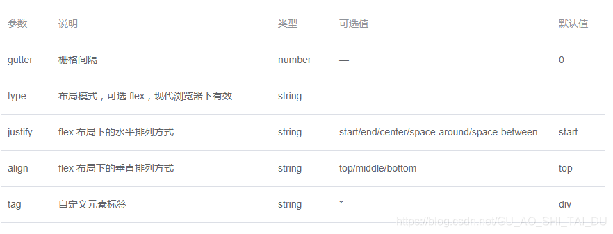
-
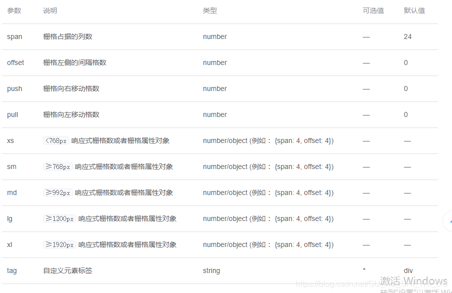
Col Attributes(Col属性)


 扫一扫
扫一扫


 1455
1455

 被折叠的 条评论
为什么被折叠?
被折叠的 条评论
为什么被折叠?
 到【灌水乐园】发言


