 uni-app标题展示问题的解决方案


移动端实际效果: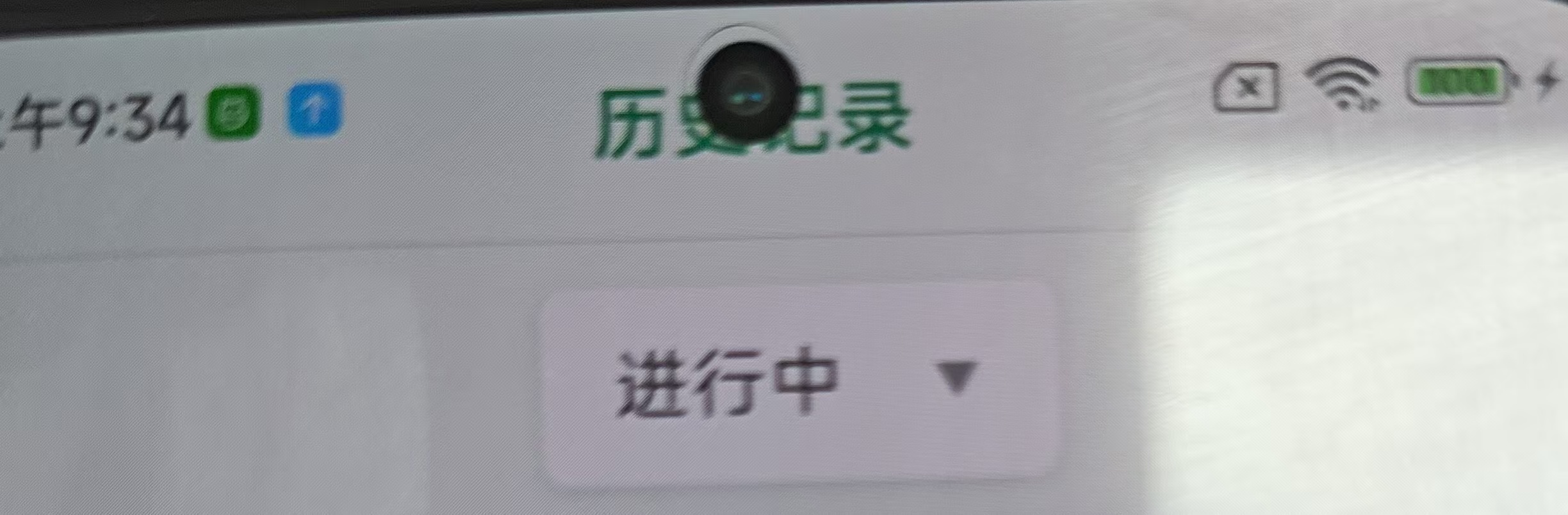
网页端调试效果: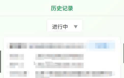
这个问题的直接原因就是移动端没有做适配代码,所在导致我们在浏览器的H5端看着很正常的头部Title,一到移动端运行调试就会导致头部titel整体向上移,移到前置摄像头旁边,以下是解决方案:
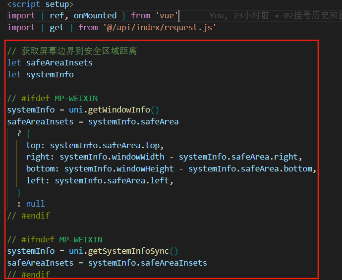
在标题父盒子上加上:style="{ paddingTop: `${safeAreaInsets?.top || 0}px` }",在<script setup>里面加上let safeAreaInsets
let systemInfo
systemInfo = uni.getWindowInfo()
safeAreaInsets = systemInfo.safeArea
? {
top: systemInfo.safeArea.top,
right: systemInfo.windowWidth - systemInfo.safeArea.right,
bottom: systemInfo.windowHeight - systemInfo.safeArea.bottom,
left: systemInfo.safeArea.left,
}
: null
systemInfo = uni.getSystemInfoSync()
safeAreaInsets = systemInfo.safeAreaInsets即可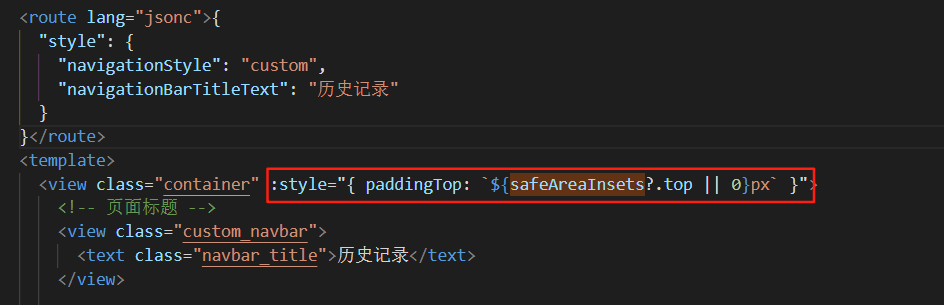
好的到上面加上这两端代码就完成了,下面是我自己完整的pages配置,因为可能大家写的都不一样,所有提供给有需要的小伙伴做下参考,配合图一


备注:经实测可能会顶到下方的输入框,可以让AI做下对应的处理即可
参考提示词::style="{ paddingTop: `${safeAreaInsets?.top || 0}px` }"做头部适配的样式功能影响到了底部输入框的位置,导致输入框向下移了部分,请帮我解决该问题;


 扫一扫
扫一扫


 1147
1147

 被折叠的 条评论
为什么被折叠?
被折叠的 条评论
为什么被折叠?
 到【灌水乐园】发言


