


微信小程序原生里面没有下拉的组件,只能自己手动封装一个了。
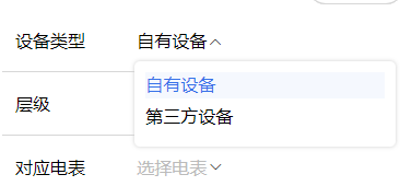
先看一下效果吧
link-select.wxml
<!--components/link-select/link-select.wxml-->
<view class="w100 select_all_view">
  <view class="mr-10 pt-10 size-28" style="width: {{titleWidth}};" wx:if="{{title}}">{{title}}</view>
  <view class="select_view relative" style="width: {{title ? 'calc(100% - ' + titleWidth + ' - 10rpx)' : '100%'}};max-width: {{title ? 'calc(100% - ' + titleWidth + ' - 10rpx)' : '100%'}};">
    <view class="inputPlaceholder h100 w100 radius-10 relative flex_l pd-10 {{ disabled ? 'gray-3' : 'black' }}" bindtap="{{disabled || readonly ? '' : 'changeShow'}}" style="background: {{disabled ?'' : bgColor}};">
      <block wx:if="{{disabled || readonly}}">
        <view class="flex-1" wx:if="{{selectLabel}}">{{selectLabel}}</view>
        <view class="flex-1 gray-3 line-1" wx:else>{{placeholder}}</view>
        <text class="licon-down"></text>
      </block>
      <block wx:else>
        <block wx:if="{{selectLabel}}">
          <view class="flex-1">{{selectLabel}}</view>
          <text class="licon-down transfer {{show ? 'is-reverse' : 'no-reverse' }}"></text>
        </block>
        <block wx:else>
          <view class="flex-1 gray-3 line-1">{{placeholder}}</view>
          <text class="licon-down transfer {{show ? 'is-reverse' : 'no-reverse' }}"></text>
        </block>
      </block>
    </view>
    <!-- 下拉展开后的可选择内容 -->
    <block wx:if='{{show}}'>
      <view class="content radius-10 pd-20 size-28" style="{{toTop ? 'top: -' + (options.length > 4 ? 296 : (options.length * 64 + 40)) + 'rpx; margin-top: -10rpx;' : 'margin-top: 60rpx;'}}">
        <view class="pd-10 center gray-3" wx:if="{{options.length < 1}}">暂无数据</view>
        <view class="line-1 w100 pd-10 contentItem {{item[valueName] == selectValue ? 'bold':''}}" wx:for="{{options}}" wx:key="index" bindtap="handleChange" data-item="{{item}}" style="color: {{ item[valueName] == selectValue ? textColor : '#000'}}; background: {{item[valueName] == selectValue ? itemBgColor:''}};">
          {{item[labelName]}}
        </view>
      </view>
    </block>
  </view>
</view>
link-select.js
// components/link-select/link-select.js
Component({
  options: {
    addGlobalClass: true,
  },
  properties: {
    /* --------- 样式参数 --------- */
    titleWidth: { // 标题长度
      type: String,
      value: "60px"
    },
    bgColor: { // 输入框背景颜色
      type: String,
      value: "#fff"
    },
    itemBgColor: { // 选中的选项背景颜色
      type: String,
      value: "#F5F8FE"
    },
    textColor: { // 选中的字体颜色
      type: String,
      value: "#3772E9"
    },
    /* --------- 数据参数 --------- */
    title: { // 下拉框标题
      type: String,
      value: ""
    },
    options: { // 选项数组
      type: Array,
      value: [],
    },
    labelName: { // 选项数组-绑定的label名称
      type: String,
      value: "dictLabel",
    },
    valueName: { // 选项数组-绑定的value名称
      type: String,
      value: "dictValue"
    },
    modelValue: { // 绑定的value
      type: [String, Object],
      value: "",
      observer: function () {
        //如果有默认值,需要匹配出name,所以这里使用obersver,当父组件中值改变时触发
        this.handleData();
      }
    },
    placeholder: { // 输入框为空时占位符
      type: String,
      value: "请选择"
    },
    disabled: { // 是否禁用
      type: Boolean,
      value: false
    },
    readonly: { // 是否只读
      type: Boolean,
      value: false
    }
  },
  /**
   * 页面的初始数据
   */
  data: {
    show: false, //选项框及图标展示
    selectValue: "", //选中的value
    selectLabel: "", //选中的label
    toTop: false, // 下拉框是否展示在输入框上方
  },
  attached() {
    this.handleData()
  },
  methods: {
    // 清空输入框
    clearInput() {
      this.setData({
        selectValue: "", //选中的value
        selectLabel: "", //选中的label
        show: false,
      })
    },
    // 下拉框收起和展开
    changeShow(e) {
      let that = this
      const query = wx.createSelectorQuery();
      // 选择当前点击的 view 元素
      query.select('.inputPlaceholder').boundingClientRect();
      query.exec(function (res) { // res[0].bottom 是元素距离可视区域顶部的距离加上元素自身的高度; res[1].scrollTop 是页面的滚动距离
        var show = !that.data.show
        if (res[0]) {
          /* that.triggerEvent("handleShow", show); // [暂未发现]处理滚动选项区域时背景页面滚动问题 */
          let toBottom = wx.getSystemInfoSync().windowHeight - res[0].bottom;
          console.log('距离设备底部的距离:', toBottom);
          that.setData({
            toTop: toBottom < 160 ? true : false,
            show: show
          })
        } else {
          that.setData({ show: show })
        }
      });
    },
    // 选择数据后回显
    handleChange(e) {
      let { item } = e.currentTarget.dataset
      let { labelName, valueName } = this.data
      this.setData({
        selectValue: item[valueName],
        selectLabel: item[labelName],
        show: false
      })
      let obj = {}
      obj[valueName] = item[valueName]
      obj[labelName] = item[labelName]
      this.triggerEvent("handleChange", obj);// 传参
    },
    // 匹配值并回显
    handleData() {
      let { modelValue, options, valueName, labelName } = this.properties;
      const value = modelValue ?? "";
      if (value) {
        let item = options.find(r => r[valueName] == value)
        this.setData({
          selectLabel: item ? item[labelName] : value,
          selectValue: value,
        });
      }else {
        this.setData({
          selectValue: "", //选中的value
          selectLabel: "", //选中的label
          show: false,
        })
      }
    }
  }
})
link-select.wxss
/* components/wan-select/select.wxss */
.select_all_view {
  display: flex;
  justify-content: start;
  align-items: start;
  z-index: 999;
}

.select_view {
  /* min-width: 200rpx; */
  min-height: 64rpx;
  align-items: center;
  display: flex;
}
.relative {
  position: relative;
}
.inputPlaceholder {
  font-size: 32rpx;
  display: flex;
}

.icon {
  position: absolute;
  right: 12rpx;
  top: 20rpx;
}

.contentItem {
  min-height: 48rpx;
  margin-bottom: 10rpx;
}

.content {
  width: calc(100% - 4px);
  margin-left: 2px;
  position: absolute;
  z-index: 999;
  max-height: 296rpx;
  background: #FFFFFF;
  /* border: 1px solid #ccc; */
  box-shadow: 0 0 4px #ccc;
  opacity: 1;
  /* margin-top: 10rpx; */
  overflow-x: hidden;
  overflow-y: scroll;
  top: 10rpx;
  border-radius: 10rpx;
  padding: 20rpx;
  left: -4px;
}

.triangleBox {
  position: absolute;
  z-index: 1000;
  left: 30rpx;
}

.triangle {
  position: relative;
  border-left: 12rpx solid transparent;
  border-right: 12rpx solid transparent;
  border-bottom: 10rpx solid #ccc;
}

.triangle::after {
  content: '';
  position: absolute;
  top: 3rpx;
  left: -12rpx;
  border-left: 12rpx solid transparent;
  border-right: 12rpx solid transparent;
  border-bottom: 10rpx solid #fff;
}

.triangleBox-top {
  position: absolute;
  z-index: 1000;
  left: 30rpx;

}

.triangle-top {
  position: relative;
  border-left: 12rpx solid transparent;
  border-right: 12rpx solid transparent;
  border-top: 10rpx solid #ccc;
}

.triangle-top::after {
  content: '';
  position: absolute;
  bottom: 3rpx;
  left: -12rpx;
  border-left: 12rpx solid transparent;
  border-right: 12rpx solid transparent;
  border-top: 10rpx solid #fff;
}

.is-reverse {
  transform: rotate(180deg);
}

.transfer {
  transition: transform .1s;
}

.no-reverse {
  transition: rotate(0deg);
}
.licon-down {
  margin-top: 5rpx;
}
.gray-3 {
  color: #bbb;
}
需要用的时候
<link-select options="{{agreementList}}" labelName="label" valueName="value" modelValue="{{formData.tableAgreement}}" bindhandleChange="handleInputChange" data-field="formData.tableAgreement"></link-select>
如果有问题的 可以留言~


 扫一扫
扫一扫


 2294
2294

 被折叠的 条评论
为什么被折叠?
被折叠的 条评论
为什么被折叠?
 到【灌水乐园】发言


