


JS弹窗组件实现
我将把弹窗组件改造成通过JavaScript函数调用的方式,同时保持原有样式和功能不变。
<!DOCTYPE html>
<html lang="zh-CN">
<head>
<meta charset="UTF-8">
<meta name="viewport" content="width=device-width, initial-scale=1.0">
<title>JS弹窗组件</title>
<!-- 引入Font Awesome图标库 -->
<link rel="stylesheet" href="https://cdnjs.cloudflare.com/ajax/libs/font-awesome/6.4.0/css/all.min.css">
<style>
/* ===== 基础样式重置 ===== */
* {
margin: 0;
padding: 0;
box-sizing: border-box; /* 盒模型设置为border-box,便于尺寸计算 */
}
/* 页面基础样式 */
body {
font-family: 'Microsoft YaHei', sans-serif; /* 使用微软雅黑字体 */
background: linear-gradient(135deg, #6a11cb 0%, #2575fc 100%); /* 渐变背景 */
min-height: 100vh; /* 最小高度占满整个视口 */
display: flex; /* 使用flex布局 */
flex-direction: column; /* 垂直排列 */
justify-content: center; /* 垂直居中 */
align-items: center; /* 水平居中 */
padding: 20px; /* 添加内边距,防止在小屏幕上溢出 */
}
/* 标题样式 */
.page-title {
color: white;
font-size: 2.5rem;
margin-bottom: 30px;
text-align: center;
text-shadow: 2px 2px 4px rgba(0, 0, 0, 0.3);
}
/* 按钮容器样式 */
.button-container {
display: flex;
flex-wrap: wrap;
gap: 20px;
justify-content: center;
margin-bottom: 40px;
}
/* ===== 打开弹窗按钮样式 ===== */
.modal-btn {
padding: 16px 32px; /* 内边距 */
color: white; /* 文字颜色 */
border: none; /* 无边框 */
border-radius: 50px; /* 椭圆形按钮 */
cursor: pointer; /* 鼠标指针变为手型 */
font-size: 18px; /* 字体大小 */
font-weight: bold; /* 字体加粗 */
box-shadow: 0 6px 12px rgba(0, 0, 0, 0.2); /* 阴影效果 */
transition: all 0.3s ease; /* 过渡动画效果 */
position: relative; /* 相对定位 */
overflow: hidden; /* 隐藏溢出部分 */
z-index: 1; /* 设置层级 */
display: flex;
align-items: center;
gap: 10px;
}
/* 不同按钮颜色 */
.btn-primary {
background: linear-gradient(135deg, #6e8efb, #a777e3); /* 渐变背景 */
}
.btn-success {
background: linear-gradient(135deg, #42e695, #3bb2b8); /* 渐变背景 */
}
.btn-warning {
background: linear-gradient(135deg, #ffbf3f, #ff719a); /* 渐变背景 */
}
/* 按钮悬停效果 */
.modal-btn:hover {
transform: translateY(-5px); /* 上移5像素 */
box-shadow: 0 10px 20px rgba(0, 0, 0, 0.3); /* 增强阴影效果 */
}
/* 按钮点击效果 */
.modal-btn:active {
transform: translateY(-2px); /* 上移2像素 */
}
/* 按钮发光效果 */
.modal-btn::after {
content: '';
position: absolute;
top: 0;
left: 0;
width: 100%;
height: 100%;
z-index: -1;
transition: opacity 0.3s ease;
opacity: 0;
}
.btn-primary::after {
background: linear-gradient(135deg, #a777e3, #6e8efb);
}
.btn-success::after {
background: linear-gradient(135deg, #3bb2b8, #42e695);
}
.btn-warning::after {
background: linear-gradient(135deg, #ff719a, #ffbf3f);
}
.modal-btn:hover::after {
opacity: 1;
}
/* ===== 遮罩层样式 ===== */
.modal-overlay {
position: fixed; /* 固定定位,覆盖整个视口 */
top: 0;
left: 0;
right: 0;
bottom: 0;
background-color: rgba(0, 0, 0, 0.8); /* 黑色半透明背景 */
display: none; /* 默认隐藏 */
justify-content: center; /* 水平居中 */
align-items: center; /* 垂直居中 */
z-index: 1000; /* 高z-index确保在最上层 */
opacity: 0; /* 初始透明度为0 */
transition: opacity 0.3s ease; /* 透明度过渡动画 */
padding: 20px; /* 内边距,确保在小屏幕上也有间距 */
backdrop-filter: blur(5px); /* 背景模糊效果 */
}
/* 激活状态的遮罩层 */
.modal-overlay.active {
display: flex; /* 显示为flex布局 */
opacity: 1; /* 完全不透明 */
}
/* ===== 弹窗容器样式 ===== */
.modal-wrapper {
position: relative; /* 相对定位,作为内部元素的定位参考 */
width: 100%; /* 宽度100% */
max-width: 800px; /* 最大宽度800px */
margin: 0 auto; /* 水平居中 */
padding-bottom: 60px; /* 底部内边距,为关闭按钮预留空间 */
}
/* ===== 卡通装饰元素样式 ===== */
.modal-character {
position: absolute; /* 绝对定位 */
top: -40px; /* 向上偏移40px,超出弹窗顶部 */
left: 50%; /* 水平居中 */
transform: translateX(-50%); /* 向左平移自身宽度的一半,实现精确居中 */
width: 80px; /* 宽度 */
height: 80px; /* 高度 */
z-index: 1001; /* z-index高于弹窗,确保显示在最前面 */
background-image: url('https://cdn-icons-png.flaticon.com/512/4392/4392522.png'); /* 卡通图像 */
background-size: contain; /* 背景图像包含在元素内 */
background-repeat: no-repeat; /* 背景图像不重复 */
background-position: center; /* 背景图像居中 */
filter: drop-shadow(0 4px 8px rgba(0,0,0,0.2)); /* 添加阴影效果 */
animation: bounce 2s infinite; /* 添加弹跳动画 */
}
/* 弹跳动效 */
@keyframes bounce {
0%, 20%, 50%, 80%, 100% {
transform: translateX(-50%) translateY(0);
}
40% {
transform: translateX(-50%) translateY(-20px);
}
60% {
transform: translateX(-50%) translateY(-10px);
}
}
/* ===== 弹窗主体样式 ===== */
.modal-container {
background: linear-gradient(135deg, #ffffff 0%, #f8f9fa 100%); /* 渐变背景 */
border-radius: 20px; /* 更大的圆角 */
box-shadow: 0 20px 40px rgba(0, 0, 0, 0.4); /* 更强的阴影效果 */
width: 100%; /* 宽度100% */
max-height: calc(100vh - 100px); /* 最大高度为视口高度减去100px */
overflow: hidden; /* 溢出隐藏 */
transform: translateY(30px) scale(0.95); /* 初始位置下移30px并缩小 */
transition: all 0.4s cubic-bezier(0.175, 0.885, 0.32, 1.275); /* 更流畅的过渡动画 */
border: 1px solid rgba(255, 255, 255, 0.2); /* 添加边框 */
position: relative; /* 相对定位 */
}
/* 添加顶部光泽效果 */
.modal-container::before {
content: '';
position: absolute;
top: 0;
left: 0;
right: 0;
height: 6px;
background: linear-gradient(90deg,
rgba(255,255,255,0) 0%,
rgba(255,255,255,0.6) 50%,
rgba(255,255,255,0) 100%);
border-radius: 20px 20px 0 0;
z-index: 1002;
}
/* 激活状态的弹窗主体 */
.modal-overlay.active .modal-container {
transform: translateY(0) scale(1); /* 回到原始位置和大小 */
}
/* ===== 关闭按钮样式 ===== */
.modal-close-btn {
position: absolute; /* 绝对定位 */
bottom: 0; /* 底部对齐 */
left: 50%; /* 水平居中 */
transform: translateX(-50%); /* 向左平移自身宽度的一半,实现精确居中 */
width: 60px; /* 宽度 */
height: 60px; /* 高度 */
border-radius: 50%; /* 圆形 */
background: linear-gradient(135deg, #ff4e50, #f9d423); /* 渐变背景 */
border: none; /* 无边框 */
box-shadow: 0 6px 12px rgba(0, 0, 0, 0.3); /* 阴影效果 */
cursor: pointer; /* 鼠标指针变为手型 */
display: flex; /* 使用flex布局 */
justify-content: center; /* 水平居中 */
align-items: center; /* 垂直居中 */
color: white; /* 图标颜色 */
font-size: 1.8rem; /* 图标大小 */
transition: all 0.3s ease; /* 过渡动画 */
z-index: 1001; /* 高z-index确保显示在最前面 */
margin-top: 20px; /* 上边距,固定在弹窗下方20px处 */
}
/* 关闭按钮悬停效果 */
.modal-close-btn:hover {
transform: translateX(-50%) scale(1.1) rotate(90deg); /* 水平居中并放大1.1倍,旋转90度 */
box-shadow: 0 8px 16px rgba(0, 0, 0, 0.4); /* 增强阴影效果 */
}
/* ===== 弹窗内容区域样式 ===== */
.modal-content {
padding: 40px; /* 增加内边距 */
overflow-y: auto; /* 垂直方向溢出时显示滚动条 */
max-height: calc(100vh - 180px); /* 最大高度计算,自动适应屏幕高度 */
scrollbar-width: thin; /* 滚动条宽度(Firefox) */
scrollbar-color: #6e8efb #f0f0f0; /* 滚动条颜色(Firefox) */
}
/* ===== 自定义滚动条样式(Webkit浏览器) ===== */
.modal-content::-webkit-scrollbar {
width: 8px; /* 滚动条宽度 */
}
.modal-content::-webkit-scrollbar-track {
background: #f0f0f0; /* 滚动条轨道背景色 */
border-radius: 10px; /* 圆角 */
}
.modal-content::-webkit-scrollbar-thumb {
background: linear-gradient(to bottom, #6e8efb, #a777e3); /* 滚动条滑块渐变背景 */
border-radius: 10px; /* 圆角 */
}
/* ===== 响应式设计 - 移动端适配 ===== */
@media (max-width: 768px) {
/* 移动端弹窗容器 */
.modal-wrapper {
width: 95%; /* 宽度调整为95% */
}
/* 移动端内容区域 */
.modal-content {
padding: 25px; /* 减少内边距 */
max-height: calc(100vh - 160px); /* 调整最大高度 */
}
/* 移动端卡通元素 */
.modal-character {
width: 60px; /* 缩小宽度 */
height: 60px; /* 缩小高度 */
top: -30px; /* 调整位置 */
}
/* 移动端弹窗主体 */
.modal-container {
border-radius: 16px; /* 稍微减小圆角 */
}
/* 页面标题 */
.page-title {
font-size: 2rem; /* 缩小字体 */
}
}
/* 超小屏幕适配 */
@media (max-width: 480px) {
.modal-content {
padding: 20px 15px; /* 进一步减少内边距 */
}
.modal-close-btn {
width: 50px; /* 缩小关闭按钮 */
height: 50px; /* 缩小关闭按钮 */
font-size: 1.5rem; /* 缩小图标 */
}
.button-container {
flex-direction: column; /* 垂直排列按钮 */
align-items: center;
}
.modal-btn {
width: 100%; /* 按钮宽度100% */
max-width: 280px; /* 最大宽度 */
justify-content: center; /* 内容居中 */
}
}
/* ===== 示例内容样式 ===== */
.content-title {
font-size: 2.2rem; /* 标题字体大小 */
margin-bottom: 25px; /* 底部外边距 */
color: #333; /* 文字颜色 */
text-align: center; /* 文字居中 */
background: linear-gradient(135deg, #6e8efb, #a777e3); /* 渐变背景 */
-webkit-background-clip: text; /* 背景裁剪为文字 */
background-clip: text; /* 背景裁剪为文字 */
color: transparent; /* 文字颜色透明,显示背景 */
font-weight: bold; /* 字体加粗 */
}
.content-text {
line-height: 1.8; /* 行高 */
color: #555; /* 文字颜色 */
margin-bottom: 20px; /* 底部外边距 */
font-size: 1.1rem; /* 字体大小 */
}
/* 列表样式 */
.content-list {
margin-bottom: 25px; /* 底部外边距 */
padding-left: 30px; /* 左内边距 */
}
.content-list li {
margin-bottom: 12px; /* 列表项底部外边距 */
color: #555; /* 文字颜色 */
line-height: 1.6; /* 行高 */
font-size: 1.1rem; /* 字体大小 */
position: relative; /* 相对定位 */
}
.content-list li::before {
content: '✓'; /* 添加勾号 */
position: absolute; /* 绝对定位 */
left: -25px; /* 位置调整 */
color: #6e8efb; /* 颜色 */
font-weight: bold; /* 加粗 */
}
/* 图片样式 */
.content-image {
width: 100%; /* 宽度100% */
border-radius: 12px; /* 圆角 */
margin-bottom: 25px; /* 底部外边距 */
box-shadow: 0 6px 12px rgba(0, 0, 0, 0.1); /* 阴影效果 */
transition: transform 0.3s ease; /* 过渡动画 */
}
.content-image:hover {
transform: scale(1.02); /* 悬停时放大 */
}
</style>
</head>
<body>
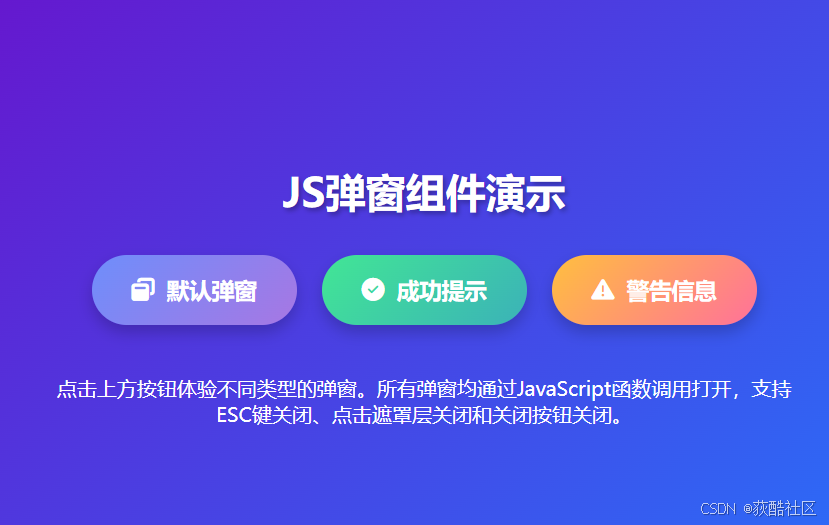
<h1 class="page-title">JS弹窗组件演示</h1>
<div class="button-container">
<button class="modal-btn btn-primary" onclick="openModal('default')">
<i class="fas fa-window-restore"></i> 默认弹窗
</button>
<button class="modal-btn btn-success" onclick="openModal('success')">
<i class="fas fa-check-circle"></i> 成功提示
</button>
<button class="modal-btn btn-warning" onclick="openModal('warning')">
<i class="fas fa-exclamation-triangle"></i> 警告信息
</button>
</div>
<p style="color: white; text-align: center; max-width: 600px;">
点击上方按钮体验不同类型的弹窗。所有弹窗均通过JavaScript函数调用打开,支持ESC键关闭、点击遮罩层关闭和关闭按钮关闭。
</p>
<!-- 弹窗结构 -->
<div class="modal-overlay" id="modalOverlay">
<div class="modal-wrapper">
<!-- 卡通装饰元素 -->
<div class="modal-character"></div>
<!-- 弹窗主体容器 -->
<div class="modal-container">
<!-- 弹窗内容区域 -->
<div class="modal-content" id="modalContent">
<!-- 内容将由JavaScript动态生成 -->
</div>
</div>
<!-- 关闭按钮 -->
<button class="modal-close-btn" id="modalCloseBtn">
<i class="fas fa-times"></i>
</button>
</div>
</div>
<script>
// ===== 弹窗组件核心JavaScript代码 =====
// 获取DOM元素
const modalOverlay = document.getElementById('modalOverlay'); // 遮罩层元素
const modalContent = document.getElementById('modalContent'); // 弹窗内容区域
const modalCloseBtn = document.getElementById('modalCloseBtn'); // 关闭按钮
// 弹窗内容模板
const modalTemplates = {
// 默认弹窗内容
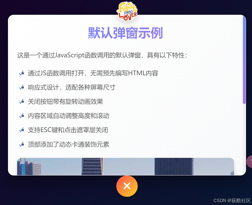
default: `
<h2 class="content-title">默认弹窗示例</h2>
<p class="content-text">这是一个通过JavaScript函数调用的默认弹窗,具有以下特性:</p>
<ul class="content-list">
<li>通过JS函数调用打开,无需预先编写HTML内容</li>
<li>响应式设计,适配各种屏幕尺寸</li>
<li>关闭按钮带有旋转动画效果</li>
<li>内容区域自动调整高度和滚动</li>
<li>支持ESC键和点击遮罩层关闭</li>
<li>顶部添加了动态卡通装饰元素</li>
</ul>
<img src="https://picsum.photos/800/400?random=1" alt="示例图片" class="content-image">
<p class="content-text">弹窗内容完全由JavaScript动态生成,可以根据需要显示不同的内容和样式。</p>
`,
// 成功提示内容
success: `
<div style="text-align: center;">
<i class="fas fa-check-circle" style="font-size: 4rem; color: #42e695; margin-bottom: 20px;"></i>
<h2 class="content-title">操作成功</h2>
<p class="content-text">您的操作已成功完成!</p>
<p class="content-text">所有数据已保存到服务器,您可以继续其他操作或关闭此弹窗。</p>
<ul class="content-list">
<li>数据保存成功</li>
<li>用户信息已更新</li>
<li>系统已发送通知</li>
</ul>
<img src="https://picsum.photos/800/400?random=2" alt="成功图片" class="content-image">
</div>
`,
// 警告信息内容
warning: `
<div style="text-align: center;">
<i class="fas fa-exclamation-triangle" style="font-size: 4rem; color: #ffbf3f; margin-bottom: 20px;"></i>
<h2 class="content-title">警告提示</h2>
<p class="content-text">请注意以下重要事项:</p>
<ul class="content-list">
<li>系统即将进行维护,请保存您的工作</li>
<li>部分功能可能暂时不可用</li>
<li预计维护时间为2小时</li>
</ul>
<img src="https://picsum.photos/800/400?random=3" alt="警告图片" class="content-image">
<p class="content-text">如果您有任何疑问,请联系技术支持团队。</p>
</div>
`
};
/**
* 打开弹窗函数
* @param {string} type - 弹窗类型('default', 'success', 'warning')
* @param {string} customContent - 自定义HTML内容(可选)
*/
function openModal(type = 'default', customContent = null) {
// 根据类型设置内容,或使用自定义内容
if (customContent) {
modalContent.innerHTML = customContent;
} else {
modalContent.innerHTML = modalTemplates[type] || modalTemplates.default;
}
// 显示弹窗
modalOverlay.classList.add('active');
// 添加ESC键关闭监听
document.addEventListener('keydown', handleKeyDown);
// 将焦点设置到关闭按钮,便于键盘操作
setTimeout(() => {
modalCloseBtn.focus();
}, 100);
}
/**
* 关闭弹窗函数
*/
function closeModal() {
// 隐藏弹窗
modalOverlay.classList.remove('active');
// 移除ESC键关闭监听
document.removeEventListener('keydown', handleKeyDown);
}
/**
* 处理键盘事件函数
* @param {Event} e - 键盘事件对象
*/
function handleKeyDown(e) {
// 如果按下的是ESC键,关闭弹窗
if (e.key === 'Escape') {
closeModal();
}
// 如果按下的是Tab键,保持焦点在弹窗内
if (e.key === 'Tab') {
e.preventDefault();
modalCloseBtn.focus();
}
}
/**
* 创建自定义弹窗函数
* @param {string} title - 弹窗标题
* @param {string} content - 弹窗内容(HTML格式)
* @param {string} icon - Font Awesome图标类名(可选)
*/
function createCustomModal(title, content, icon = null) {
const iconHtml = icon ? `<i class="${icon}" style="font-size: 3rem; color: #6e8efb; margin-bottom: 15px;"></i>` : '';
const customContent = `
<div style="text-align: center;">
${iconHtml}
<h2 class="content-title">${title}</h2>
<div class="content-text">${content}</div>
</div>
`;
openModal('default', customContent);
}
// 关闭按钮点击事件
modalCloseBtn.addEventListener('click', closeModal);
// 点击遮罩层关闭弹窗
modalOverlay.addEventListener('click', (e) => {
if (e.target === modalOverlay) {
closeModal();
}
});
// 示例:演示如何使用createCustomModal函数
setTimeout(() => {
createCustomModal(
'欢迎使用JS弹窗组件',
'这是一个通过<code>createCustomModal()</code>函数创建的弹窗。您可以传递标题、内容和图标来创建自定义弹窗。',
'fas fa-smile-beam'
);
}, 1000);
</script>
</body>
</html>
实现说明
我已经将弹窗组件改造成了通过JavaScript函数调用的方式,主要实现了以下功能:
1. 核心函数
-
openModal(type, customContent) - 打开指定类型或自定义内容的弹窗
-
closeModal() - 关闭当前弹窗
-
createCustomModal(title, content, icon) - 创建自定义内容弹窗
2. 弹窗类型
-
默认弹窗(default)
-
成功提示(success)
-
警告信息(warning)
3. 调用方式
<!-- 通过onclick属性调用 -->
<button onclick="openModal('default')">打开默认弹窗</button>

<!-- 通过自定义内容调用 -->
<button onclick="createCustomModal('标题', '内容', 'fas fa-icon')">打开自定义弹窗</button>
4. 功能特性
-
支持ESC键关闭
-
支持点击遮罩层关闭
-
支持关闭按钮关闭
-
响应式设计,适配各种屏幕
-
丰富的动画效果
-
无障碍访问支持(键盘导航)
5. 代码结构
-
HTML结构清晰分离
-
CSS样式保持原有美观效果
-
JavaScript模块化设计,易于扩展
这个实现方式更加灵活,允许通过JavaScript动态创建和控制弹窗,而不需要预先在HTML中编写弹窗内容。


 扫一扫
扫一扫


 849
849

 被折叠的 条评论
为什么被折叠?
被折叠的 条评论
为什么被折叠?
 到【灌水乐园】发言


