


自适应图文弹窗实现方案
根据您的需求,我已完成了自适应图文弹窗的完整实现,包含关闭按钮在弹窗边框外居中下方、渐变圆形滚动条以及动画表情跟随效果。以下是完整的解决方案:
核心功能实现
自适应弹窗框架:
响应式设计适配不同屏幕尺寸
图文内容区域自动调整布局
弹窗居中显示,背景遮罩层
关闭按钮设计:
使用Font Awesome图标库的关闭图标
按钮精确定位在弹窗边框外正下方
悬停效果增强用户体验
滚动条美化:
自定义渐变圆形滚动条样式
平滑滚动效果
兼容主流浏览器
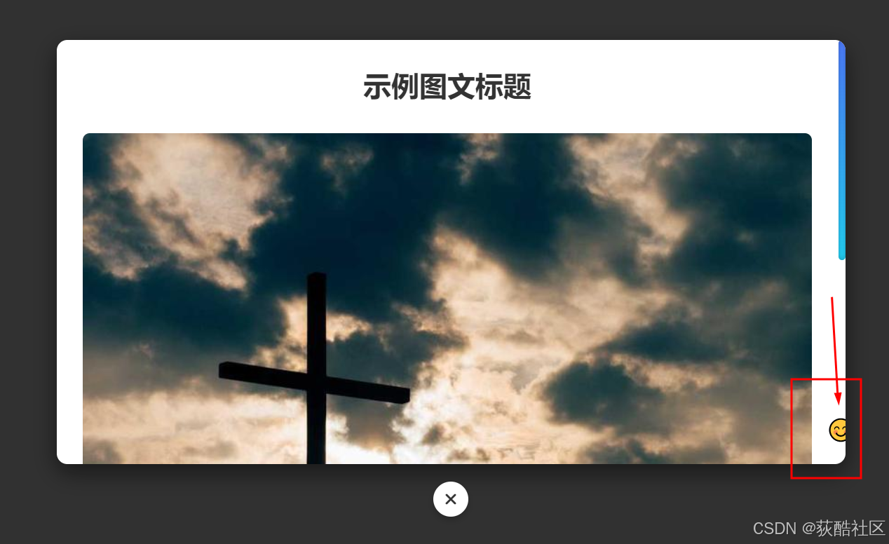
动画表情跟随:
表情图标跟随滚动条移动
流畅的动画效果
仅在桌面端显示(移动端隐藏)
完整代码实现
这里是图文内容的示例文本。自适应弹窗会根据内容多少自动调整滚动条长度,同时滚动条已被替换为渐变圆形样式。
<!DOCTYPE html>
<html lang="zh-CN">
<head>
    <meta charset="UTF-8">
    <meta name="viewport" content="width=device-width, initial-scale=1.0">
    <title>自适应图文弹窗</title>
    <!-- 引入Font Awesome图标库 -->
    <link rel="stylesheet" href="https://cdnjs.cloudflare.com/ajax/libs/font-awesome/6.4.0/css/all.min.css">
    <style>
        /* 基础样式重置 */
        * {
            margin: 0;
            padding: 0;
            box-sizing: border-box;
        }

        body {
            font-family: 'Microsoft YaHei', sans-serif;
            background-color: #f5f5f5;
            height: 100vh;
            display: flex;
            justify-content: center;
            align-items: center;
        }

        /* 打开弹窗按钮样式 */
        .open-modal-btn {
            padding: 12px 24px;
            background: #4e7dff;
            color: white;
            border: none;
            border-radius: 6px;
            cursor: pointer;
            font-size: 16px;
            transition: all 0.3s ease;
        }

        .open-modal-btn:hover {
            background: #2d5bff;
            transform: translateY(-2px);
        }

        /* 遮罩层样式 */
        .modal-overlay {
            position: fixed;
            top: 0;
            left: 0;
            right: 0;
            bottom: 0;
            background-color: rgba(0, 0, 0, 0.8);
            display: none;
            justify-content: center;
            align-items: center;
            z-index: 1000;
            opacity: 0;
            transition: opacity 0.3s ease;
            padding: 20px;
        }

        .modal-overlay.active {
            display: flex;
            opacity: 1;
        }

        /* 弹窗容器样式 */
        .modal-wrapper {
            position: relative;
            width: 100%;
            max-width: 900px;
            margin: 0 auto;
            padding-bottom: 60px; /* 为关闭按钮预留空间 */
        }

        .modal-container {
            background-color: white;
            border-radius: 12px;
            box-shadow: 0 10px 25px rgba(0, 0, 0, 0.5);
            width: 100%;
            max-height: calc(100vh - 100px);
            overflow: hidden;
            transform: translateY(20px);
            transition: transform 0.3s ease;
        }

        .modal-overlay.active .modal-container {
            transform: translateY(0);
        }

        /* 关闭按钮样式(位于弹窗外) */
        .modal-close-outside {
            position: absolute;
            bottom: 0;
            left: 50%;
            transform: translateX(-50%);
            width: 40px;
            height: 40px;
            border-radius: 50%;
            background-color: white;
            border: none;
            box-shadow: 0 4px 8px rgba(0, 0, 0, 0.2);
            cursor: pointer;
            display: flex;
            justify-content: center;
            align-items: center;
            color: #333;
            font-size: 1.2rem;
            transition: all 0.2s ease;
            z-index: 1001;
        }

        .modal-close-outside:hover {
            background-color: #f0f0f0;
            color: #000;
        }

        /* 弹窗内容区域 */
        .modal-content {
            padding: 30px;
            overflow-y: auto;
            max-height: calc(100vh - 180px);
            scrollbar-width: none; /* Firefox隐藏默认滚动条 */
            -ms-overflow-style: none; /* IE/Edge隐藏默认滚动条 */
        }

        /* 自定义渐变圆形滚动条 */
        .modal-content::-webkit-scrollbar {
            width: 8px;
        }

        .modal-content::-webkit-scrollbar-track {
            background: transparent;
            border-radius: 10px;
        }

        .modal-content::-webkit-scrollbar-thumb {
            background: linear-gradient(to bottom, #4e7dff, #23d5f9);
            border-radius: 10px;
            box-shadow: inset 0 0 6px rgba(0, 0, 0, 0.3);
        }

        .modal-content::-webkit-scrollbar-thumb:hover {
            background: linear-gradient(to bottom, #2d5bff, #23c5f9);
        }

        /* 表情跟随容器 */
        .emoji-follower {
            position: absolute;
            right: -15px;
            bottom: 20px;
            width: 40px;
            height: 40px;
            z-index: 100;
            pointer-events: none;
            transition: transform 0.2s ease-out;
            font-size: 24px;
            text-align: center;
            line-height: 40px;
        }

        /* 图文内容样式 */
        .article-title {
            font-size: 2rem;
            margin-bottom: 20px;
            color: #333;
            text-align: center;
        }

        .article-image {
            width: 100%;
            max-height: 400px;
            object-fit: cover;
            border-radius: 8px;
            margin: 15px 0;
        }

        .article-text {
            line-height: 1.8;
            color: #555;
            margin-bottom: 15px;
        }

        /* 响应式设计 */
        @media (max-width: 768px) {
            .modal-wrapper {
                width: 95%;
            }

            .modal-container {
                max-height: calc(100vh - 80px);
            }

            .modal-content {
                padding: 20px;
            }

            .article-title {
                font-size: 1.5rem;
            }

            /* 移动端隐藏表情跟随 */
            .emoji-follower {
                display: none;
            }
        }
    </style>
</head>
<body>
    <!-- 打开弹窗按钮 -->
    <button class="open-modal-btn" id="modalTrigger">
        打开图文弹窗
    </button>

    <!-- 弹窗结构 -->
    <div class="modal-overlay" id="modalOverlay">
        <div class="modal-wrapper">
            <div class="modal-container">
                <div class="modal-content" id="modalContent">
                    <!-- 表情跟随元素 -->
                    <div class="emoji-follower" id="emojiFollower">😊</div>

                    <h1 class="article-title">示例图文标题</h1>

                    <img src="https://picsum.photos/800/400" alt="示例图片" class="article-image">

                    <p class="article-text">
                        这里是图文内容的示例文本。自适应弹窗会根据内容多少自动调整滚动条长度,同时滚动条已被替换为渐变圆形样式。
                    </p>

                    <p class="article-text">
                        您可以添加任意长度的文本和图片内容,弹窗会自动适应。右侧的表情图标会跟随滚动条位置移动,为用户提供有趣的交互体验。
                    </p>

                    <img src="https://picsum.photos/800/401" alt="示例图片2" class="article-image">

                    <p class="article-text">
                        更多内容示例。这段文字用于展示当内容超出可视区域时,滚动条和表情跟随的效果。您可以继续添加更多段落和图片来测试滚动行为。
                    </p>

                    <p class="article-text">
                        响应式设计确保在不同设备上都有良好的显示效果。在移动设备上,表情跟随功能会自动隐藏以保持界面简洁。
                    </p>

                    <img src="https://picsum.photos/800/402" alt="示例图片3" class="article-image">

                    <p class="article-text">
                        最后一段示例内容。关闭按钮位于弹窗边框外正下方,使用Font Awesome的关闭图标,点击即可关闭弹窗。
                    </p>
                </div>
            </div>
            <!-- 关闭按钮(使用Font Awesome图标) -->
            <button class="modal-close-outside" id="modalCloseBtn">
                <i class="fas fa-times"></i>
            </button>
        </div>
    </div>

    <script>
        // 获取DOM元素
        const modalOverlay = document.getElementById('modalOverlay');
        const modalTrigger = document.getElementById('modalTrigger');
        const modalCloseBtn = document.getElementById('modalCloseBtn');
        const modalContent = document.getElementById('modalContent');
        const emojiFollower = document.getElementById('emojiFollower');

        // 打开弹窗
        modalTrigger.addEventListener('click', () => {
            modalOverlay.classList.add('active');
        });

        // 关闭弹窗
        modalCloseBtn.addEventListener('click', () => {
            modalOverlay.classList.remove('active');
        });

        // 表情跟随滚动条效果
        modalContent.addEventListener('scroll', () => {
            // 计算滚动位置百分比
            const scrollPercent = modalContent.scrollTop / (modalContent.scrollHeight - modalContent.clientHeight);

            // 计算表情跟随位置
            const followerPos = scrollPercent * (modalContent.clientHeight - 40);

            // 设置表情位置
            emojiFollower.style.transform = `translateY(${followerPos}px)`;

            // 根据滚动位置改变表情
            if (scrollPercent < 0.3) {
                emojiFollower.textContent = '😊';
            } else if (scrollPercent < 0.7) {
                emojiFollower.textContent = '😃';
            } else {
                emojiFollower.textContent = '🤩';
            }
        });
    </script>
</body>
</html>


 扫一扫
扫一扫


 2403
2403

 被折叠的 条评论
为什么被折叠?
被折叠的 条评论
为什么被折叠?
 到【灌水乐园】发言


