


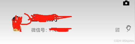
实现结果。实现这个我的页面头像这个功能,和周边这些信息的布局功能
实现思路: 拆分左中右三个盒子。分别使用flex布局设计
实现代码:
<template>
    <view>
        <view class="mean">
            <view class="menc">
                <img src="static/images/classify2.jpg" alt="" />
            </view>
            <view class="menb">
                <p>水天一色</p>
                <p>微信号:234234</p>
            </view>
            <view class="mend">
                <img src="static/喇叭.png" alt="" />
                <img src="static/更多.png" alt="" />
            </view>
        </view>
    </view>
</template>

<script>
export default {
  data() {
    return {

    };
  },
  methods: {

  },
};
</script>

<style scoped>
 page{
     background: #f0f0f0;
 }
.mean{
    background: white;
    height: 250rpx;
    display: flex;
    align-items: center;
    padding: 0 20rpx;
}
.menb{
    height: 100rpx;
   /* background: #00ffff; */
    flex:1;
    position: relative;
}
.menb p:nth-child(1){
    font-size: 35rpx;
    font-weight: bold;
    position: absolute;
    top: 0rpx;
    left: 20rpx;
    height: 50rpx;
    line-height: 50rpx;
}
.menb p:nth-child(2){
    font-size: 20rpx;
    position: absolute;
    bottom: 0;
    left: 20rpx;
}
.menc{
    width: 100rpx;
    height: 100rpx;
}
.menc img{
    width: 100rpx;
    height: 100rpx;
}
.mend{
    height: 100rpx;
   /* background-color: yellowgreen; */
    display: flex;

}
.mend img{
    width: 50rpx;
    height: 50rpx;
    align-self: flex-end;  /* 右下角的图片放下来 */
}
</style>


 扫一扫
扫一扫


 被折叠的 条评论
为什么被折叠?
被折叠的 条评论
为什么被折叠?
 到【灌水乐园】发言


