


 本文档介绍如何使用pandas_datareader获取股票数据,并利用Bokeh库创建股票K线图。首先,优化DataFrame以包含涨跌状态、方块中心位置和高度信息。接着,详细说明了Bokeh中创建candlestick chart的过程,包括设置横轴为datetime类型,调整Rect图像参数,并在Rect图像上添加segment以增强图表细节。最后,探讨了如何设置图表的大小使其随浏览器窗口变化,以及调整Rect的颜色。
Stock_analysis
使用data.DataReader(name=,data_source=,start,end)对stock数据进行爬取;
此时df存入apple股票的数据,从2016.3.1到2016.3.10;
import requests
from pandas_datareader import data
import datetime
from bokeh.plotting import figure,show,output_file

start=datetime.datetime(2016,3,1)
end=datetime.datetime(2016,3,10)

df=data.DataReader(name="AAPL",data_source="yahoo",start=start,end=end)      #从雅虎找apple  #传入datetime type
#存入df
优化df(dataframe)
(1)加入status——涨、跌、平
(2)加入Middle——方块的中心位置
(3)加入Height——方块的高度
def inc_dec(c,o):         #判断状态
    if c > o:
        value="Increase"
    elif c<o:
        value="Decrease"
    else:
        value="Equal"
    return value

df["Status"]=[inc_dec(c,o) for c,o in zip(df.Close,df.Open)]      #zip得到每个close和open 传入函数得到data
df["Middle"]=(df.Open+df.Close)/2
df["Height"]=abs(df.Open-df.Close)
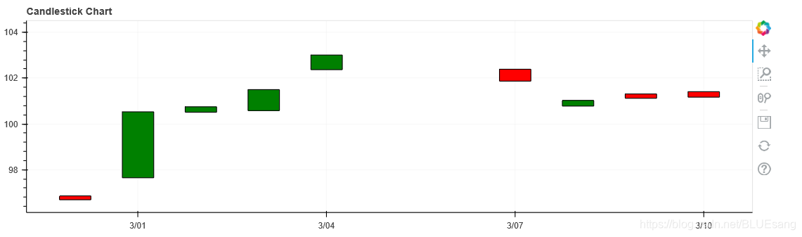
Bokeh制作figure——制作candlestick chart
(1)设置横轴的类型为datetime——p = figure(x_axis_type='datetime',width=1000,height=300)
(2)figure.rect传入的参数(x,y,width,height)
(3)传入类似list参数时,需要对每个参数进行filter限制——df.Middle[df.Status=="Increase"]
p = figure(x_axis_type='datetime',width=1000,height=300)
p.title.text="Candlestick Chart"
#得到一个空figure
#rectangle 12hours gap  quadrants
hours_12=12*60*60*1000
#涨 绿
#对每一个参数,都要传入filter——df.Status=="Increase"
p.rect(df.index[df.Status=="Increase"],df.Middle[df.Status=="Increase"],
       hours_12,df.Height[df.Status=="Increase"],fill_color="green",line_color="black")      #4个参数  x,y,width,height  #rect 直接在中间

#跌 红
p.rect(df.index[df.Status=="Decrease"],df.Middle[df.Status=="Decrease"],
       hours_12,df.Height[df.Status=="Decrease"],fill_color="red",line_color="black")

output_file("CS.html")
show(p)
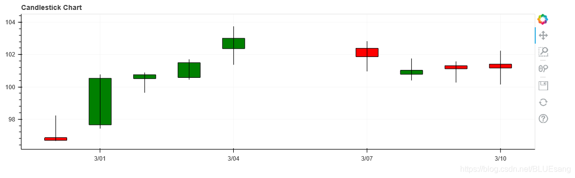
在Rect图像中加入segment
(1)改变grid_line的透明度:p.grid.grid_line_alpha=0.3
(2)增加segment图像:p.segment(df.index,df.High,df.index,df.Low,color="black")
注意点:setment写在rect后面,则显示在rect前面;
p = figure(x_axis_type='datetime',width=1000,height=300)
p.title.text="Candlestick Chart"
#得到一个空figure

#透明度
p.grid.grid_line_alpha=0.3          #grid_line的透明度


#rectangle 12hours gap  quadrants
hours_12=12*60*60*1000
#涨 绿
#对每一个参数,都要传入filter——df.Status=="Increase"
p.rect(df.index[df.Status=="Increase"],df.Middle[df.Status=="Increase"],
       hours_12,df.Height[df.Status=="Increase"],fill_color="green",line_color="black")      #4个参数  x,y,width,height  #rect 直接在中间

#跌 红
p.rect(df.index[df.Status=="Decrease"],df.Middle[df.Status=="Decrease"],
       hours_12,df.Height[df.Status=="Decrease"],fill_color="red",line_color="black")

#x轴为时间  y轴最高+最低
#在rect后面话segment  不然会被覆盖
p.segment(df.index,df.High,df.index,df.Low,color="black")          #x 最高 y最高 x最低 y最低

output_file("CS.html")
show(p)
segment写在rect前面:
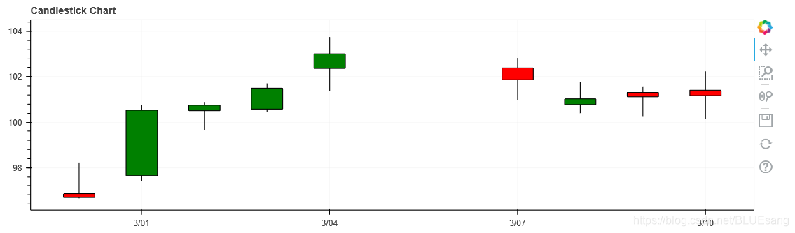
设置rect颜色+设置figure大小随浏览器变动
figure大小随浏览器变动:
p = figure(x_axis_type='datetime',width=1000,height=300,sizing_mode="scale_width")
设置rect颜色:
p.rect(df.index[df.Status=="Increase"],df.Middle[df.Status=="Increase"],
       hours_12,df.Height[df.Status=="Increase"],fill_color="#CCFFFF",line_color="black")      #4个参数  x,y,width,height  #rect 直接在中间

#跌 红
p.rect(df.index[df.Status=="Decrease"],df.Middle[df.Status=="Decrease"],
       hours_12,df.Height[df.Status=="Decrease"],fill_color="#FF3333",line_color="black")
完整代码
import requests
from pandas_datareader import data
import datetime
from bokeh.plotting import figure,show,output_file

start=datetime.datetime(2018,3,1)
end=datetime.datetime(2020,3,10)
df=data.DataReader(name="AAPL",data_source="yahoo",start=start,end=end)      #从雅虎找apple  #传入datetime type
#存入df


def inc_dec(c,o):         #判断状态
    if c > o:
        value="Increase"
    elif c<o:
        value="Decrease"
    else:
        value="Equal"
    return value

df["Status"]=[inc_dec(c,o) for c,o in zip(df.Close,df.Open)]      #zip得到每个close和open 传入函数得到data
df["Middle"]=(df.Open+df.Close)/2
df["Height"]=abs(df.Open-df.Close)

p = figure(x_axis_type='datetime',width=1000,height=300,sizing_mode="scale_width")
p.title.text="Candlestick Chart"
#得到一个空figure

#透明度
p.grid.grid_line_alpha=0.3          #grid_line的透明度

p.segment(df.index,df.High,df.index,df.Low,color="black")          #x 最高 y最高 x最低 y最低
#rectangle 12hours gap  quadrants
hours_12=12*60*60*1000
#涨 绿
#对每一个参数,都要传入filter——df.Status=="Increase"
p.rect(df.index[df.Status=="Increase"],df.Middle[df.Status=="Increase"],
       hours_12,df.Height[df.Status=="Increase"],fill_color="#CCFFFF",line_color="black")      #4个参数  x,y,width,height  #rect 直接在中间

#跌 红
p.rect(df.index[df.Status=="Decrease"],df.Middle[df.Status=="Decrease"],
       hours_12,df.Height[df.Status=="Decrease"],fill_color="#FF3333",line_color="black")

#x轴为时间  y轴最高+最低
#在rect后面话segment  不然会被覆盖

output_file("CS.html")
show(p)


 4905
4905

 被折叠的 条评论
为什么被折叠?
被折叠的 条评论
为什么被折叠?
 到【灌水乐园】发言


