


当我第一次看到自己三个月前写的前端代码时,我删掉了整个仓库。那不是代码,那是一座用 JavaScript 搭建的坟墓,埋葬着我对编程的热情。就在我准备转行卖煎饼果子的前一天,一位资深架构师看了我的代码,只说了八个字:“你根本不会组件封装啊。”

为什么写不好组件,是你"升职加薪"的最大拦路虎?
2023年某招聘平台的数据显示,掌握"组件化思维"的前端开发者平均薪资比同等经验但缺乏这项技能的同行高出32%。这不是巧合。当我们深入研究那些被提拔为"前端架构师"的工程师简历时,发现一个共同点:他们都精通组件设计与封装。
不会封装组件的前端工程师,就像不会调味的厨师,再勤奋也只能做出食之无味的料理。我曾亲眼目睹一个项目里同一个日期选择器被复制了27次,每次都有细微的差别。最终,产品迭代时,这27处代码需要分别修改,团队怒气值直接拉满。
// 复制的第1个日期选择器
const DatePicker1 = () => {
  // 200行代码,为了特定业务场景A小改了一点点
}

// 复制的第22个日期选择器
const DatePicker22 = () => {
  // 200行几乎相同的代码,为了特定业务场景V又小改了一点点
}
有些公司甚至把"能否设计出优雅可复用组件"作为中高级前端的晋升门槛。一位FAANG的前端面试官私下告诉我:“如果候选人在编码环节只会复制粘贴,而不考虑组件封装,基本上就凉了。”
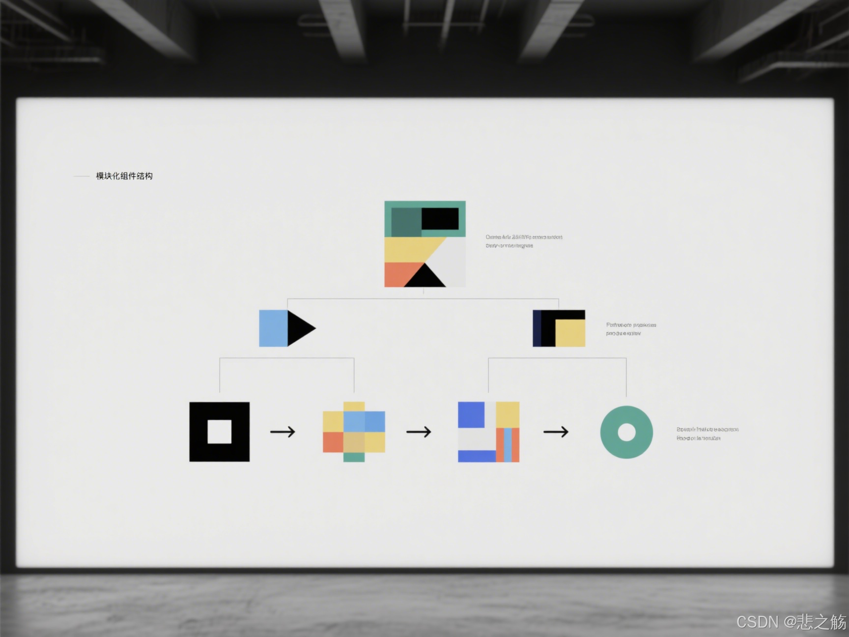
组件封装的黄金原则:可复用 ≠ 万能组件
很多初级前端开发者陷入一个误区:以为组件封装就是把所有功能塞进一个巨大的组件里,通过无数的props来控制不同行为。结果就是创造了一个看似强大,实则难用的"万能组件"。
记住这句话:好的组件不是万能的,而是专注的。
举个例子,假设我们要封装一个按钮组件,错误的思路是这样的:
// 反面教材:过度封装的按钮组件
<SuperButton
  text="提交"
  loading={loading}
  icon="send"
  shape="round"
  animation="pulse"
  hoverEffect="shadow"
  activeEffect="shrink"
  loadingPosition="right"
  loadingSize="small"
  popConfirm={{
    title: "确定提交吗?",
    okText: "确定",
    cancelText: "取消",
    placement: "top",
    // ... 还有20个配置项
  }}
  // ... 还有30个其他props
/>
乍一看很强大,实际使用时却需要查阅冗长的文档,甚至可能出现props冲突。真正好的组件封装遵循以下原则:
- 单一职责原则:一个组件只做一件事,做好这件事
- 高内聚、低耦合:相关功能聚集在组件内部,与外部的依赖降到最低
- 适当抽象:不为了封装而封装,抽象要有明确目的
- 遵循"开放封闭原则":对扩展开放,对修改封闭
如何封装一个"优雅"的组件?实战手把手教学
让我们以一个真实场景为例:封装一个通用的数据表格组件。很多人第一次尝试时会这样做:
// 初学者常犯的错误:一个包含所有功能的Table组件
function BigTable(props) {
  // 1000行代码处理各种边界情况
  // 排序、筛选、分页、展开行、合并单元格、编辑、选择、导出...

  return (
    <table>
      {/* 各种条件渲染 */}
    </table>
  );
}
这个组件虽然"功能强大",但实际上是一团乱麻,难以维护也难以扩展。现在,让我们看看如何正确封装:
步骤1:确定组件的核心职责
表格组件的核心是什么?展示数据。其他功能如排序、筛选、分页等都是辅助功能。因此,我们首先构建一个专注于展示数据的基础表格:
// 基础表格组件
function Table({ columns, dataSource }) {
  return (
    <table>
      <thead>
        <tr>
          {columns.map(column => (
            <th key={column.key}>{column.title}</th>
          ))}
        </tr>
      </thead>
      <tbody>
        {dataSource.map(record => (
          <tr key={record.id}>
            {columns.map(column => (
              <td key={`${record.id}-${column.key}`}>
                {column.render ? column.render(record[column.dataIndex], record) : record[column.dataIndex]}
              </td>
            ))}
          </tr>
        ))}
      </tbody>
    </table>
  );
}
步骤2:通过组合而非继承扩展功能
不要试图将所有功能塞进一个组件。相反,创建专注的功能组件,然后通过组合使用:
// 为表格添加排序功能的高阶组件
function withSorting(TableComponent) {
  return function SortableTable({ columns, dataSource, ...rest }) {
    const [sortedInfo, setSortedInfo] = useState({});

    const handleSort = (columnKey) => {
      // 排序逻辑
    };

    const sortedColumns = columns.map(column => ({
      ...column,
      sorter: column.sorter,
      sortOrder: sortedInfo.columnKey === column.key && sortedInfo.order,
      title: (
        <div onClick={() => column.sorter && handleSort(column.key)}>
          {column.title}
          {/* 排序图标 */}
        </div>
      )
    }));

    return <TableComponent columns={sortedColumns} dataSource={dataSource} {...rest} />;
  };
}

// 使用组合方式
const SortableTable = withSorting(Table);
步骤3:设计直观的API
好的组件API应该是直观的,开发者能够猜测出它的用法:
// 使用示例
<Table
  columns={[
    {
      title: '姓名',
      dataIndex: 'name',
      key: 'name',
      render: (text, record) => <a>{text}</a>
    },
    {
      title: '年龄',
      dataIndex: 'age',
      key: 'age',
      sorter: true
    }
  ]}
  dataSource={users}
/>
步骤4:提供合理的默认值和扩展点
优秀的组件应该"开箱即用",同时允许高级定制:
function Table({
  columns,
  dataSource,
  loading = false,
  emptyText = '暂无数据',
  rowKey = 'id',
  onRow = () => ({})
}) {
  if (loading) {
    return <LoadingIndicator />;
  }

  if (!dataSource.length) {
    return <EmptyState text={emptyText} />;
  }

  return (
    <table>
      {/* 表头和表身实现 */}
      <tbody>
        {dataSource.map(record => (
          <tr key={record[rowKey]} {...onRow(record)}>
            {/* 单元格渲染 */}
          </tr>
        ))}
      </tbody>
    </table>
  );
}

提升组件封装水平的5个高级技巧
1. 用TypeScript给组件添加类型保护
TypeScript不仅能提高代码质量,还能作为"活文档"指导组件使用:
// 使用TypeScript定义严格的props类型
interface ButtonProps {
  type?: 'primary' | 'default' | 'danger';
  size?: 'large' | 'medium' | 'small';
  loading?: boolean;
  disabled?: boolean;
  onClick?: (event: React.MouseEvent<HTMLButtonElement>) => void;
  children: React.ReactNode;
}

const Button: React.FC<ButtonProps> = ({
  type = 'default',
  size = 'medium',
  loading = false,
  disabled = false,
  onClick,
  children
}) => {
  // 实现逻辑
  return (
    <button
      className={`btn btn-${type} btn-${size}`}
      disabled={disabled || loading}
      onClick={onClick}
    >
      {loading && <Spinner />}
      {children}
    </button>
  );
};
类型定义不仅提供了代码补全,还能在编译时捕获错误,比如使用了不支持的按钮类型。
2. 使用Hooks抽取和复用逻辑
组件逻辑可以通过自定义Hook抽离,实现真正的逻辑复用:
// 抽离分页逻辑为可复用Hook
function usePagination(totalItems, defaultPageSize = 10) {
  const [current, setCurrent] = useState(1);
  const [pageSize, setPageSize] = useState(defaultPageSize);

  const totalPages = Math.ceil(totalItems / pageSize);

  const goToPage = (page) => {
    setCurrent(Math.min(Math.max(1, page), totalPages));
  };

  const next = () => goToPage(current + 1);
  const prev = () => goToPage(current - 1);

  return {
    current,
    pageSize,
    totalPages,
    goToPage,
    next,
    prev,
    setPageSize
  };
}

// 在表格组件中使用
function PaginatedTable({ columns, dataSource, pageSize = 10 }) {
  const pagination = usePagination(dataSource.length, pageSize);

  const currentPageData = dataSource.slice(
    (pagination.current - 1) * pagination.pageSize,
    pagination.current * pagination.pageSize
  );

  return (
    <>
      <Table columns={columns} dataSource={currentPageData} />
      <Pagination {...pagination} />
    </>
  );
}
3. 基于配置驱动的动态渲染
高级组件往往基于配置生成UI,而不是硬编码:
// 配置驱动的表单组件
const formConfig = {
  fields: [
    {
      type: 'input',
      name: 'username',
      label: '用户名',
      rules: [{ required: true, message: '请输入用户名' }]
    },
    {
      type: 'password',
      name: 'password',
      label: '密码',
      rules: [{ required: true, message: '请输入密码' }]
    },
    {
      type: 'select',
      name: 'role',
      label: '角色',
      options: [
        { label: '管理员', value: 'admin' },
        { label: '用户', value: 'user' }
      ]
    }
  ],
  layout: 'vertical',
  submitText: '登录'
};

function DynamicForm({ config, onSubmit }) {
  // 根据配置渲染表单
  return (
    <Form layout={config.layout} onFinish={onSubmit}>
      {config.fields.map(field => (
        <Form.Item
          key={field.name}
          name={field.name}
          label={field.label}
          rules={field.rules}
        >
          {renderField(field)}
        </Form.Item>
      ))}
      <Button type="primary" htmlType="submit">
        {config.submitText}
      </Button>
    </Form>
  );
}

function renderField(field) {
  switch (field.type) {
    case 'input':
      return <Input />;
    case 'password':
      return <Input.Password />;
    case 'select':
      return (
        <Select>
          {field.options.map(option => (
            <Select.Option key={option.value} value={option.value}>
              {option.label}
            </Select.Option>
          ))}
        </Select>
      );
    // 可扩展更多类型
    default:
      return null;
  }
}
4. 组件懒加载与性能优化
对于大型组件,可以使用懒加载减少初始加载时间:
// React中使用React.lazy懒加载组件
const HeavyChart = React.lazy(() => import('./HeavyChart'));

function Dashboard() {
  return (
    <div>
      <Suspense fallback={<LoadingSpinner />}>
        <HeavyChart />
      </Suspense>
    </div>
  );
}
同时,使用性能优化技巧避免不必要的渲染:
// 使用React.memo避免不必要的重渲染
const PriceDisplay = React.memo(({ price, currency }) => {
  console.log('PriceDisplay rendering');
  return (
    <div>
      {currency} {price.toFixed(2)}
    </div>
  );
});

// 只有price或currency改变时,组件才会重新渲染
5. 组件通信模式的选择
不同的组件通信方式适用于不同场景:
- Props下传:最基本的父子组件通信方式
- 回调函数:子组件向父组件通信
- Context API:跨多层组件传递数据
- 状态管理库:复杂应用中的全局状态管理
选择合适的通信模式对组件设计至关重要:
// 使用Context API避免props层层传递
const ThemeContext = React.createContext('light');

function App() {
  const [theme, setTheme] = useState('light');

  return (
    <ThemeContext.Provider value={theme}>
      <div>
        <Header />
        <Button onClick={() => setTheme(theme === 'light' ? 'dark' : 'light')}>
          切换主题
        </Button>
      </div>
    </ThemeContext.Provider>
  );
}

function Header() {
  return (
    <div>
      <Logo />
      <Nav />
    </div>
  );
}

function Nav() {
  const theme = useContext(ThemeContext);

  return (
    <nav className={`nav-${theme}`}>
      {/* 导航内容 */}
    </nav>
  );
}

职场实战:如何用组件封装"赢下"团队信任?
光会封装组件还不够,你需要让团队意识到你带来的价值。以下是我在多家公司实践过的策略:
建立组件文档
代码即文档是一个美好的愿景,但现实中,一个好的文档能极大提高组件的可用性:
/**
 * 通用按钮组件
 * @component
 * @example
 * // 基础用法
 * <Button>点击我</Button>
 *
 * // 不同类型
 * <Button type="primary">主要按钮</Button>
 * <Button type="danger">危险按钮</Button>
 *
 * // 加载状态
 * <Button loading>加载中</Button>
 *
 * @property {('default'|'primary'|'danger')} [type='default'] - 按钮类型
 * @property {('large'|'medium'|'small')} [size='medium'] - 按钮大小
 * @property {boolean} [loading=false] - 是否显示加载状态
 * @property {boolean} [disabled=false] - 是否禁用
 * @property {Function} [onClick] - 点击事件处理函数
 */
更进一步,可以使用Storybook这样的工具创建交互式组件文档:
// Button.stories.js
export default {
  title: 'Components/Button',
  component: Button,
  argTypes: {
    type: {
      control: { type: 'select', options: ['default', 'primary', 'danger'] }
    },
    size: {
      control: { type: 'radio', options: ['large', 'medium', 'small'] }
    },
    loading: { control: 'boolean' },
    disabled: { control: 'boolean' },
    onClick: { action: 'clicked' }
  }
};

const Template = args => <Button {...args} />;

export const Default = Template.bind({});
Default.args = {
  children: '默认按钮'
};

export const Primary = Template.bind({});
Primary.args = {
  type: 'primary',
  children: '主要按钮'
};

// 更多变体...
封装组件库并发布
将常用组件封装为私有NPM包,能大幅提高团队开发效率:
# 创建组件库结构
mkdir my-company-ui
cd my-company-ui
npm init -y

# 添加必要依赖
npm install --save-dev react react-dom typescript rollup

# 配置package.json
# ...

# 发布到私有NPM仓库
npm publish --access private
然后团队成员只需要:
npm install @my-company/ui
就可以使用统一的组件:
import { Button, Table, Modal } from '@my-company/ui';
统一设计规范
组件封装的终极目标是实现设计与开发的无缝协作:
// 定义设计标记
const tokens = {
  colors: {
    primary: '#1890ff',
    success: '#52c41a',
    warning: '#faad14',
    error: '#f5222d',
    // 更多颜色...
  },
  spacing: {
    xs: '4px',
    sm: '8px',
    md: '16px',
    lg: '24px',
    xl: '32px',
  },
  typography: {
    fontSizes: {
      xs: '12px',
      sm: '14px',
      md: '16px',
      lg: '20px',
      xl: '24px',
    },
    fontWeights: {
      normal: 400,
      medium: 500,
      bold: 600,
    },
  },
  // 其他设计标记...
};

// 在组件中使用
const Button = styled.button`
  background-color: ${props =>
    props.type === 'primary' ? tokens.colors.primary : 'transparent'
  };
  padding: ${tokens.spacing.sm} ${tokens.spacing.md};
  font-size: ${tokens.typography.fontSizes.md};
  font-weight: ${tokens.typography.fontWeights.medium};
  // 其他样式...
`;
这样,当设计师修改设计标记时,所有组件都会自动更新,保持一致性。
从业务代码中提炼通用组件
最有说服力的是从实际业务中提炼组件。当你看到团队成员重复编写类似代码时,这就是机会:
// 之前:团队成员各自实现相似功能
function TeamMember1Page() {
  const [isConfirmVisible, setIsConfirmVisible] = useState(false);
  const [confirmAction, setConfirmAction] = useState(null);

  const handleDelete = () => {
    setConfirmAction(() => deleteItem);
    setIsConfirmVisible(true);
  };

  return (
    <>
      <button onClick={handleDelete}>删除</button>

      {isConfirmVisible && (
        <div className="modal">
          <p>确定要删除吗?</p>
          <button onClick={() => {
            confirmAction();
            setIsConfirmVisible(false);
          }}>确定</button>
          <button onClick={() => setIsConfirmVisible(false)}>取消</button>
        </div>
      )}
    </>
  );
}

// 之后:提炼为通用确认组件
function useConfirm() {
  const [isVisible, setIsVisible] = useState(false);
  const [config, setConfig] = useState({});

  const showConfirm = (newConfig) => {
    setConfig(newConfig);
    setIsVisible(true);
  };

  const ConfirmModal = () => isVisible ? (
    <Modal
      visible={isVisible}
      title={config.title || "确认"}
      onOk={() => {
        config.onConfirm?.();
        setIsVisible(false);
      }}
      onCancel={() => {
        config.onCancel?.();
        setIsVisible(false);
      }}
    >
      {config.content}
    </Modal>
  ) : null;

  return [showConfirm, ConfirmModal];
}

// 使用提炼后的组件
function TeamMemberPage() {
  const [showConfirm, ConfirmModal] = useConfirm();

  const handleDelete = () => {
    showConfirm({
      title: "删除确认",
      content: "确定要删除这个项目吗?",
      onConfirm: deleteItem
    });
  };

  return (
    <>
      <button onClick={handleDelete}>删除</button>
      <ConfirmModal />
    </>
  );
}
一年后,我的代码从"屎山"变成了"艺术品"
回想一年前那个想转行卖煎饼果子的自己,现在我已经成为团队里的组件专家。最让我自豪的不是涨了多少薪水(虽然确实涨了不少),而是当新人加入团队时,他们会说:“你们的代码库真好懂,组件用起来特别方便。”
一个好的组件封装不仅能提升开发效率,更能提升整个团队的工程质量。它就像代码中的乐高积木,让我们能够搭建出更复杂、更可靠的系统。
从"我的功能能用就行"到"我要写出让团队受益的代码",这是每个开发者必经的成长路径。组件封装技巧不是与生俱来的天赋,而是通过实践和思考积累的经验。
对了,那位原本准备教训我的资深架构师,现在是我们部门的技术总监。他经常对新人说:"看看这套组件库,就是这小子从零做起来的。"每当此时,我都暗自庆幸当初没有真去卖煎饼果子。
如果你正面临着代码混乱、复用性差、团队协作困难的问题,不妨尝试本文介绍的组件封装技巧。也许一年后,你也会成为团队里的"组件达人"。
你有哪些组件封装的心得或问题?欢迎在评论区分享,我会一一回复。别忘了点赞、收藏和转发这篇文章,让更多前端开发者受益!


 扫一扫
扫一扫


 2715
2715

 被折叠的 条评论
为什么被折叠?
被折叠的 条评论
为什么被折叠?
 到【灌水乐园】发言


