


往期鸿蒙5.0全套实战文章必看:(文中附带全栈鸿蒙5.0学习资料)
swiper
滑动容器,提供切换子组件显示的能力。
说明
从API Version 8 开始支持。后续版本如有新增内容,则采用上角标单独标记该内容的起始版本。
属性
除支持通用属性外,还支持如下属性:
| 名称 | 类型 | 默认值 | 必填 | 描述 |
|---|---|---|---|---|
| index | number | 0 | 否 | 当前在容器中显示的子组件的索引值。 |
| indicator | boolean | true | 否 | 是否启用导航点指示器,默认true。 |
| digital | boolean | false | 否 | 是否启用数字导航点,默认为false。 必须设置indicator时才能生效数字导航点。 |
| loop | boolean | true | 否 | 是否开启循环滑动。 |
| duration | number | - | 否 | 子组件切换的动画时长。 |
| vertical | boolean | false | 否 | 是否为纵向滑动,纵向滑动时采用纵向的指示器。 |
样式
除支持通用样式外,还支持如下样式:
| 名称 | 类型 | 默认值 | 必填 | 描述 |
|---|---|---|---|---|
| indicator-color | <color> | - | 否 | 导航点指示器的填充颜色。 |
| indicator-selected-color | <color> | - | 否 | 导航点指示器选中的颜色。 |
| indicator-size | <length> | 4px | 否 | 导航点指示器的直径大小。 |
| indicator-top|left|right|bottom | <length> | <percentage> | - | 否 | 导航点指示器在swiper中的相对位置。 |
事件
支持通用事件。
示例
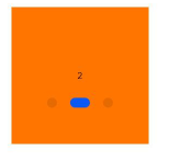
<!-- xxx.hml -->
<swiper class="container" index="{{index}}">
  <div class="swiper-item primary-item">
    <text>1</text>
  </div>
  <div class="swiper-item warning-item">
    <text>2</text>
  </div>
  <div class="swiper-item success-item">
    <text>3</text>
  </div>
</swiper>
/* xxx.css */
.container {
left: 0px;
top: 0px;
width: 454px;
height: 454px;
}
.swiper-item {
width: 454px;
height: 454px;
justify-content: center;
align-items: center;
}
.primary-item {
background-color: #007dff;
}
.warning-item {
background-color: #ff7500;
}
.success-item {
background-color: #41ba41;
}{
"data": {
"index": 1
}
}4*4卡片


 扫一扫
扫一扫


 1005
1005

 被折叠的 条评论
为什么被折叠?
被折叠的 条评论
为什么被折叠?
 到【灌水乐园】发言


