


往期鸿蒙5.0全套实战文章必看:(文中附带全栈鸿蒙5.0学习资料)
tabs
说明
从API version 4开始支持。后续版本如有新增内容,则采用上角标单独标记该内容的起始版本。
tab页签容器。
权限列表
无
子组件
仅支持<tab-bar>和<tab-content>。
属性
除支持通用属性外,还支持如下属性:
| 名称 | 类型 | 默认值 | 必填 | 描述 |
|---|---|---|---|---|
| index | number | 0 | 否 | 当前处于激活态的tab索引。 |
| vertical | boolean | false | 否 | 是否为纵向的tab,默认为false,可选值为: - false:tabbar和tabcontent上下排列。 - true:tabbar和tabcontent左右排列。 |
样式
支持通用样式。
事件
除支持通用事件外,还支持如下事件:
| 名称 | 参数 | 描述 |
|---|---|---|
| change | { index: indexValue } | tab页签切换后触发,动态修改index值不会触发该回调。 |
示例
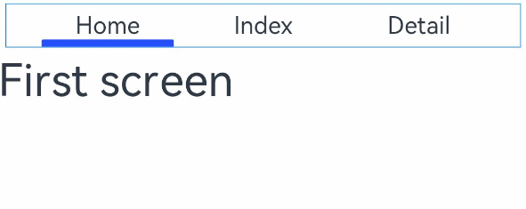
<!-- xxx.hml -->
<div class="container">
  <tabs class = "tabs" index="0" vertical="false" onchange="change">
    <tab-bar class="tab-bar" mode="fixed">
      <text class="tab-text">Home</text>
      <text class="tab-text">Index</text>
      <text class="tab-text">Detail</text>
    </tab-bar>
    <tab-content class="tabcontent" scrollable="true">
      <div class="item-content" >
        <text class="item-title">First screen</text>
      </div>
      <div class="item-content" >
        <text class="item-title">Second screen</text>
      </div>
      <div class="item-content" >
        <text class="item-title">Third screen</text>
      </div>
    </tab-content>
  </tabs>
</div>
/* xxx.css */
.container {
flex-direction: column;
justify-content: flex-start;
align-items: center;
}
.tabs {
width: 100%;
}
.tabcontent {
width: 100%;
height: 80%;
justify-content: center;
}
.item-content {
height: 100%;
justify-content: center;
}
.item-title {
font-size: 60px;
}
.tab-bar {
margin: 10px;
height: 60px;
border-color: #007dff;
border-width: 1px;
}
.tab-text {
width: 300px;
text-align: center;
}// xxx.js
export default {
change: function(e) {
console.log("Tab index: " + e.index);
},
}


 扫一扫
扫一扫


 1771
1771

 被折叠的 条评论
为什么被折叠?
被折叠的 条评论
为什么被折叠?
 到【灌水乐园】发言


