


往期鸿蒙5.0全套实战文章必看:(文中附带全栈鸿蒙5.0学习资料)
警告弹窗 (AlertDialog)
显示警告弹窗组件,可设置文本内容与响应回调。
说明
从API Version 7开始支持。后续版本如有新增内容,则采用上角标单独标记该内容的起始版本。
本模块功能依赖UI的执行上下文,不可在UI上下文不明确的地方使用,参见UIContext说明。
从API version 10开始,可以通过使用UIContext中的showAlertDialog来明确UI的执行上下文。
AlertDialog
show
static show(value: AlertDialogParamWithConfirm | AlertDialogParamWithButtons | AlertDialogParamWithOptions)
定义警告弹窗并弹出。
元服务API: 从API version 11开始,该接口支持在元服务中使用。
系统能力: SystemCapability.ArkUI.ArkUI.Full
参数:
| 参数名 | 类型 | 必填 | 说明 |
|---|---|---|---|
| value | AlertDialogParamWithConfirm | AlertDialogParamWithButtons | AlertDialogParamWithOptions10+ | 是 | 定义并显示AlertDialog组件。 |
AlertDialogParam对象说明
系统能力: SystemCapability.ArkUI.ArkUI.Full
| 名称 | 类型 | 必填 | 说明 |
|---|---|---|---|
| title | ResourceStr | 否 | 弹窗标题。 元服务API: 从API version 11开始,该接口支持在元服务中使用。 |
| subtitle10+ | ResourceStr | 否 | 弹窗副标题。 元服务API: 从API version 11开始,该接口支持在元服务中使用。 |
| message | ResourceStr | 是 | 弹窗内容。 元服务API: 从API version 11开始,该接口支持在元服务中使用。 |
| autoCancel | boolean | 否 | 点击遮障层时,是否关闭弹窗,true表示关闭弹窗。false表示不关闭弹窗。 默认值:true 元服务API: 从API version 11开始,该接口支持在元服务中使用。 |
| cancel | () => void | 否 | 点击遮障层关闭dialog时的回调。 元服务API: 从API version 11开始,该接口支持在元服务中使用。 |
| alignment | DialogAlignment | 否 | 弹窗在竖直方向上的对齐方式。 默认值:DialogAlignment.Default 元服务API: 从API version 11开始,该接口支持在元服务中使用。 说明: 若在UIExtension中设置showInSubWindow为true, 弹窗将基于UIExtension的宿主窗口对齐。 |
| offset | Offset | 否 | 弹窗相对alignment所在位置的偏移量。 默认值:{ dx: 0 , dy: 0 } 元服务API: 从API version 11开始,该接口支持在元服务中使用。 |
| gridCount | number | 否 | 弹窗容器宽度所占用栅格数。 默认值:4 元服务API: 从API version 11开始,该接口支持在元服务中使用。 |
| maskRect10+ | Rectangle | 否 | 弹窗遮蔽层区域,在遮蔽层区域内的事件不透传,在遮蔽层区域外的事件透传。 默认值:{ x: 0, y: 0, width: '100%', height: '100%' } 说明: showInSubWindow为true时,maskRect不生效。 元服务API: 从API version 11开始,该接口支持在元服务中使用。 |
| showInSubWindow11+ | boolean | 否 | 某弹框需要显示在主窗口之外时,是否在子窗口显示此弹窗。 默认值:false,弹窗显示在应用内,而非独立子窗口。 说明:showInSubWindow为true的弹窗无法触发显示另一个showInSubWindow为true的弹窗。 元服务API: 从API version 12开始,该接口支持在元服务中使用。 |
| isModal11+ | boolean | 否 | 弹窗是否为模态窗口,模态窗口有蒙层,非模态窗口无蒙层。 默认值:true,此时弹窗有蒙层。 元服务API: 从API version 12开始,该接口支持在元服务中使用。 |
| backgroundColor11+ | ResourceColor | 否 | 弹窗背板颜色。 默认值:Color.Transparent 说明: 当设置了backgroundColor为非透明色时,backgroundBlurStyle需要设置为BlurStyle.NONE,否则颜色显示将不符合预期效果。 元服务API: 从API version 12开始,该接口支持在元服务中使用。 |
| backgroundBlurStyle11+ | BlurStyle | 否 | 弹窗背板模糊材质。 默认值:BlurStyle.COMPONENT_ULTRA_THICK 说明: 设置为BlurStyle.NONE即可关闭背景虚化。当设置了backgroundBlurStyle为非NONE值时,则不要设置backgroundColor,否则颜色显示将不符合预期效果。 元服务API: 从API version 12开始,该接口支持在元服务中使用。 |
| onWillDismiss12+ | Callback<DismissDialogAction> | 否 | 交互式关闭回调函数。 说明: 1.当用户执行点击遮障层关闭、左滑/右滑、三键back、键盘ESC关闭交互操作时,如果注册该回调函数,则不会立刻关闭弹窗。在回调函数中可以通过reason得到阻拦关闭弹窗的操作类型,从而根据原因选择是否能关闭弹窗。当前组件返回的reason中,暂不支持CLOSE_BUTTON的枚举值。 2.在onWillDismiss回调中,不能再做onWillDismiss拦截。 元服务API: 从API version 12开始,该接口支持在元服务中使用。 |
| cornerRadius12+ | BorderRadiuses | Dimension | LocalizedBorderRadiuses | 否 | 设置背板的圆角半径。 可分别设置4个圆角的半径。 默认值:{ topLeft: '32vp', topRight: '32vp', bottomLeft: '32vp', bottomRight: '32vp' } 圆角大小受组件尺寸限制,最大值为组件宽或高的一半,若值为负,则按照默认值处理。 百分比参数方式:以父元素弹窗宽和高的百分比来设置弹窗的圆角。 说明: 当cornerRadius属性类型为LocalizedBorderRadiuses时,支持随语言习惯改变布局顺序。 元服务API: 从API version 12开始,该接口支持在元服务中使用。 |
| transition12+ | TransitionEffect | 否 | 设置弹窗显示和退出的过渡效果。 说明: 1.如果不设置,则使用默认的显示/退出动效。 2.显示动效中按back键,打断显示动效,执行退出动效,动画效果为显示动效与退出动效的曲线叠加后的效果。 3.退出动效中按back键,不会打断退出动效,退出动效继续执行,继续按back键退出应用。 元服务API: 从API version 12开始,该接口支持在元服务中使用。 |
| width12+ | Dimension | 否 | 设置弹窗背板的宽度。 说明: - 弹窗宽度默认最大值:400vp。 - 百分比参数方式:弹窗参考宽度为所在窗口的宽度,在此基础上调小或调大。 元服务API: 从API version 12开始,该接口支持在元服务中使用。 |
| height12+ | Dimension | 否 | 设置弹窗背板的高度。 说明: - 弹窗高度默认最大值:0.9 *(窗口高度 - 安全区域)。 - 百分比参数方式:弹窗参考高度为(窗口高度 - 安全区域),在此基础上调小或调大。 元服务API: 从API version 12开始,该接口支持在元服务中使用。 |
| borderWidth12+ | Dimension | EdgeWidths | LocalizedEdgeWidths | 否 | 可分别设置4个边框宽度。 默认值:0 百分比参数方式:以父元素弹窗宽的百分比来设置弹窗的边框宽度。 当弹窗左边框和右边框大于弹窗宽度,弹窗上边框和下边框大于弹窗高度,显示可能不符合预期。 说明: 当borderWidth属性类型为LocalizedEdgeWidths时,支持随语言习惯改变布局顺序。 元服务API: 从API version 12开始,该接口支持在元服务中使用。 |
| borderColor12+ | ResourceColor | EdgeColors | LocalizedEdgeColors | 否 | 设置弹窗背板的边框颜色。 默认值:Color.Black 如果使用borderColor属性,需要和borderWidth属性一起使用。说明: 当borderColor属性类型为LocalizedEdgeColors时,支持随语言习惯改变布局顺序。 元服务API: 从API version 12开始,该接口支持在元服务中使用。 |
| borderStyle12+ | BorderStyle | EdgeStyles | 否 | 设置弹窗背板的边框样式。 默认值:BorderStyle.Solid 如果使用borderStyle属性,需要和borderWidth属性一起使用。 元服务API: 从API version 12开始,该接口支持在元服务中使用。 |
| shadow12+ | ShadowOptions | ShadowStyle | 否 | 设置弹窗背板的阴影。 当设备为2in1时,默认场景下获焦阴影值为ShadowStyle.OUTER_FLOATING_MD,失焦为ShadowStyle.OUTER_FLOATING_SM 元服务API: 从API version 12开始,该接口支持在元服务中使用。 |
| textStyle12+ | TextStyle | 否 | 设置弹窗message内容的文本样式。 元服务API: 从API version 12开始,该接口支持在元服务中使用。 |
AlertDialogParamWithConfirm对象说明
继承自AlertDialogParam。
元服务API: 从API version 11开始,该接口支持在元服务中使用。
系统能力: SystemCapability.ArkUI.ArkUI.Full
| 名称 | 类型 | 必填 | 说明 |
|---|---|---|---|
| confirm | { enabled10+?: boolean, defaultFocus10+?: boolean, style10+?: DialogButtonStyle, value: ResourceStr, fontColor?: ResourceColor, backgroundColor?: ResourceColor, action: () => void } | 否 | 确认Button的使能状态、默认焦点、按钮风格、文本内容、文本色、按钮背景色和点击回调。在弹窗获焦且未进行tab键走焦时,该按钮默认响应Enter键,且多重弹窗可自动获焦连续响应。默认响应Enter键能力在defaultFocus为true时不生效。 enabled:点击Button是否响应,true表示Button可以响应,false表示Button不可以响应。 默认值:true defaultFocus:设置Button是否是默认焦点,true表示Button是默认焦点,false表示Button不是默认焦点。 默认值:false style:设置Button的风格样式。 默认值:DialogButtonStyle.DEFAULT。 value:Button文本内容。 fontColor:Button文本颜色。 backgroundColor:Button背景颜色。 action: Button选中时的回调。 |
confirm参数优先级:fontColor、backgroundColor > style > defaultFocus
| backgroundColor | fontColor | style | defaultFocus | 效果 |
|---|---|---|---|---|
| 绿底 | 红字 | - | - | 绿底红字 |
| 绿底 | - | DialogButtonStyle.HIGHLIGHT | - | 绿底白字 |
| 绿底 | - | DialogButtonStyle.DEFAULT | - | 绿底蓝字 |
| 绿底 | - | - | TRUE | 绿底白字 |
| 绿底 | - | - | FALSE/- | 绿底蓝字 |
| - | 红字 | DialogButtonStyle.HIGHLIGHT | - | 蓝底红字 |
| - | 红字 | DialogButtonStyle.DEFAULT | - | 白底红字 |
| - | 红字 | - | TRUE | 蓝底红字 |
| - | 红字 | - | FALSE/- | 白底红字 |
| - | - | DialogButtonStyle.HIGHLIGHT | - | 蓝底白字 |
| - | - | DialogButtonStyle.DEFAULT | - | 白底蓝字 |
| - | - | - | TRUE | 蓝底白字 |
| - | - | - | FALSE/- | 白底蓝字 |
AlertDialogParamWithButtons对象说明
继承自AlertDialogParam。
元服务API: 从API version 11开始,该接口支持在元服务中使用。
系统能力: SystemCapability.ArkUI.ArkUI.Full
| 名称 | 类型 | 必填 | 说明 |
|---|---|---|---|
| primaryButton | { enabled10+?: boolean, defaultFocus10+?: boolean, style10+?: DialogButtonStyle, value: ResourceStr, fontColor?: ResourceColor, backgroundColor?: ResourceColor, action: () => void; } | 是 | 确认Button的使能状态、默认焦点、按钮风格、文本内容、文本色、按钮背景色和点击回调。在弹窗获焦且未进行tab键走焦时,该按钮默认响应Enter键,且多重弹窗可自动获焦连续响应。默认响应Enter键能力在defaultFocus为true时不生效。 enabled:点击Button是否响应。 默认值:true defaultFocus:设置Button是否是默认焦点。 默认值:false style:设置Button的风格样式。 默认值:DialogButtonStyle.DEFAULT。 value:Button文本内容。 fontColor:Button文本颜色。 backgroundColor:Button背景颜色。 action: Button选中时的回调。 |
| secondaryButton | { enabled10+?: boolean, defaultFocus10+?: boolean, style10+?: DialogButtonStyle, value: ResourceStr, fontColor?: ResourceColor, backgroundColor?: ResourceColor, action: () => void; } | 是 | 确认Button的使能状态、默认焦点、按钮风格、文本内容、文本色、按钮背景色和点击回调。 enabled:点击Button是否响应。 默认值:true。 defaultFocus:设置Button是否是默认焦点。 默认值:false。 style:设置Button的风格样式。 默认值:DialogButtonStyle.DEFAULT。 value:Button文本内容。 fontColor:Button文本颜色。 backgroundColor:Button背景颜色。 action: Button选中时的回调。 |
AlertDialogParamWithOptions10+对象说明
继承自AlertDialogParam。
元服务API: 从API version 11开始,该接口支持在元服务中使用。
系统能力: SystemCapability.ArkUI.ArkUI.Full
| 名称 | 类型 | 必填 | 说明 |
|---|---|---|---|
| buttons10+ | Array<AlertDialogButtonOptions> | 是 | 弹窗容器中的多个按钮。 |
| buttonDirection10+ | DialogButtonDirection | 否 | 按钮排布方向默认值为DialogButtonDirection.AUTO,建议3个以上按钮使用Auto模式(两个以上按钮会切换为纵向模式,通常能显示更多按钮),非Auto模式下,3个以上按钮可能会显示不全,超出显示范围的按钮会被截断。 |
AlertDialogButtonOptions10+对象说明
系统能力: SystemCapability.ArkUI.ArkUI.Full
| 名称 | 类型 | 必填 | 说明 |
|---|---|---|---|
| enabled | boolean | 否 | 点击Button是否响应,默认值true。 元服务API: 从API version 11开始,该接口支持在元服务中使用。 |
| defaultFocus | boolean | 否 | 设置Button是否是默认焦点,默认值false。 元服务API: 从API version 11开始,该接口支持在元服务中使用。 |
| style | DialogButtonStyle | 否 | 设置Button的风格样式,默认值DialogButtonStyle.DEFAULT。 元服务API: 从API version 11开始,该接口支持在元服务中使用。 |
| value | ResourceStr | 是 | Button的文本内容,若值为null,则该按钮不显示。 元服务API: 从API version 11开始,该接口支持在元服务中使用。 |
| fontColor | ResourceColor | 否 | Button的文本颜色。 元服务API: 从API version 11开始,该接口支持在元服务中使用。 |
| backgroundColor | ResourceColor | 否 | Button背景颜色。 元服务API: 从API version 11开始,该接口支持在元服务中使用。 |
| action | () => void | 是 | Button选中时的回调。 元服务API: 从API version 11开始,该接口支持在元服务中使用。 |
| primary12+ | boolean | 否 | 在弹窗获焦且未进行tab键走焦时,按钮是否默认响应Enter键。多个Button时,只允许一个Button的该字段配置为true,否则所有Button均不响应。多重弹窗可自动获焦连续响应。在defaultFocus为true时不生效。 元服务API: 从API version 12开始,该接口支持在元服务中使用。 |
DialogButtonDirection10+枚举说明
元服务API: 从API version 11开始,该接口支持在元服务中使用。
系统能力: SystemCapability.ArkUI.ArkUI.Full
| 名称 | 描述 |
|---|---|
| AUTO | 两个及以下按钮水平排布,两个以上为竖直排布。 |
| HORIZONTAL | 按钮水平布局。 |
| VERTICAL | 按钮竖直布局。 |
DialogAlignment枚举说明
元服务API: 从API version 11开始,该接口支持在元服务中使用。
系统能力: SystemCapability.ArkUI.ArkUI.Full
| 名称 | 描述 |
|---|---|
| Top | 垂直顶部对齐。 |
| Center | 垂直居中对齐。 |
| Bottom | 垂直底部对齐。 |
| Default | 默认对齐。 |
| TopStart8+ | 左上对齐。 |
| TopEnd8+ | 右上对齐。 |
| CenterStart8+ | 左中对齐。 |
| CenterEnd8+ | 右中对齐。 |
| BottomStart8+ | 左下对齐。 |
| BottomEnd8+ | 右下对齐。 |
Rectangle8+类型说明
Rectangle是各种Dialog中maskRect参数的类型。
卡片能力: 从API version 9开始,该接口支持在ArkTS卡片中使用。
元服务API: 从API version 11开始,该接口支持在元服务中使用。
系统能力: SystemCapability.ArkUI.ArkUI.Full
| 名称 | 类型 | 必填 | 说明 |
|---|---|---|---|
| x | Length | 否 | 弹窗遮蔽层区域相对于窗口左上角的x轴坐标。 默认值:0vp |
| y | Length | 否 | 弹窗遮蔽层区域相对于窗口左上角的y轴坐标。 默认值:0vp |
| width | Length | 否 | 弹窗遮蔽层区域的宽度。 默认值:'100%' |
| height | Length | 否 | 弹窗遮蔽层区域的高度。 默认值:'100%' |
说明
x和y可以设置正负值百分比。当x设置为'100%'时表示遮蔽层区域往右偏移窗口本身宽度大小,当x设置为'-100%'时表示遮蔽层区域往左偏移窗口本身宽度大小。当y设置为'100%'时表示遮蔽层区域往下偏移窗口本身高度大小,当y设置为'-100%'时表示遮蔽层区域往上偏移窗口本身高度大小。
width和height只能设置正值,支持百分比,如果设置为负值,那么该值将被重置为默认值。
百分比相对于窗口自身宽高进行计算。
DismissDialogAction12+
Dialog关闭的信息。
元服务API: 从API version 12开始,该接口支持在元服务中使用。
系统能力: SystemCapability.ArkUI.ArkUI.Full
属性
| 名称 | 类型 | 可读 | 可写 | 说明 |
|---|---|---|---|---|
| dismiss | Callback<void> | 否 | 否 | Dialog关闭回调函数。开发者需要退出时调用,不需要退出时无需调用。 |
| reason | DismissReason | 否 | 否 | Dialog无法关闭原因。根据开发者需要选择不同操作下,Dialog是否需要关闭。 |
TextStyle12+对象说明
元服务API: 从API version 12开始,该接口支持在元服务中使用。
系统能力: SystemCapability.ArkUI.ArkUI.Full
| 名称 | 类型 | 必填 | 说明 |
|---|---|---|---|
| wordBreak | WordBreak | 否 | 弹窗message内容的文本截断方式。 默认值:WordBreak.BREAK_ALL |
示例
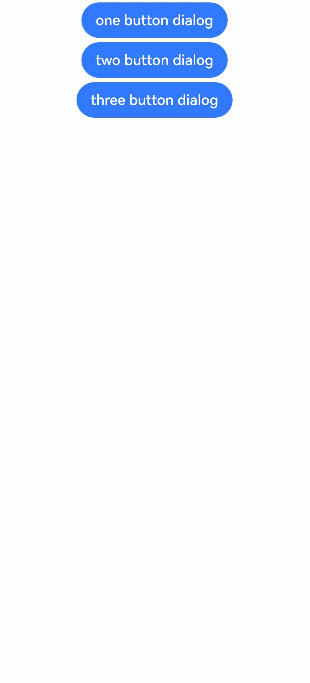
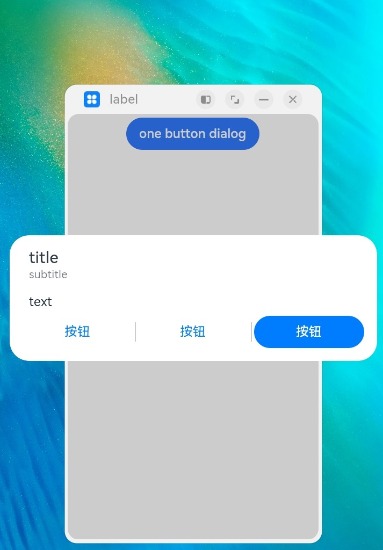
示例1(弹出多个按钮的弹窗)
说明
直接使用AlertDialog可能导致实例不明确的问题,建议使用getUIContext获取UIContext实例,并使用showAlertDialog调用绑定实例的AlertDialog.show()。
该示例实现了分别弹出一、二、三个按钮的弹窗。
// xxx.ets
@Entry
@Component
struct AlertDialogExample {
  build() {
    Column({ space: 5 }) {
      Button('one button dialog')
        .onClick(() => {
          // 建议使用this.getUIContext().showAlertDialog()
          AlertDialog.show(
            {
              title: 'title',
              message: 'text',
              autoCancel: true,
              alignment: DialogAlignment.Bottom,
              offset: { dx: 0, dy: -20 },
              gridCount: 3,
              confirm: {
                value: 'button',
                action: () => {
                  console.info('Button-clicking callback')
                }
              },
              cancel: () => {
                console.info('Closed callbacks')
              },
              onWillDismiss:(dismissDialogAction: DismissDialogAction)=> {
                console.info("reason=" + JSON.stringify(dismissDialogAction.reason))
                console.log("dialog onWillDismiss")
                if (dismissDialogAction.reason == DismissReason.PRESS_BACK) {
                  dismissDialogAction.dismiss()
                }
                if (dismissDialogAction.reason == DismissReason.TOUCH_OUTSIDE) {
                  dismissDialogAction.dismiss()
                }
              }
            }
          )
        })
        .backgroundColor(0x317aff)
      Button('two button dialog')
        .onClick(() => {
          // 建议使用this.getUIContext().showAlertDialog()
          AlertDialog.show(
            {
              title: 'title',
              subtitle: 'subtitle',
              message: 'text',
              autoCancel: true,
              alignment: DialogAlignment.Bottom,
              gridCount: 4,
              offset: { dx: 0, dy: -20 },
              primaryButton: {
                value: 'cancel',
                action: () => {
                  console.info('Callback when the first button is clicked')
                }
              },
              secondaryButton: {
                enabled: true,
                defaultFocus: true,
                style: DialogButtonStyle.HIGHLIGHT,
                value: 'ok',
                action: () => {
                  console.info('Callback when the second button is clicked')
                }
              },
              cancel: () => {
                console.info('Closed callbacks')
              },
              onWillDismiss:(dismissDialogAction: DismissDialogAction)=> {
                console.info("reason=" + JSON.stringify(dismissDialogAction.reason))
                console.log("dialog onWillDismiss")
                if (dismissDialogAction.reason == DismissReason.PRESS_BACK) {
                  dismissDialogAction.dismiss()
                }
                if (dismissDialogAction.reason == DismissReason.TOUCH_OUTSIDE) {
                  dismissDialogAction.dismiss()
                }
              }
            }
          )
        }).backgroundColor(0x317aff)
        Button('three button dialog')
        .onClick(() => {
          // 建议使用this.getUIContext().showAlertDialog()
          AlertDialog.show(
            {
              title: 'title',
              subtitle: 'subtitle',
              message: 'text',
              autoCancel: true,
              alignment: DialogAlignment.Bottom,
              gridCount: 4,
              offset: { dx: 0, dy: -20 },
              buttonDirection: DialogButtonDirection.HORIZONTAL,
              buttons: [
                {
                  value: '按钮',
                  action: () => {
                    console.info('Callback when button1 is clicked')
                  }
                },
                {
                  value: '按钮',
                  action: () => {
                    console.info('Callback when button2 is clicked')
                  }
                },
                {
                  value: '按钮',
                  enabled: true,
                  defaultFocus: true,
                  style: DialogButtonStyle.HIGHLIGHT,
                  action: () => {
                    console.info('Callback when button3 is clicked')
                  }
                },
              ],
              cancel: () => {
                console.info('Closed callbacks')
              },
              onWillDismiss:(dismissDialogAction: DismissDialogAction)=> {
                console.info("reason=" + JSON.stringify(dismissDialogAction.reason))
                console.log("dialog onWillDismiss")
                if (dismissDialogAction.reason == DismissReason.PRESS_BACK) {
                  dismissDialogAction.dismiss()
                }
                if (dismissDialogAction.reason == DismissReason.TOUCH_OUTSIDE) {
                  dismissDialogAction.dismiss()
                }
              }
            }
          )
        }).backgroundColor(0x317aff)
    }.width('100%').margin({ top: 5 })
  }
}
示例2(可在主窗外弹出的弹窗)
该示例通过配置showInSubWindow为true弹出可以在主窗外显示的弹窗。
说明
直接使用AlertDialog可能导致实例不明确的问题,建议使用getUIContext获取UIContext实例,并使用showAlertDialog调用绑定实例的AlertDialog.show()。
// xxx.ets
@Entry
@Component
struct AlertDialogExample {
  build() {
    Column({ space: 5 }) {
      Button('one button dialog')
        .onClick(() => {
          // 建议使用this.getUIContext().showAlertDialog()
          AlertDialog.show(
            {
              title: 'title',
              subtitle: 'subtitle',
              message: 'text',
              autoCancel: true,
              alignment: DialogAlignment.Center,
              gridCount: 4,
              showInSubWindow: true,
              isModal: true,
              offset: { dx: 0, dy: -20 },
              buttonDirection: DialogButtonDirection.HORIZONTAL,
              buttons: [
                {
                  value: '按钮',
                  action: () => {
                    console.info('Callback when button1 is clicked')
                  }
                },
                {
                  value: '按钮',
                  action: () => {
                    console.info('Callback when button2 is clicked')
                  }
                },
                {
                  value: '按钮',
                  enabled: true,
                  defaultFocus: true,
                  style: DialogButtonStyle.HIGHLIGHT,
                  action: () => {
                    console.info('Callback when button3 is clicked')
                  }
                },
              ],
              cancel: () => {
                console.info('Closed callbacks')
              },
              onWillDismiss: (dismissDialogAction: DismissDialogAction) => {
                console.info("reason=" + JSON.stringify(dismissDialogAction.reason))
                console.log("dialog onWillDismiss")
                if (dismissDialogAction.reason == DismissReason.PRESS_BACK) {
                  dismissDialogAction.dismiss()
                }
                if (dismissDialogAction.reason == DismissReason.TOUCH_OUTSIDE) {
                  dismissDialogAction.dismiss()
                }
              }
            })
        })
    }.width('100%').margin({ top: 5 }).backgroundColor(0x317aff)
  }
}
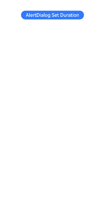
示例3(设置弹窗的动画)
该示例通过配置transition实现弹窗的显示和消失动画。
说明
直接使用AlertDialog可能导致实例不明确的问题,建议使用getUIContext获取UIContext实例,并使用showAlertDialog调用绑定实例的AlertDialog.show()。
// xxx.ets
@Entry
@Component
struct AlertDialogExample {
  build() {
    Column({ space: 5 }) {
      Button('AlertDialog Set Duration')
        .onClick(()=>{
            // 建议使用this.getUIContext().showAlertDialog()
            AlertDialog.show(
              {
                title: 'AlertDialog 1',
                message: 'Set Animation Duration open 3 second, close 100ms',
                autoCancel: true,
                alignment: DialogAlignment.Top,
                offset: { dx: 0, dy: -20 },
                gridCount: 3,
                transition:TransitionEffect.asymmetric(TransitionEffect.OPACITY
                  .animation({ duration: 3000, curve: Curve.Sharp }).combine(TransitionEffect.scale({x: 1.5, y: 1.5}).animation({duration: 3000, curve: Curve.Sharp})),
                  TransitionEffect.OPACITY.animation({ duration: 100, curve: Curve.Smooth })
                    .combine(TransitionEffect.scale({x: 0.5, y: 0.5}).animation({duration: 100, curve: Curve.Smooth}))),
                confirm: {
                  value: 'button',
                  action: () => {
                    console.info('Button-clicking callback')
                  }
                },
                cancel: () => {
                  console.info('Closed callbacks')
                }
              }
            )
        })
        .backgroundColor(0x317aff).height("88px")
    }.width('100%').margin({ top: 5 })
  }
}
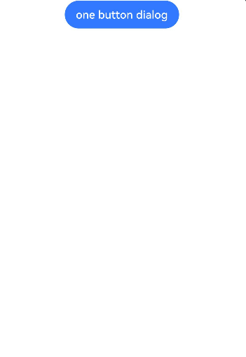
示例4(设置弹窗的样式)
该示例定义了AlertDialog的样式,如宽度、高度、背景色、阴影等等。
说明
直接使用AlertDialog可能导致实例不明确的问题,建议使用getUIContext获取UIContext实例,并使用showAlertDialog调用绑定实例的AlertDialog.show()。
// xxx.ets
@Entry
@Component
struct AlertDialogExample {
  build() {
    Column({ space: 5 }) {
      Button('one button dialog')
        .onClick(() => {
          // 建议使用this.getUIContext().showAlertDialog()
          AlertDialog.show(
            {
              title: 'title',
              message: 'text',
              autoCancel: true,
              alignment: DialogAlignment.Center,
              offset: { dx: 0, dy: -20 },
              gridCount: 3,
              width: 300,
              height: 200,
              cornerRadius: 20,
              borderWidth: 1,
              borderStyle: BorderStyle.Dashed,//使用borderStyle属性,需要和borderWidth属性一起使用
              borderColor: Color.Blue,//使用borderColor属性,需要和borderWidth属性一起使用
              backgroundColor: Color.White,
              shadow: ({ radius: 20, color: Color.Grey, offsetX: 50, offsetY: 0}),
              textStyle: { wordBreak: WordBreak.BREAK_ALL },
              confirm: {
                value: 'button',
                action: () => {
                  console.info('Button-clicking callback')
                }
              },
              cancel: () => {
                console.info('Closed callbacks')
              },
              onWillDismiss:(dismissDialogAction: DismissDialogAction)=> {
                console.info("reason=" + JSON.stringify(dismissDialogAction.reason))
                console.log("dialog onWillDismiss")
                if (dismissDialogAction.reason == DismissReason.PRESS_BACK) {
                  dismissDialogAction.dismiss()
                }
                if (dismissDialogAction.reason == DismissReason.TOUCH_OUTSIDE) {
                  dismissDialogAction.dismiss()
                }
              }
            }
          )
        })
        .backgroundColor(0x317aff)
    }.width('100%').margin({ top: 5 })
  }
}


 扫一扫
扫一扫


 1311
1311

 被折叠的 条评论
为什么被折叠?
被折叠的 条评论
为什么被折叠?
 到【灌水乐园】发言


