


往期鸿蒙5.0全套实战文章必看:(文中附带全栈鸿蒙5.0学习资料)
TextTimer
通过文本显示计时信息并控制其计时器状态的组件。
在组件不可见时时间变动将停止,组件的可见状态基于onVisibleAreaChange处理,可见阈值ratios大于0即视为可见状态。
说明
该组件从API Version 8开始支持。后续版本如有新增内容,则采用上角标单独标记该内容的起始版本。
子组件
无
接口
TextTimer(options?: TextTimerOptions)
卡片能力: 从API version 10开始,该接口支持在ArkTS卡片中使用。
元服务API: 从API version 11开始,该接口支持在元服务中使用。
系统能力: SystemCapability.ArkUI.ArkUI.Full
参数:
| 参数名 | 类型 | 必填 | 说明 |
|---|---|---|---|
| options | TextTimerOptions | 否 | 通过文本显示计时信息并控制其计时器状态的组件参数。 |
TextTimerOptions对象说明
卡片能力: 从API version 10开始,该接口支持在ArkTS卡片中使用。
元服务API: 从API version 11开始,该接口支持在元服务中使用。
系统能力: SystemCapability.ArkUI.ArkUI.Full
| 名称 | 类型 | 必填 | 说明 |
|---|---|---|---|
| isCountDown | boolean | 否 | 是否倒计时。值为true时,计时器开启倒计时,值为false时,计时器开始计时。 默认值:false |
| count | number | 否 | 计时器时间(isCountDown为true时生效),单位为毫秒。最长不超过86400000毫秒(24小时)。 0<count<86400000时,count值为计时器初始值。否则,使用默认值为计时器初始值。 默认值:60000 |
| controller | TextTimerController | 否 | TextTimer控制器。 |
属性
除支持通用属性外,还支持以下属性:
format
format(value: string)
设置自定义格式,需至少包含一个HH、mm、ss、SS中的关键字。如使用yy、MM、dd等日期格式,则使用默认值。
卡片能力: 从API version 10开始,该接口支持在ArkTS卡片中使用。
元服务API: 从API version 11开始,该接口支持在元服务中使用。
系统能力: SystemCapability.ArkUI.ArkUI.Full
参数:
| 参数名 | 类型 | 必填 | 说明 |
|---|---|---|---|
| value | string | 是 | 自定义格式。 默认值:'HH:mm:ss.SS' |
fontColor
fontColor(value: ResourceColor)
设置字体颜色。
卡片能力: 从API version 10开始,该接口支持在ArkTS卡片中使用。
元服务API: 从API version 11开始,该接口支持在元服务中使用。
系统能力: SystemCapability.ArkUI.ArkUI.Full
参数:
| 参数名 | 类型 | 必填 | 说明 |
|---|---|---|---|
| value | ResourceColor | 是 | 字体颜色。 |
fontSize
fontSize(value: Length)
设置字体大小。
卡片能力: 从API version 10开始,该接口支持在ArkTS卡片中使用。
元服务API: 从API version 11开始,该接口支持在元服务中使用。
系统能力: SystemCapability.ArkUI.ArkUI.Full
参数:
| 参数名 | 类型 | 必填 | 说明 |
|---|---|---|---|
| value | Length | 是 | 字体大小。fontSize为number类型时,使用fp单位。字体默认大小16fp。不支持设置百分比字符串。 |
fontStyle
fontStyle(value: FontStyle)
设置字体样式。
卡片能力: 从API version 10开始,该接口支持在ArkTS卡片中使用。
元服务API: 从API version 11开始,该接口支持在元服务中使用。
系统能力: SystemCapability.ArkUI.ArkUI.Full
参数:
| 参数名 | 类型 | 必填 | 说明 |
|---|---|---|---|
| value | FontStyle | 是 | 字体样式。 默认值:FontStyle.Normal |
fontWeight
fontWeight(value: number | FontWeight | string)
设置文本的字体粗细,设置过大可能会在不同字体下有截断。
卡片能力: 从API version 10开始,该接口支持在ArkTS卡片中使用。
元服务API: 从API version 11开始,该接口支持在元服务中使用。
系统能力: SystemCapability.ArkUI.ArkUI.Full
参数:
| 参数名 | 类型 | 必填 | 说明 |
|---|---|---|---|
| value | number | FontWeight | string | 是 | 文本的字体粗细,number类型取值[100, 900],取值间隔为100,默认为400,取值越大,字体越粗。string类型仅支持number类型取值的字符串形式,例如"400",以及"bold"、"bolder"、"lighter"、"regular"、"medium",分别对应FontWeight中相应的枚举值。 默认值:FontWeight.Normal |
fontFamily
fontFamily(value: ResourceStr)
设置字体列表。
卡片能力: 从API version 10开始,该接口支持在ArkTS卡片中使用。
元服务API: 从API version 11开始,该接口支持在元服务中使用。
系统能力: SystemCapability.ArkUI.ArkUI.Full
参数:
| 参数名 | 类型 | 必填 | 说明 |
|---|---|---|---|
| value | ResourceStr | 是 | 字体列表。默认字体'HarmonyOS Sans'。 应用当前支持'HarmonyOS Sans'字体和注册自定义字体。 卡片当前仅支持'HarmonyOS Sans'字体。 |
textShadow11+
textShadow(value: ShadowOptions | Array<ShadowOptions>)
设置文字阴影效果。该接口支持以数组形式入参,实现多重文字阴影。不支持fill字段, 不支持智能取色模式。
元服务API: 从API version 12开始,该接口支持在元服务中使用。
系统能力: SystemCapability.ArkUI.ArkUI.Full
参数:
| 参数名 | 类型 | 必填 | 说明 |
|---|---|---|---|
| value | ShadowOptions | Array<ShadowOptions> | 是 | 文字阴影效果。 |
contentModifier12+
contentModifier(modifier: ContentModifier<TextTimerConfiguration>)
定制TextTimer内容区的方法。
元服务API: 从API version 12开始,该接口支持在元服务中使用。
系统能力: SystemCapability.ArkUI.ArkUI.Full
参数:
| 参数名 | 类型 | 必填 | 说明 |
|---|---|---|---|
| modifier | ContentModifier<TextTimerConfiguration> | 是 | 在TextTimer组件上,定制内容区的方法。 modifier: 内容修改器,开发者需要自定义class实现ContentModifier接口。 |
事件
onTimer
onTimer(event: (utc: number, elapsedTime: number) => void)
时间文本发生变化时触发。锁屏状态和应用后台状态下不会触发该事件。
设置高精度的format(SSS、SS)时,回调间隔可能会出现波动。
卡片能力: 从API version 10开始,该接口支持在ArkTS卡片中使用。
元服务API: 从API version 11开始,该接口支持在元服务中使用。
系统能力: SystemCapability.ArkUI.ArkUI.Full
参数:
| 参数名 | 类型 | 必填 | 说明 |
|---|---|---|---|
| utc | number | 是 | Linux时间戳,即自1970年1月1日起经过的时间,单位为设置格式的最小单位。 |
| elapsedTime | number | 是 | 计时器经过的时间,单位为设置格式的最小单位。 |
TextTimerController
TextTimer组件的控制器,用于控制文本计时器。一个TextTimer组件仅支持绑定一个控制器,组件创建完成后相关指令才能被调用。
卡片能力: 从API version 10开始,该接口支持在ArkTS卡片中使用。
元服务API: 从API version 11开始,该接口支持在元服务中使用。
导入对象
textTimerController: TextTimerController = new TextTimerController()constructor
constructor()
TextTimerController的构造函数。
元服务API: 从API version 11开始,该接口支持在元服务中使用。
系统能力: SystemCapability.ArkUI.ArkUI.Full
start
start()
计时开始。
卡片能力: 从API version 10开始,该接口支持在ArkTS卡片中使用。
元服务API: 从API version 11开始,该接口支持在元服务中使用。
系统能力: SystemCapability.ArkUI.ArkUI.Full
pause
pause()
计时暂停。
卡片能力: 从API version 10开始,该接口支持在ArkTS卡片中使用。
元服务API: 从API version 11开始,该接口支持在元服务中使用。
系统能力: SystemCapability.ArkUI.ArkUI.Full
reset
reset()
重置计时器。
卡片能力: 从API version 10开始,该接口支持在ArkTS卡片中使用。
元服务API: 从API version 11开始,该接口支持在元服务中使用。
系统能力: SystemCapability.ArkUI.ArkUI.Full
TextTimerConfiguration12+对象说明
开发者需要自定义class实现ContentModifier接口。
元服务API: 从API version 12开始,该接口支持在元服务中使用。
系统能力: SystemCapability.ArkUI.ArkUI.Full
| 名称 | 类型 | 必填 | 说明 |
|---|---|---|---|
| count | number | 是 | 计时器时间(isCountDown为true时生效),单位为毫秒。最长不超过86400000毫秒(24小时)。 0<count<86400000时,count值为倒计时初始值。否则,使用默认值为倒计时初始值。 默认值:60000。 |
| isCountDown | boolean | 是 | 是否倒计时。值为true时,计时器开启倒计时,值为false时,计时器开始计时。 默认值:false |
| started | boolean | 是 | 是否已经开始了计时。 |
| elapsedTime | number | 是 | 计时器经过的时间,单位为设置格式的最小单位。 |
示例
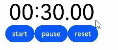
示例1(支持手动启停的文本计时器)
该示例展示了TextTimer组件的基本使用方法,通过format属性设置计时器的文本显示格式。
用户可以通过点击"start"、"pause"、"reset"按钮,开启、暂停、重置计时器。
// xxx.ets
@Entry
@Component
struct TextTimerExample {
  textTimerController: TextTimerController = new TextTimerController()
  @State format: string = 'mm:ss.SS'

  build() {
    Column() {
      TextTimer({ isCountDown: true, count: 30000, controller: this.textTimerController })
        .format(this.format)
        .fontColor(Color.Black)
        .fontSize(50)
        .onTimer((utc: number, elapsedTime: number) => {
          console.info('textTimer notCountDown utc is:' + utc + ', elapsedTime: ' + elapsedTime)
        })
      Row() {
        Button("start").onClick(() => {
          this.textTimerController.start()
        })
        Button("pause").onClick(() => {
          this.textTimerController.pause()
        })
        Button("reset").onClick(() => {
          this.textTimerController.reset()
        })
      }
    }
  }
}
示例2(设定文本阴影样式)
该示例通过textShadow属性设置计时器的文本阴影样式。
// xxx.ets
@Entry
@Component
struct TextTimerExample {
  @State textShadows: ShadowOptions | Array<ShadowOptions> = [{
    radius: 10,
    color: Color.Red,
    offsetX: 10,
    offsetY: 0
  }, {
    radius: 10,
    color: Color.Black,
    offsetX: 20,
    offsetY: 0
  }, {
    radius: 10,
    color: Color.Brown,
    offsetX: 30,
    offsetY: 0
  }, {
    radius: 10,
    color: Color.Green,
    offsetX: 40,
    offsetY: 0
  }, {
    radius: 10,
    color: Color.Yellow,
    offsetX: 100,
    offsetY: 0
  }]

  build() {
    Column({ space: 8 }) {
      TextTimer().fontSize(50).textShadow(this.textShadows)
    }
  }
}
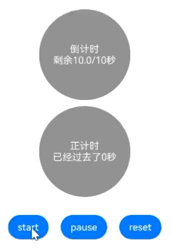
示例3(设定自定义内容区)
该示例实现了两个简易秒表,使用浅灰色背景。计时器开始后,会实时显示时间变化。倒计时器开始后,背景会变成黑色,正计时器开始后,背景会变成灰色。
// xxx.ets
class MyTextTimerModifier implements ContentModifier<TextTimerConfiguration> {
  constructor() {
  }

  applyContent(): WrappedBuilder<[TextTimerConfiguration]> {
    return wrapBuilder(buildTextTimer)
  }
}

@Builder
function buildTextTimer(config: TextTimerConfiguration) {
  Column() {
    Stack({ alignContent: Alignment.Center }) {
      Circle({ width: 150, height: 150 })
        .fill(config.started ? (config.isCountDown ? 0xFF232323 : 0xFF717171) : 0xFF929292)
      Column() {
        Text(config.isCountDown ? "倒计时" : "正计时").fontColor(Color.White)
        Text(
          (config.isCountDown ? "剩余" : "已经过去了") + (config.isCountDown ?
            (Math.max(config.count / 1000 - config.elapsedTime / 100, 0)).toFixed(1) + "/" +
            (config.count / 1000).toFixed(0)
            : ((config.elapsedTime / 100).toFixed(0))
          ) + "秒"
        ).fontColor(Color.White)
      }
    }
  }
}

@Entry
@Component
struct Index {
  @State count: number = 10000
  @State myTimerModifier: MyTextTimerModifier = new MyTextTimerModifier()
  countDownTextTimerController: TextTimerController = new TextTimerController()
  countUpTextTimerController: TextTimerController = new TextTimerController()

  build() {
    Row() {
      Column() {
        TextTimer({ isCountDown: true, count: this.count, controller: this.countDownTextTimerController })
          .contentModifier(this.myTimerModifier)
          .onTimer((utc: number, elapsedTime: number) => {
            console.info('textTimer onTimer utc is:' + utc + ', elapsedTime: ' + elapsedTime)
          })
          .margin(10)
        TextTimer({ isCountDown: false, controller: this.countUpTextTimerController })
          .contentModifier(this.myTimerModifier)
          .onTimer((utc: number, elapsedTime: number) => {
            console.info('textTimer onTimer utc is:' + utc + ', elapsedTime: ' + elapsedTime)
          })
        Row() {
          Button("start").onClick(() => {
            this.countDownTextTimerController.start()
            this.countUpTextTimerController.start()
          }).margin(10)
          Button("pause").onClick(() => {
            this.countDownTextTimerController.pause()
            this.countUpTextTimerController.pause()
          }).margin(10)
          Button("reset").onClick(() => {
            this.countDownTextTimerController.reset()
            this.countUpTextTimerController.reset()
          }).margin(10)
        }.margin(20)
      }.width('100%')
    }.height('100%')
  }
}
示例4(创建之后立即执行计时)
该示例展示了TextTimer计时器如何在创建完成之后立即开始计时。
// xxx.ets
@Entry
@Component
struct TextTimerStart {
  textTimerController: TextTimerController = new TextTimerController()
  @State format: string = 'mm:ss.SS'

  build() {
    Column() {
      Scroll()
        .height('20%')
      TextTimer({ isCountDown: true, count: 30000, controller: this.textTimerController })
        .format(this.format)
        .fontColor(Color.Black)
        .fontSize(50)
        .onTimer((utc: number, elapsedTime: number) => {
          console.info('textTimer notCountDown utc is:' + utc + ', elapsedTime: ' + elapsedTime)
        })
        .onAppear(() => {
          this.textTimerController.start()
        })
    }
  }
}


 扫一扫
扫一扫


 1679
1679

 被折叠的 条评论
为什么被折叠?
被折叠的 条评论
为什么被折叠?
 到【灌水乐园】发言


