 鸿蒙5.0开发:ArkTS组件Popup详解


往期鸿蒙5.0全套实战文章必看:(文中附带全栈鸿蒙5.0学习资料)
Popup
Popup是用于显示特定样式气泡。
说明
该组件从API Version 11开始支持。后续版本如有新增内容,则采用上角标单独标记该内容的起始版本。
导入模块
import { Popup, PopupOptions, PopupTextOptions, PopupButtonOptions, PopupIconOptions } from '@kit.ArkUI';子组件
无
Popup
Popup(options: PopupOptions)
装饰器类型:@Builder
元服务API: 从API version 12开始,该接口支持在元服务中使用。
系统能力: SystemCapability.ArkUI.ArkUI.Full
参数:
| 名称 | 类型 | 必填 | 说明 |
|---|---|---|---|
| options | PopupOptions | 是 | 定义Popup组件的类型。 |
PopupOptions
PopupOptions定义Popup的具体式样参数。
元服务API: 从API version 12开始,该接口支持在元服务中使用。
系统能力: SystemCapability.ArkUI.ArkUI.Full
| 名称 | 类型 | 必填 | 说明 |
|---|---|---|---|
| icon | PopupIconOptions | 否 | 设置popup图标。 说明: 当size设置异常值或0时不显示。 |
| title | PopupTextOptions | 否 | 设置popup标题文本。 |
| message | PopupTextOptions | 是 | 设置popup内容文本。 说明: message不支持设置fontWeight。 |
| showClose | boolean | Resource | 否 | 设置popup关闭按钮。 默认值:true |
| onClose | () => void | 否 | 设置popup关闭按钮回调函数。 |
| buttons | [PopupButtonOptions?,PopupButtonOptions?] | 否 | 设置popup操作按钮,按钮最多设置两个。 |
| direction12+ | Direction | 否 | 布局方向。 默认值:Direction.Auto |
PopupTextOptions
PopupTextOptions设置文本样式。
元服务API: 从API version 12开始,该接口支持在元服务中使用。
系统能力: SystemCapability.ArkUI.ArkUI.Full
| 名称 | 类型 | 必填 | 描述 |
|---|---|---|---|
| text | ResourceStr | 是 | 设置文本内容。 |
| fontSize | number | string | Resource | 否 | 设置文本字体大小。 默认值:$r('sys.float.ohos_id_text_size_body2') |
| fontColor | ResourceColor | 否 | 设置文本字体颜色。 默认值:$r('sys.color.ohos_id_color_text_secondary') |
| fontWeight | number | FontWeight | string | 否 | 设置文本字体粗细。 默认值:FontWeight.Regular |
PopupButtonOptions
PopupButtonOptions定义按钮的相关属性和事件。
元服务API: 从API version 12开始,该接口支持在元服务中使用。
系统能力: SystemCapability.ArkUI.ArkUI.Full
| 名称 | 类型 | 必填 | 描述 |
|---|---|---|---|
| text | ResourceStr | 是 | 设置按钮内容。 |
| action | () => void | 否 | 设置按钮click回调。 |
| fontSize | number | string | Resource | 否 | 设置按钮文本字体大小。 默认值:$r('sys.float.ohos_id_text_size_button2') |
| fontColor | ResourceColor | 否 | 设置按钮文本字体颜色。 默认值:$r('sys.color.ohos_id_color_text_primary_activated') |
PopupIconOptions
PopupIconOptions定义icon(右上角图标)的属性。
元服务API: 从API version 12开始,该接口支持在元服务中使用。
系统能力: SystemCapability.ArkUI.ArkUI.Full
| 名称 | 类型 | 必填 | 描述 |
|---|---|---|---|
| image | ResourceStr | 是 | 设置图标内容。 |
| width | Dimension | 否 | 设置图标宽度。 默认值:32VP |
| height | Dimension | 否 | 设置图标高度。 默认值:32VP |
| fillColor | ResourceColor | 否 | 设置图标填充颜色。 说明: 仅针对svg图源生效。 |
| borderRadius | Length | BorderRadiuses | 否 | 设置图标圆角。 默认值:$r('sys.float.ohos_id_corner_radius_default_s') |
示例
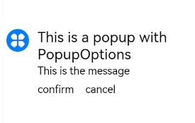
示例1(设置气泡样式)
该示例通过配置PopupIconOptions、PopupTextOptions、PopupButtonOptions实现气泡的样式。
// xxx.ets
import { Popup, PopupTextOptions, PopupButtonOptions, PopupIconOptions } from '@kit.ArkUI';

@Entry
@Component
struct PopupExample {

  build() {
    Row() {
      // popup 自定义高级组件
      Popup({
        // PopupIconOptions类型设置图标内容
        icon: {
          image: $r('app.media.icon'),
          width:32,
          height:32,
          fillColor:Color.White,
          borderRadius: 16
        } as PopupIconOptions,
        // PopupTextOptions类型设置文字内容
        title: {
          text: 'This is a popup with PopupOptions',
          fontSize: 20,
          fontColor: Color.Black,
          fontWeight: FontWeight.Normal
        } as PopupTextOptions,
        // PopupTextOptions类型设置文字内容
        message: {
          text: 'This is the message',
          fontSize: 15,
          fontColor: Color.Black
        } as PopupTextOptions,
        showClose: false,
        onClose: () => {
          console.info('close Button click')
        },
        // PopupButtonOptions类型设置按钮内容
        buttons: [{
          text: 'confirm',
          action: () => {
            console.info('confirm button click')
          },
          fontSize: 15,
          fontColor: Color.Black,
        },
          {
            text: 'cancel',
            action: () => {
              console.info('cancel button click')
            },
            fontSize: 15,
            fontColor: Color.Black
          },] as [PopupButtonOptions?, PopupButtonOptions?]
      })
    }
    .width(300)
    .height(200)
    .borderWidth(2)
    .justifyContent(FlexAlign.Center)
  }
}
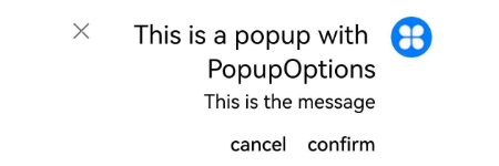
示例 2(设置镜像效果)
该示例通过配置direction实现Popup的镜像效果。
// xxx.ets
import { Popup, PopupTextOptions, PopupButtonOptions, PopupIconOptions } from '@kit.ArkUI'

@Entry
@Component
struct PopupPage {
  @State currentDirection: Direction = Direction.Rtl

  build() {
    Column() {
      // popup 自定义高级组件
      Popup({
        //PopupIconOptions 类型设置图标内容
        direction: this.currentDirection,
        icon: {
          image: $r('app.media.icon'),
          width: 32,
          height: 32,
          fillColor: Color.White,
          borderRadius: 16,
        } as PopupIconOptions,
        // PopupTextOptions 类型设置文字内容
        title: {
          text: 'This is a popup with PopupOptions',
          fontSize: 20,
          fontColor: Color.Black,
          fontWeight: FontWeight.Normal,

        } as PopupTextOptions,
        //PopupTextOptions 类型设置文字内容
        message: {
          text: 'This is the message',
          fontSize: 15,
          fontColor: Color.Black,
        } as PopupTextOptions,
        showClose: true,
        onClose: () => {
          console.info('close Button click')
        },
        // PopupButtonOptions 类型设置按钮内容
        buttons: [{
          text: 'confirm',
          action: () => {
            console.info('confirm button click')
          },
          fontSize: 15,
          fontColor: Color.Black,

        },
          {
            text: 'cancel',
            action: () => {
              console.info('cancel button click')
            },
            fontSize: 15,
            fontColor: Color.Black,
          },] as [PopupButtonOptions?, PopupButtonOptions?],
      })

    }
    .justifyContent(FlexAlign.Center)
    .width('100%')
    .height('100%')
  }
}


 扫一扫
扫一扫


 被折叠的 条评论
为什么被折叠?
被折叠的 条评论
为什么被折叠?
 到【灌水乐园】发言


