


往期鸿蒙5.0全套实战文章必看:(文中附带全栈鸿蒙5.0学习资料)
LoadingProgress
用于显示加载动效的组件。
加载动效在组件不可见时停止,组件的可见状态基于onVisibleAreaChange处理,可见阈值ratios大于0即视为可见状态。
说明
该组件从API Version 8开始支持。后续版本如有新增内容,则采用上角标单独标记该内容的起始版本。
子组件
无
接口
LoadingProgress()
创建加载进展组件。
卡片能力: 从API version 9开始,该接口支持在ArkTS卡片中使用。
元服务API: 从API version 11开始,该接口支持在元服务中使用。
系统能力: SystemCapability.ArkUI.ArkUI.Full
属性
除支持通用属性外,还支持以下属性:
color
color(value: ResourceColor)
设置加载进度条前景色。
卡片能力: 从API version 9开始,该接口支持在ArkTS卡片中使用。
元服务API: 从API version 11开始,该接口支持在元服务中使用。
系统能力: SystemCapability.ArkUI.ArkUI.Full
参数:
| 参数名 | 类型 | 必填 | 说明 |
|---|---|---|---|
| value | ResourceColor | 是 | 加载进度条的前景色。 默认值: API version 10及以下:'#99666666' API version 11及以上:'#ff666666' |
enableLoading10+
enableLoading(value: boolean)
设置LoadingProgress动画显示或者不显示。LoadingProgress动画不显示时,该组件依旧占位。通用属性Visibility.Hidden隐藏的是包括border、padding等整个组件范围,而enableLoading=false只隐藏LoadingProgress本身动画内容,不包括border等。
元服务API: 从API version 11开始,该接口支持在元服务中使用。
系统能力: SystemCapability.ArkUI.ArkUI.Full
参数:
| 参数名 | 类型 | 必填 | 说明 |
|---|---|---|---|
| value | boolean | 是 | LoadingProgress动画是否显示。 默认值:true |
contentModifier12+
contentModifier(modifier: ContentModifier<LoadingProgressConfiguration>)
定制LoadingProgress内容区的方法。
元服务API: 从API version 12开始,该接口支持在元服务中使用。
系统能力: SystemCapability.ArkUI.ArkUI.Full
参数:
| 参数名 | 类型 | 必填 | 说明 |
|---|---|---|---|
| modifier | ContentModifier<LoadingProgressConfiguration> | 是 | 在LoadingProgress组件上,定制内容区的方法。 modifier: 内容修改器,开发者需要自定义class实现ContentModifier接口。 |
事件
支持通用事件。
LoadingProgressConfiguration12+对象说明
开发者需要自定义class实现ContentModifier接口。
元服务API: 从API version 12开始,该接口支持在元服务中使用。
| 参数名 | 类型 | 默认值 | 说明 |
|---|---|---|---|
| enableloading | boolean | true | LoadingProgress动画是否显示。 默认值:true。 |
LoadingProgressStyle(deprecated)枚举说明
从API version 8开始废弃。
卡片能力: 从API version 9开始,该接口支持在ArkTS卡片中使用。
元服务API: 从API version 11开始,该接口支持在元服务中使用。
系统能力: SystemCapability.ArkUI.ArkUI.Full
| 名称 | 说明 |
|---|---|
| Default | 默认加载样式。API version 8及以后不支持设置。 |
| Circular | 环形加载样式。API version 8及以后不支持设置。 |
| Orbital | 彗星形加载样式。API version 8及以后默认为彗星形样式。 |
示例
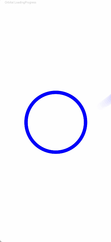
示例1(设置颜色)
该示例通过color接口,实现了设置加载动效颜色的功能。
// xxx.ets
@Entry
@Component
struct LoadingProgressExample {
  build() {
    Column({ space: 5 }) {
      Text('Orbital LoadingProgress ').fontSize(9).fontColor(0xCCCCCC).width('90%')
      LoadingProgress()
        .color(Color.Blue)
        .layoutWeight(1)
    }.width('100%').margin({ top: 5 })
  }
}
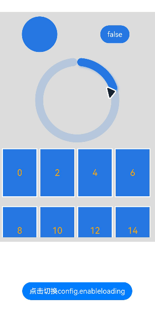
示例2(设置定制内容区)
该示例通过contentModifier接口,实现了定制内容区的功能,并通过enableLoading接口实现了通过按钮切换是否显示LoadingProgress的效果。
// xxx.ets
import { promptAction } from '@kit.ArkUI'

class MyLoadingProgressStyle implements ContentModifier<LoadingProgressConfiguration> {
  enableLoading: boolean = false

  constructor(enableLoading: boolean) {
    this.enableLoading = enableLoading
  }

  applyContent(): WrappedBuilder<[LoadingProgressConfiguration]> {
    return wrapBuilder(buildLoadingProgress)
  }
}

let arr1: string[] =
  ["0", "1", "2", "3", "4", "5", "6", "7", "8", "9", "10", "11", "12", "13", "14", "15", "16", "17", "18", "19"]
let arr2: string[] = ["0", "1", "2", "3", "4", "5", "6", "7", "8", "9"]

@Builder
function buildLoadingProgress(config: LoadingProgressConfiguration) {
  Column({ space: 8 }) {
    Row() {
      Column() {
        Circle({
          width: ((config.contentModifier as MyLoadingProgressStyle).enableLoading) ? 100 : 80,
          height: ((config.contentModifier as MyLoadingProgressStyle).enableLoading) ? 100 : 80
        })
          .fill(((config.contentModifier as MyLoadingProgressStyle).enableLoading) ? Color.Grey : 0x2577e3)
      }.width('50%')

      Column() {
        Button('' + ((config.contentModifier as MyLoadingProgressStyle).enableLoading))
          .onClick((event: ClickEvent) => {
            promptAction.showToast({
              message: ((config.contentModifier as MyLoadingProgressStyle).enableLoading) + ''
            })
          })
          .fontColor(Color.White)
          .backgroundColor(((config.contentModifier as MyLoadingProgressStyle).enableLoading) ? Color.Grey : 0x2577e3)
      }.width('50%')

    }

    Row() {
      Column() {
        Gauge({
          value: (config.contentModifier as MyLoadingProgressStyle).enableLoading ? 50 : 30, min: 11, max: 100
        }) {
          Column() {
            Text('60')
              .maxFontSize("180sp")
              .minFontSize("160.0vp")
              .fontWeight(FontWeight.Medium)
              .fontColor("#ff182431")
              .width('40%')
              .height('30%')
              .textAlign(TextAlign.Center)
              .margin({ top: '22.2%' })
              .textOverflow({ overflow: TextOverflow.Ellipsis })
              .maxLines(1)
          }.width('100%').height('100%')
        }
        .colors(((config.contentModifier as MyLoadingProgressStyle).enableLoading) ? Color.Grey : 0x2577e3)
        .width(200)
        .strokeWidth(18)
        .padding(5)
        .trackShadow({ radius: 7, offsetX: 7, offsetY: 7 })
        .height(200)
      }.width('100%')

    }

    Column() {
      List({ space: 20, initialIndex: 0 }) {
        ForEach(arr2, (item: string) => {
          ListItem() {
            Text((config.contentModifier as MyLoadingProgressStyle).enableLoading ? '' + item : Number(item) * 2 + '')
              .width('100%')
              .height('100%')
              .fontColor((config.contentModifier as MyLoadingProgressStyle).enableLoading ? Color.White : Color.Orange)
              .fontSize((config.contentModifier as MyLoadingProgressStyle).enableLoading ? 16 : 20)
              .textAlign(TextAlign.Center)
              .backgroundColor((config.contentModifier as MyLoadingProgressStyle).enableLoading ? Color.Grey : 0x2577e3)
          }
          .height(110)
          .border({
            width: 2,
            color: Color.White
          })
        }, (item: string) => item)
      }
      .height(200)
      .width('100%')
      .friction(0.6)

      .lanes({
        minLength: (config.contentModifier as MyLoadingProgressStyle).enableLoading ? 40 : 80,
        maxLength: (config.contentModifier as MyLoadingProgressStyle).enableLoading ? 40 : 80
      })
      .scrollBar(BarState.Off)
    }

  }.width("100%").padding(10)
}


@Entry
@Component
struct LoadingProgressDemoExample {
  @State loadingProgressList: (boolean | undefined | null)[] = [undefined, true, null, false]
  @State widthList: (number | string)[] = ['110%', 220, '40%', 80]
  @State loadingProgressIndex: number = 0
  @State clickFlag: number = 0
  scroller: Scroller = new Scroller()

  build() {
    Column() {
      Scroll(this.scroller) {
        Column({ space: 5 }) {
          Column() {
            LoadingProgress()
              .color('#106836')
              .size({ width: '100%' })
              .contentModifier(new MyLoadingProgressStyle(this.loadingProgressList[this.loadingProgressIndex]))
          }.width('100%').backgroundColor(0xdcdcdc)
        }.width('100%').margin({ top: 5 })
      }.height('85%')

      Button('点击切换config.enableloading').onClick(() => {
        this.clickFlag++
        this.loadingProgressIndex = (this.loadingProgressIndex + 1) % this.loadingProgressList.length
        console.log('enableLoading:' + this.loadingProgressList[this.loadingProgressIndex])
      }).margin(20)
    }

  }
}


 扫一扫
扫一扫


 2102
2102

 被折叠的 条评论
为什么被折叠?
被折叠的 条评论
为什么被折叠?
 到【灌水乐园】发言


