


 本文是一位前端开发工程师的经验分享,涵盖了HTML、CSS、JS相关的问题与解决方案,包括meta标签、语义化标签、手机号码输入限制、CSS1px边框、滚动动画、移动端点击延迟等,旨在帮助开发者解决实际开发中遇到的问题。
引言
笔者是一名前端开发工程师,大部分开发工作都是在 H5 的世界里遨游。多年的 H5 开发经验总结了一些常用技巧,在这里分享给大家,希望在遇到同类问题时能给你提供思路和灵感,保护日益稀疏的头发。
HTML 相关
meta 标签
meta 元素可提供有关页面的元信息。下面是一些与移动端 H5 相关比较特殊的 meta 标签
<meta name="screen-orientation" content="portrait" />// 禁止屏幕旋转
<meta name="full-screen" content="yes" />// 全屏显示
<meta name="browsermode" content="application" />// UC应用模式,页面默认全屏
<meta name="x5-orientation" content="portrait" />// QQ强制竖屏
<meta name="x5-fullscreen" content="true" /> // QQ强制全屏
<meta name="x5-page-mode" content="app" /> // QQ应用模式
<meta name="renderer" content="webkit" />// 启用360浏览器的极速模式
<meta http-equiv="X-UA-Compatible" content="IE=edge,chrome=1" /> // 优先使用 IE 最新版本和 Chrome
语义化标签
HTML5 语义化标签能够让页面的结构更清晰,有利于 SEO,并且能够帮助辅助技术更好的阅读和转译你的网页。推荐使用语义化标签编写 HTML
<header></header> // 定义文档的头部区域
<nav></nav> // 定义导航链接的部分
<main></main> // 定义文档的主体部分
<section></section> // 定义文档中的节
<footer></footer> // 定义页面的页脚
<aside></aside> // 定义页面的侧边栏内容
<article></article> // 定义一个文章区域
电话号码拨号与识别
使用 a 标签实现点击手机号码唤起拨号页面
<a href="tel:4009161060" class="phone">400-916-1060</a>
在 iOS Safari 浏览器上会将类似为电话号码的数字识别为电话链接,比如:
7 位数字,形如:1234567 带括号及加号的数字,形如:(+86)123456789 双连接线的数字,形如:00-00-00111 11 位数字,形如:13800138000
关闭识别
<meta name="format-detection" content="telephone=no" />
邮箱识别
使用 a 标签实现点击邮箱地址弹出邮件发送的功能
<a href="mailto:8888@qq.com" class="email">8888@qq.com</a>
Android 手机上会对符合邮箱格式的字符串进行识别,我们可以通过如下的 meta 来关闭邮箱的自动识别
<meta name="format-detection" content="email=no" />
CSS 相关
1px 边框
css 中的 1px 并不等于移动设备的 1px,是因为不同的手机有不同的像素密度。在 window 对象中有一个 devicePixelRatio 属性,他可以反应 css 中的像素与设备的像素比
devicePixelRatio 的官方的定义为:设备物理像素和设备独立像素的比例
完美实现 1px 的方法如下,兼容 DPR(设备像素比) 1-4 的设备
 @line-color: #ccc;

[retina] {position: relative;
}

[retina]::before {position: absolute;box-sizing: border-box;width: 100%;height: 100%;font-size: 20px;content: ' ';pointer-events: none;
}

/* 设备像素比为 1 */
@media only screen and (-webkit-min-device-pixel-ratio: 1), only screen and (min-device-pixel-ratio: 1) {[retina]::before {width: 100%;height: 100%;transform: scale(1);transform-origin: 0 0;}[retina='line-bottom']::before {height: 1px;}[retina='line-top']::before {height: 1px;}[retina='line-left']::before {width: 1px;}[retina='rect-input']::before {border-width: 1px;}
}

/* 设备像素比为 1.5 */
@media only screen and (-webkit-min-device-pixel-ratio: 1.5), only screen and (min-device-pixel-ratio: 1.5) {[retina]::before {width: 150%;height: 150%;font-size: 30px;transform: scale(0.666667);transform-origin: 0 0;}[retina='line-bottom']::before {height: 1px;}[retina='line-top']::before {height: 1px;}[retina='line-left']::before {width: 1px;}[retina='rect-input']::before {border-width: 1px;}[retina='rect-input']::before {border-width: 1px;}
}

/* 设备像素比为 2 */
@media only screen and (-webkit-min-device-pixel-ratio: 2), only screen and (min-device-pixel-ratio: 2) {[retina]::before {width: 200%;height: 200%;font-size: 40px;transform: scale(0.5);transform-origin: 0 0;}[retina='line-bottom']::before {height: 1px;}[retina='line-top']::before {height: 1px;}[retina='line-left']::before {width: 1px;}[retina='rect-input']::before {border-width: 1px;}
}

/* 设备像素比为 3 */
@media only screen and (-webkit-min-device-pixel-ratio: 3), only screen and (min-device-pixel-ratio: 3) {[retina]::before {width: 300%;height: 300%;font-size: 60px;transform: scale(0.333333);transform-origin: 0 0;}[retina='line-bottom']::before {height: 2px;}[retina='line-top']::before {height: 2px;}[retina='line-left']::before {width: 2px;}[retina='rect-input']::before {border-width: 2px;}
}

/* 设备像素比为 4 */
@media only screen and (-webkit-min-device-pixel-ratio: 4), only screen and (min-device-pixel-ratio: 4) {[retina]::before {width: 400%;height: 400%;font-size: 80px;transform: scale(0.25);transform-origin: 0 0;}[retina='line-bottom']::before {height: 2px;}[retina='line-top']::before {height: 2px;}[retina='line-left']::before {width: 2px;}[retina='rect-input']::before {border-width: 2px;}
}

[retina='line-bottom']::before {bottom: 0;left: 0;background-color: @line-color;transform-origin: 0 100%;
}

[retina='line-top']::before {top: 0;left: 0;background-color: @line-color;
}

[retina='line-left']::before {top: 0;left: 0;background-color: @line-color;
}

[retina='rect-input']::before {top: 0;left: 0;box-sizing: border-box;border-color: @input-border-color;border-style: solid;border-radius: 1em;
}
使用方式很简单
上边框
<div class="container" retina="line-top"></div>
右边框
<div class="container" retina="line-right"></div>
下边框
<div class="container" retina="line-bottom"></div>
左边框
<div class="container" retina="line-left"></div>
全边框
<div class="container" retina="rect-input"></div>
绘制三角形
css 绘制三角形
.triangle-up {display: inline-block;width: 0;height: 0;border-left: 10px solid transparent;border-right: 10px solid transparent;border-bottom: 20px solid #409eff;
}

.triangle-right {display: inline-block;width: 0;height: 0;border-top: 10px solid transparent;border-bottom: 10px solid transparent;border-left: 20px solid #409eff;
}

.triangle-down {display: inline-block;width: 0;height: 0;border-right: 10px solid transparent;border-left: 10px solid transparent;border-top: 20px solid #409eff;
}

.triangle-left {display: inline-block;width: 0;height: 0;border-right: 20px solid #409eff;border-top: 10px solid transparent;border-bottom: 10px solid transparent;
}
滚动区域边缘的模糊蒙层
左侧:background: linear-gradient(90deg, #fff, #fff, 50%, hsla(0, 0%, 98%, 0));

右侧:background: linear-gradient(270deg, #fff, #fff, 20%, hsla(0, 0%, 98%, 0));
可换行的文本下划线
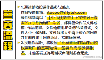
<span>“比赛期间作品许可授权声明”的签署短信,签署后完成参赛报名</span>

span {position: relative;background: linear-gradient(to bottom, transparent 50%, #FEDC00 50%);
}
音乐唱片旋转与暂停保持动画状态
常常有这样的需求,H5 页面顶部有个播放音乐的图标,点击播放音乐,图标开始旋转,再次点击暂停播放,且图标保持旋转的弧度
@keyframes rotation {from {transform: rotate(0deg);}to {transform: rotate(360deg);}
}

.music-icon {animation: rotation 5s linear infinite;
}

.music-icon.paused {animation-play-state: paused;
}
如上代码,点击暂停时加上样式类 paused,点击播放时去掉样式类 paused
镜像翻转效果
倾斜-1 并且旋转 180 度
transform: scaleX(-1) rotate(180deg);
12px 以下的字体大小实现
大部分桌面浏览器对于小于 12px 的字体会直接展示为 12px,移动端浏览器不会有这样的问题。为了保持两端同步,可以采用缩放来实现
如果设计稿上字体大小是 10px,css 可以写成 20px,然后缩放 0.5 倍大小。缩放后字体位置可能会有偏移,可以使用 translate 来调整
 <div class="10pxfont-wrapper"><div class="10pxfont">我是一段文本</div>
</div>

.10pxfont-wrapper {display: flex;justify-content: center;align-items: center;width: 375px;height : 20px;
}

.10pxfont {width: 200%;height: 200%;font-size: 20px;transform: scale(0.5);
}
屏蔽用户选择
禁止用户选择页面中的文本
.container {user-select: none;
}
清除输入框内阴影
在 safari 浏览器中,输入框默认有内部阴影,可以这样关闭:
input {-webkit-appearance: none;
}
禁止保存或拷贝图像
img {-webkit-touch-callout: none;
}
输入框 placeholder 样式设置
设置 input 里面 placeholder 字体的颜色
input::-webkit-input-placeholder,
textarea::-webkit-input-placeholder {color: #c2c2c2;
}
用户设置字号放大或者缩小导致页面布局错误
设置字体禁止缩放
body {text-size-adjust: 100% !important;
}
android 系统中元素被点击时产生边框
部分 android 系统点击一个链接,会出现一个边框或者半透明灰色遮罩, 不同生产商定义出来额效果不一样。去除代码如下
a, button, input, textarea{-webkit-tap-highlight-color: rgba(0,0,0,0);-webkit-user-modify:read-write-plaintext-only;
}
iOS 滑动不流畅
ios 手机上下滑动页面会产生卡顿,手指离开页面,页面立即停止运动。整体表现就是滑动不流畅,没有滑动惯性。 iOS 5.0 以及之后的版本,滑动有定义有两个值 auto 和 touch,默认值为 auto
在滚动容器上增加滚动 touch 方法
.scroll {-webkit-overflow-scrolling: touch;
}
safari 浏览器会给 disabled 的输入框加上 0.4 的不透明度
input:disabled {opacity: 0.4;
}
不想透明度降低可以这样设置
input:disabled {color: xxx;opacity: 1;-webkit-text-fill-color: xxx;
}
动画实现
loading 动画
接口调用时展示加载 loading
<div class="loading"></div>

.loading {width: 20px;height: 20px;background-image: url(xxxxx);background-repeat: no-repeat;animation: rotation 1s infinite;
}

@keyframes rotation {0% {transform: rotate(0deg);}100% {transform: rotate(1turn);}
}
逐帧动画之音浪实现方法
播放音频时的音浪如何实现? 
<div class="sound-wave"><div class="icon"></div>
</div>

.sound-wave {width: 21px;height: 21px;
}

.sound-wave .icon {position: relative;width: 42px;height: 42px;background-image: url(../img/sound_wave.png);background-size: 1008px 42px;animation: sound_run 1.2s steps(24,start) infinite;zoom: .5;
}

@keyframes sound_run {0% {background-position: 0 0;}100% {background-position: -1008px 0;}
}
一起来看流星雨
H5 活动类页面实现流星雨效果? 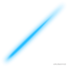
<div class="container"><div class="flowglow"></div>
</div>

.container {width: 100vw;height: 100vh;
}

.container .flowglow {position: absolute;top: 0;right: 0;width: 22vw;height: 22vw;animation: flowglow 5s infinite;background-image: url(../img/flowglow.png);background-repeat: no-repeat;background-position: 0 0;background-size: contain;transform: translate3d(22vw, -22vw, 0);
}

@keyframes flowglow {0% {transform: translate3d(-22vw, -22vw, 0);}100% {transform: translate3d(-120vw, 76vw, 0);}
}
页面切换动画,区分前进和后退
在单页应用中,点击链接进入新页面希望页面从右往左滑入,回退到上个页面希望页面从左往右滑出。
以 vue 应用为例,这里会将最外层容器 app-wrapper 绝对定位,宽高 100%,子路由页面高度 100%,内容自适应滚动。这样设计利于页面切换动画的实现。
App.vue
<template><div class="app-wrapper"><transition :name="transitionName"><keep-alive><router-view :key="$route.name"></router-view></keep-alive></transition></div>
</template>

<script lang="ts"> ...

transitionName = '';

// 监听路由添加页面切换效果
@Watch('$route')
onRouteChanged(to: Route, from: Route) {const toDeep = to.meta.deep;const fromDeep = from.meta.deep;// 初次进入首页不启用滑动效果if (from.name === null) {this.transitionName = '';} else {this.transitionName = toDeep === fromDeep ? '' : toDeep < fromDeep ? 'slide-right' : 'slide-left';}
}

... </script>

<style lang="less" scoped> .app-wrapper {position: absolute;top: 0;left: 0;width: 100%;height: 100%;
}

子页面根样式 {overflow: atuo;height: 100%;
}

// transition样式类
.slide-left-enter-active,
.slide-left-leave-active,
.slide-right-enter-active,
.slide-right-leave-active,
.slide-top-enter-active,
.slide-top-leave-active,
.slide-bottom-enter-active,
.slide-bottom-leave-active {position: absolute;width: 100%;transition: transform 300ms linear;
}

.slide-left-enter,
.slide-right-leave-to {transform: translate3d(100%, 0, 0);
}

.slide-top-enter,
.slide-bottom-leave-to {transform: translate3d(0, 100%, 0);
}

.slide-left-enter-to,
.slide-left-leave,
.slide-right-enter-to,
.slide-right-leave,
.slide-top-enter-to,
.slide-top-leave,
.slide-bottom-enter-to,
.slide-bottom-leave {transform: translate3d(0, 0, 0);
}

.slide-left-leave-to,
.slide-right-enter {transform: translate3d(-100%, 0, 0);
}

.slide-top-leave-to,
.slide-bottom-enter {transform: translate3d(0, -100%, 0);
} </style>
router.ts:根据页面层级深度设置 meta 中的 deep 参数,页面越深,deep 数字越大
import Vue from 'vue';
import Router, { RouteConfig } from 'vue-router';
import { NavTitle } from './extapi';

Vue.use(Router);

const routes: RouteConfig[] = [{path: '/',alias: ['album', '/album', 'home', '/home'],name: 'album',component: () => import(/* webpackChunkName: "album" */ './views/Album.vue'),meta: {deep: 0,title: NavTitle.Album,},},{path: '/login',alias: ['login', 'loginPop', '/loginPop'],name: 'login',component: () => import(/* webpackChunkName: "login" */ './views/Login.vue'),meta: {deep: 1,title: NavTitle.Login,},},...
]
JS 相关
手机号码输入框禁止输入非数字字符
解决方案:监听输入事件,将非数字字符替换为空字符串
<inputv-model.trim="phone"type="tel"placeholder="请输入手机号码":maxlength="11"@input="onInputMessage('phone')"
/>

// 解决在微信内IOS粘贴短信验证码,不显示在方框内的问题
onInputMessage(field: string) {this[field] = this[field].replace(/[^\d]/g, '');
}
移动端 click 事件会有 300ms 的延时
移动端 click 事件会有 300ms 的延时,原因是移动端屏幕双击会缩放(double tap to zoom) 页面,浏览器需要延时来判断用户操作是点击还是双击事件。解决方案:fastclick
var attachFastClick = require('fastclick');
attachFastClick(document.body);
safari 浏览器日期转换出现 NaN 的问题
将日期字符串的格式符号替换成’/’
'yyyy-MM-dd'.replace(/-/g, '/')
最后
整理了75个JS高频面试题,并给出了答案和解析,基本上可以保证你能应付面试官关于JS的提问。


有需要的小伙伴,可以点击下方卡片领取,无偿分享


 扫一扫
扫一扫


 7459
7459

 被折叠的 条评论
为什么被折叠?
被折叠的 条评论
为什么被折叠?
 到【灌水乐园】发言


