


Bootstrap V4系列 学习入门教程之 代码(Code)和图片(Image)
代码(Code)
展示如何使用 Bootstrap 展示行内代码和多行代码块。
一、行内代码
用<code>包裹行内代码片段。请确保转义 HTML 代码中尖括号。
<!-- 行内代码 -->
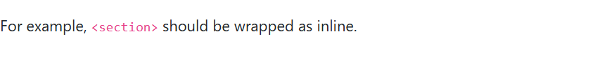
For example, <code><section></code> should be wrapped as inline.
页面展示效果:
二、代码块
用 <pre>包裹多行代码。再次注意,请确保转义代码中的尖括号,以便正确展示。你还可以选择性地添加.pre-scrollable 类,实现垂直滚动,并且设定的最大高度为 340px。
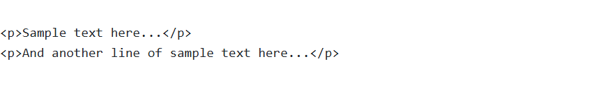
<pre><code><p>Sample text here...</p>
<p>And another line of sample text here...</p>
</code></pre>
页面展示效果:
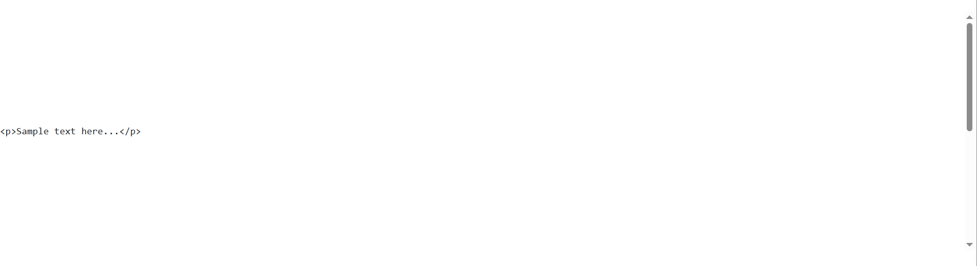
添加.pre-scrollable 类,实现垂直滚动:
<!--你还可以选择性地添加 .pre-scrollable 类,实现垂直滚动,并且设定的最大高度为 340px。-->
<pre class="pre-scrollable" style="line-height: 340px;"><code><p>Sample text here...</p>
<p>And another line of sample text here...</p>
</code></pre>
页面展示效果:
三、用户输入
<kbd> 标签通常用来标明键盘输入。
<!-- <kbd> 标签通常用来标明键盘输入。-->
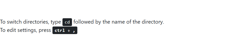
To switch directories, type <kbd>cd</kbd> followed by the name of the directory.<br>
To edit settings, press <kbd><kbd>ctrl</kbd> + <kbd>,</kbd></kbd>
页面展示效果:
四、示例输出
<samp> 标签指示程序的示例输出。
<!-- <samp> 标签指示程序的示例输出。-->
<samp>This text is meant to be treated as sample output from a computer program.</samp>
页面展示效果:

图片(Image)
展示了如何让图片支持响应式行为(这样它们就不会超出父元素的范围)以及如何通过类(class)添加些许样式。
一、响应式图片
通过 Bootstrap 所提供的 .img-fluid 类让图片支持响应式布局。其原理是将 max-width: 100%; 和 height: auto; 赋予图片,以便随父元素一起缩放。
<!--响应式图片-->
<img src="../images/a1.jpg" class="img-fluid" alt="...">
页面展示效果:

二、图片的缩略图
除了提供的 border-radius utilities 外,你还可以使用 .img-thumbnail 使图片的外观具有 1px 宽度的圆形边框。
<!--图片的缩略图-->
<img src="../images/1.jpg" class="img-thumbnail" alt="...">
页面展示效果:

三、对齐图片
通过使用 helper float classes 或 text alignment classes 将图片对齐。块级(block-level)图片可以使用 the .mx-auto margin utility class 居中对齐。
<!--对齐图片-->
<img src="../images/1.jpg" class="rounded float-left" alt="...">
<img src="../images/2.jpg" class="rounded float-right" alt="...">
页面展示效果:
<!--居中对齐-->
<img src="../images/1.jpg" class="rounded mx-auto d-block" alt="...">
页面展示效果:

<div class="text-center">
    <img src="../images/2.jpg" class="rounded" alt="...">
</div>
页面展示效果:


 扫一扫
扫一扫


 708
708

 被折叠的 条评论
为什么被折叠?
被折叠的 条评论
为什么被折叠?
 到【灌水乐园】发言


